

In addition to his practice as a writer/designer, Warren Lehrer has been an innovative educator at the intersection of visual art and writing for over three decades. After a short stint as a teaching assistant to Armin Hoffman at the Yale School of Art, where Lehrer earned his MFA, he began his teaching career as an Assistant Professor at the University of Massachusetts, Dartmouth. From 1982 – 2021 Lehrer taught at the School of Art+Design, Purchase College, SUNY (the premiere art school within the NY state university) and was Chair of the Design program for many years. He became the Leff Distinguished Professor in 2017, was awarded the SUNY Chancellor’s Award for Excellence in Scholarship and Creative Activities in 2021, and is currently Professor Emeritus. Since 1996, he’s been a founding faculty member at the Designer as Author & Entrepreneur graduate program at the School of Visual Arts (SVA). In 1995/96, he was a visiting professor at The Cooper Union. Through the years, Lehrer has been a visiting artist at scores of universities, art schools and art centers, and is a frequent lecturer and keynote speaker on his own work, on visual literature and art/design/writing pedagogy. His essays on teaching have been widely reproduced.
Lehrer’s earliest experiences as a mentor of young people was as a drama counselor, directing children’s theater for two seasons at a summer camp in Western Massachusetts. Though he went on to pursue art and writing, he continues to use theater exercises and techniques as a part of teaching writing and visual art, and performance has always been an integral part of his own work. During his two year stint teaching graphic design and typography at the School of Visual and Performing Arts at UMass, Lehrer initiated the first Art of the Book classes, a course and path of study that continues at UMass Dartmouth to this day. At SUNY Purchase, he developed curriculum and has taught a variety of classes that meld writing with design/visual arts, including a sequence of core Word+Image courses, an elective called Artist/Writer Workshop, as well as Performance Art, The Mall: Acts on Campus, a theory class titled Design Issues, and Community Design. Lehrer consulted with Steven Heller and Lita Talarico on the formation of the Designer as Author grad program at SVA, and since its launch as a program in 1996, he’s been teaching the Writing and Designing the Visual Book class every fall. Lehrer and his wife Judith Sloan also consulted with the Maryland Institute College of Art (MICA) as it was forming its Community Arts MFA program, and they served as model practitioners for that program in its launch year in tandem with installing the Crossing the BLVD exhibition at MICA’s Dekker Gallery. With Sloan, Lehrer has taught writing, book arts and performance at the Haystack Mountain School of Art. He’s also been a teaching resident at Rutgers University, Newark (twice), and had shorter residencies at the University of Utah, Ogden; the University of the Arts (Philadelphia); Scripps College (as their Frederick Goudy Lecturer); the University of Florida, Gainesville; and the School of the Art Institute of Chicago.
samples of vis lit-related student work
Writing & Designing the Visual Book (SVA Designer As Author MFA program)
The primary focus of the class is creative writing. The secondary focus is on typography/lettering as the principal vehicles for giving shape to the writing. Lastly, this is an art of the book class. Students are asked to consider the book form as a visual medium and re-imagine its possibilities, uses, and technological manifestations for our time. Emphasis is on developing an approach to writing and design as an integrated expression.
The Bifurcated Book Project
After a series of initial workshops and projects—in titling, word/image relationships, continuous writing, editing, writing from multiple perspectives, developing character and voice, shaping a story, and learning a few bookbinding structures with binding master Barbara Mauriello—students are asked to write, design and produce a book with multiple perspectives. The form and content need to grow out of and reinforce each other.

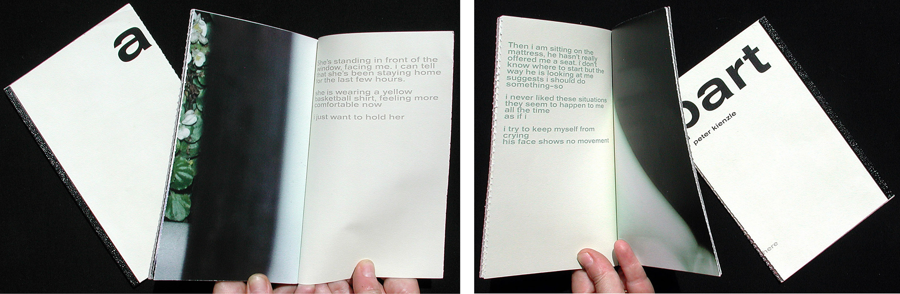
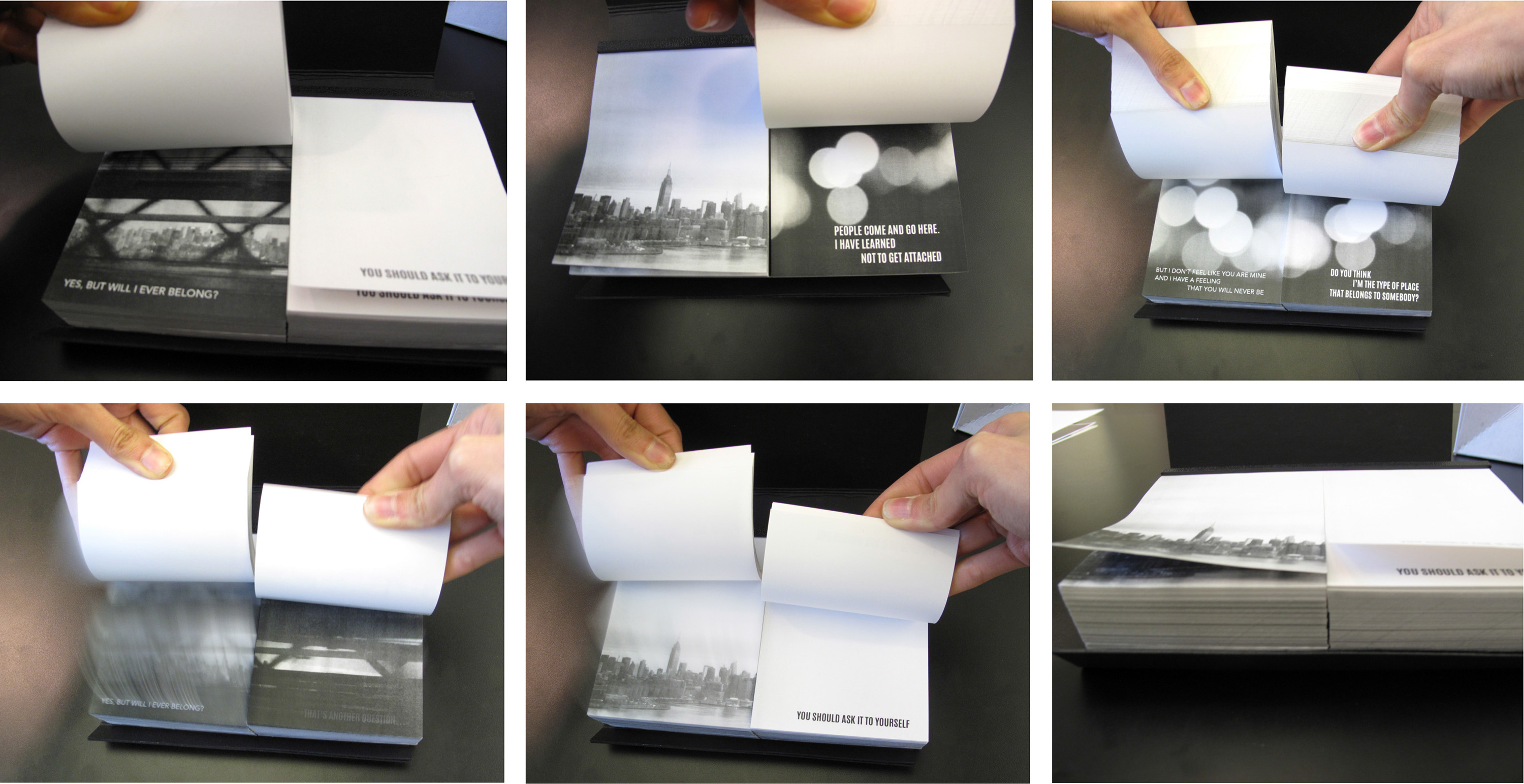
Perforated down the middle, Peter Kienzle’s book A-Part requires you to rip apart one spread at a time as you read. On the left side, you read the woman’s perspective of a couple’s relationship. On the right, the man’s perspective. As you tear through the book, the couple drifts apart. By the end, they split up and you’re left with two separate books.
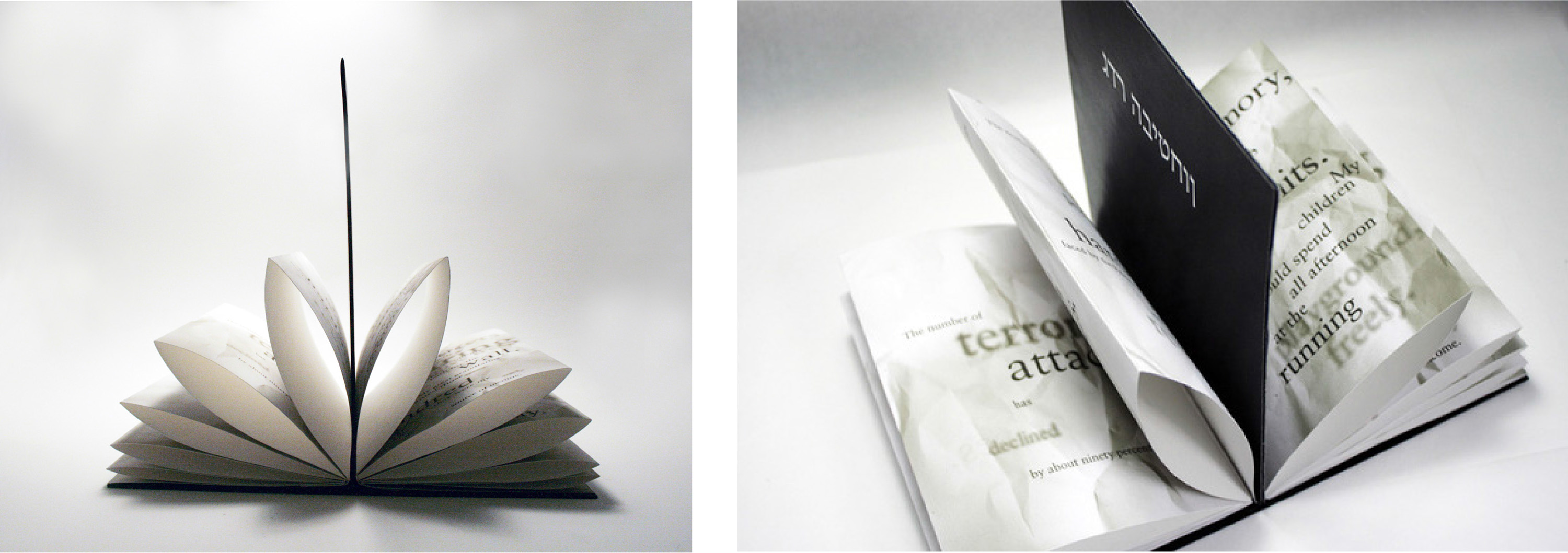
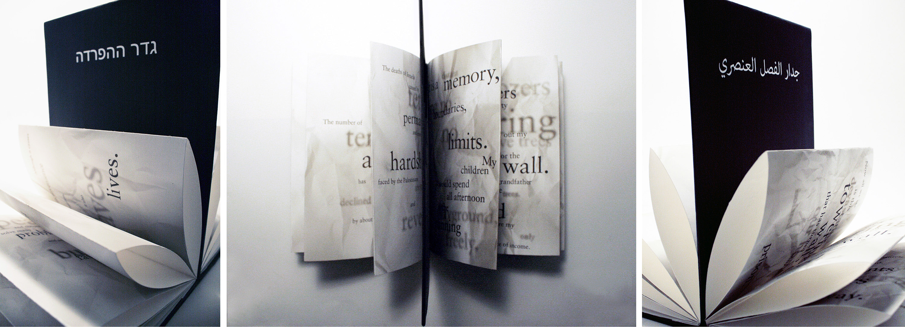
The Separation Wall, written and designed by Samia Kallidis, depicts two opposing perspectives of the “Separation Barrier” that divides the West Bank from Israel. On one side of the wall—we read a subjective narrative of an Israeli man who strongly supports the existence of the wall as necessary for peace and security. On the other side—the very different opinion of a Palestinian man who sees the wall as an isolating blockade creating impoverished ghettos. Samia is Palestinian and grew up in the Middle East. Semifinalist, 2014 Adobe Design Achievement Award.
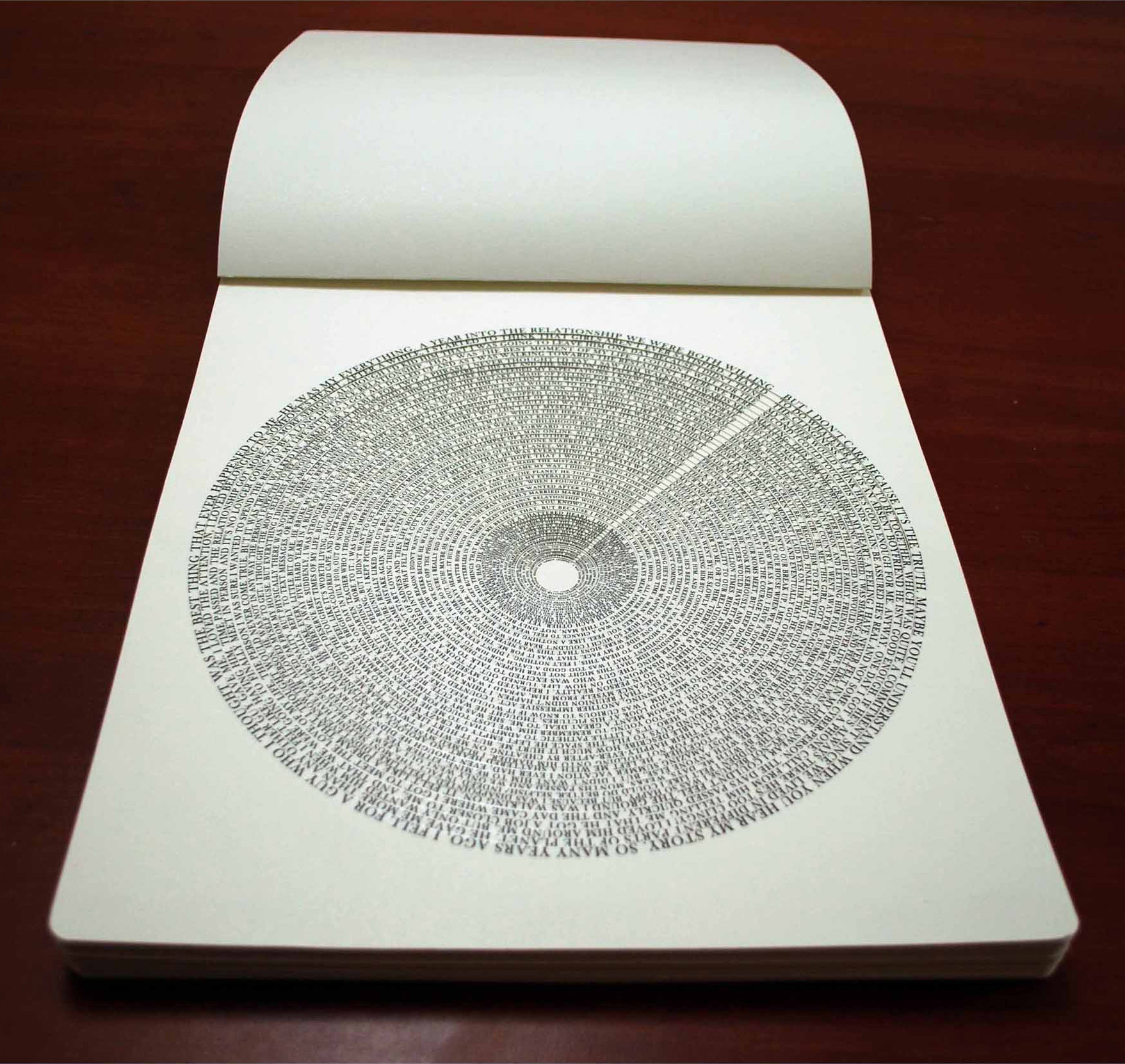

Written and designed by Nada Seet, the book Oh, This May Sound Pathetic To You is about a young woman who is always falling for guys who are far out of her reach, in one sense or another. The circular structure helps enable the reader to feel the suffering of Seet’s protagonist as she “repeats the same mistakes and spirals further into loneliness.” This painstakingly handmade bookwork, measures 11 x 13 inches, and was made in two (very) limited editions, one in English, one in Arabic. Winner, 2012 Adobe Design Achievement, Audience Selection Award.
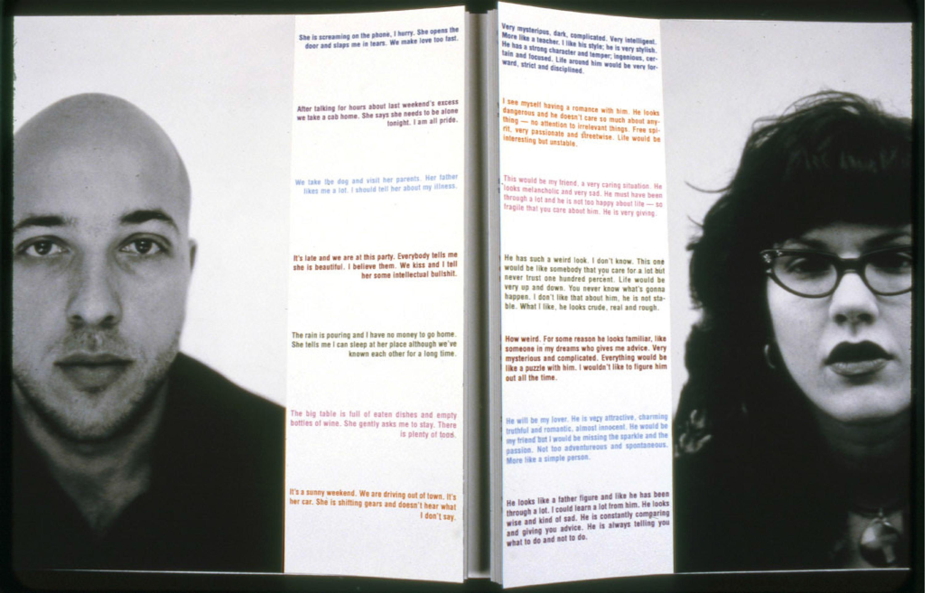
Miriam Bossard crowdsourced the content of her book by emailing photos of eligible men and women to 14 different people, asking them to write what they imagine it would be like being in a relationship with each person. This book presents the (color coded) results of her findings. Readers can read, mix and match what each person imagined about the others. (When text color lines up left and right, the two people pictured on that spread are referring to each other.)
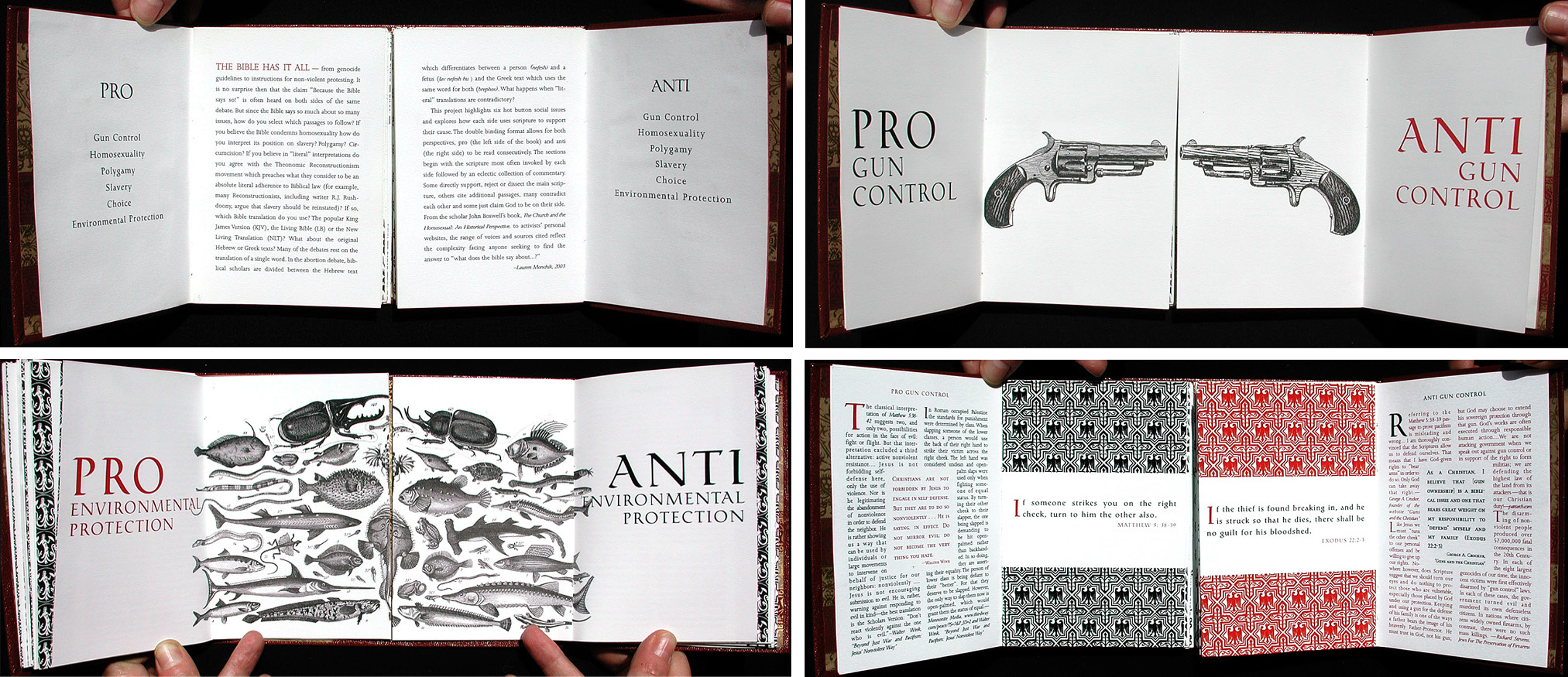
Lauren Monchik noticed how people on opposite sides of an issue use the Bible to bolster their argument. For this book, Lauren decided to study and portray the most prevalent biblical passages (and arguments) used on both sides of issues such as gun control, homosexuality/gay marriage, polygamy, slavery, abortion, and environmental protection. The design of the book is inspired by ancient sacred text structures like the Talmud that juxtapose different passages from a holy text annotated by different interpretations.
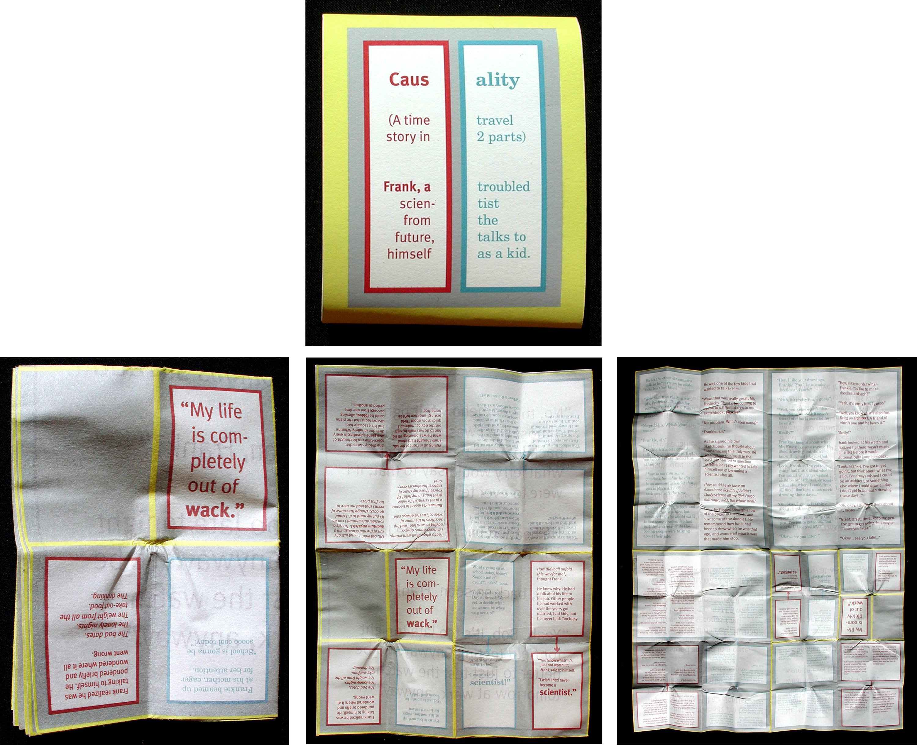
In Caus-ality, an original work of science fiction, written and designed by Len Small, a scientist experiencing a life crisis goes back in time and has a conversation with his kid self. This book is printed on both sides of a poster-sized sheet of newsprint-like paper. The book starts folded down into a tight wad, then unfolds into a dialogue between older and younger self, contained within 64 panels on each side.
Qiushuo Li’s book My Reflection, is also a conversation with oneself. On one side, going clockwise, Qiushuo writes to her younger self, at various ages. On the other side (read counter-clockwise): excerpts from Qiushuo’s journals, kept from an early age.
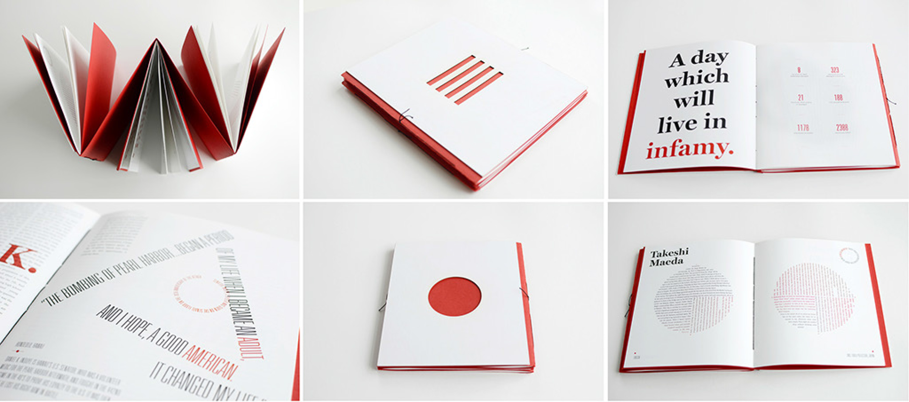
Based on stories culled from oral histories of her own Japanese and Japanese-American family, Donica Ida’s trifurcated book Japanese/American showcases reactions to the bombing of Pearl Harbor (and its aftermath) from three points of view: the Japanese military, the American military, and Japanese-Americans from the 1940s to present day. Each story highlights an individual’s true account.
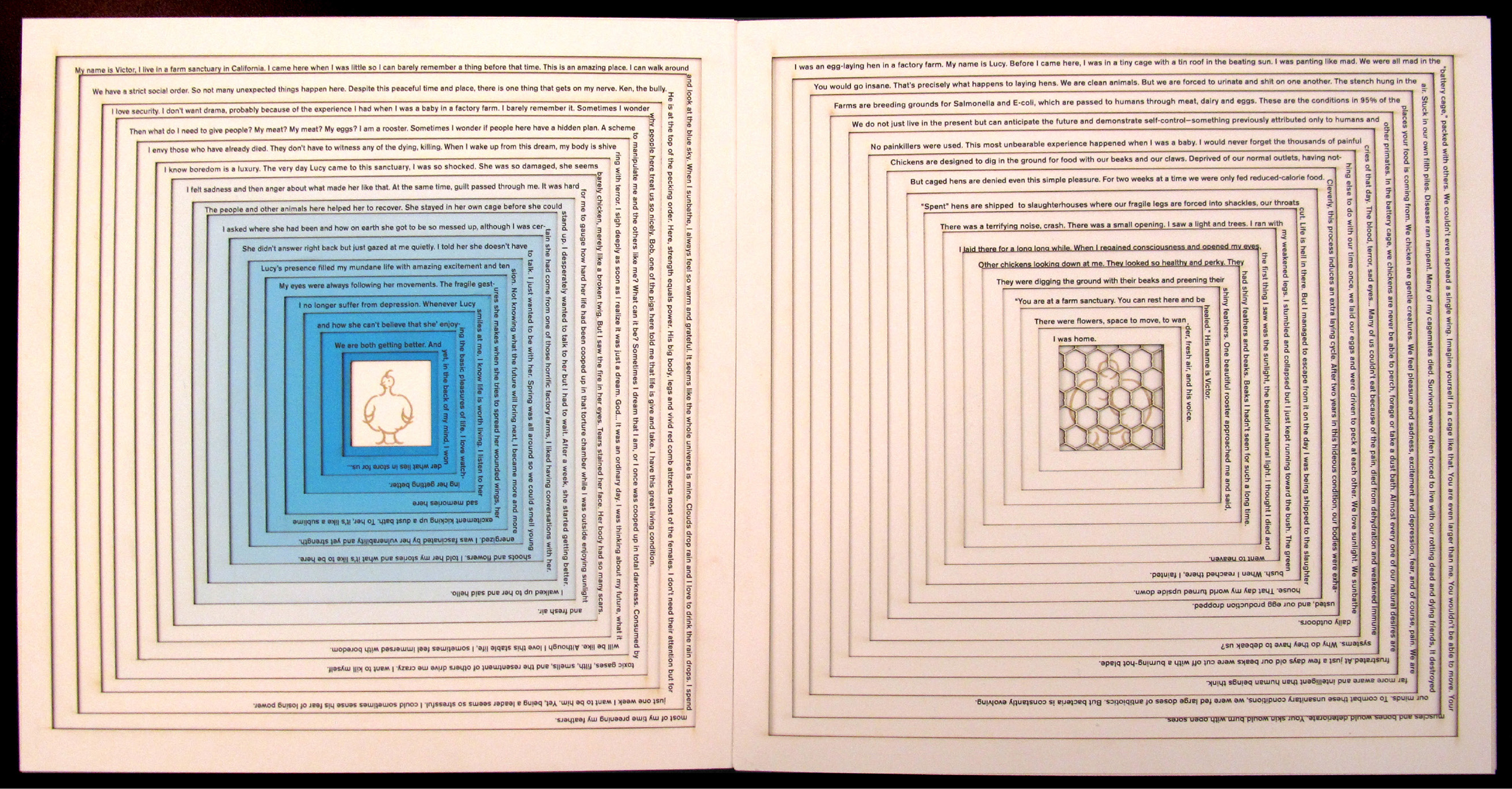
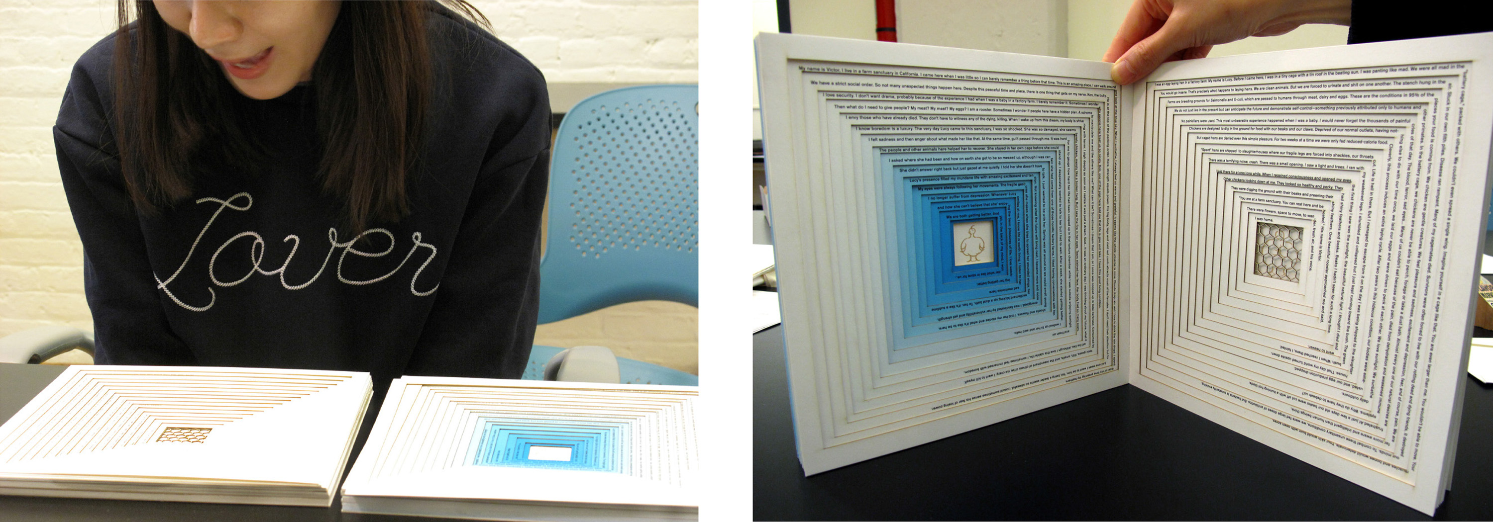
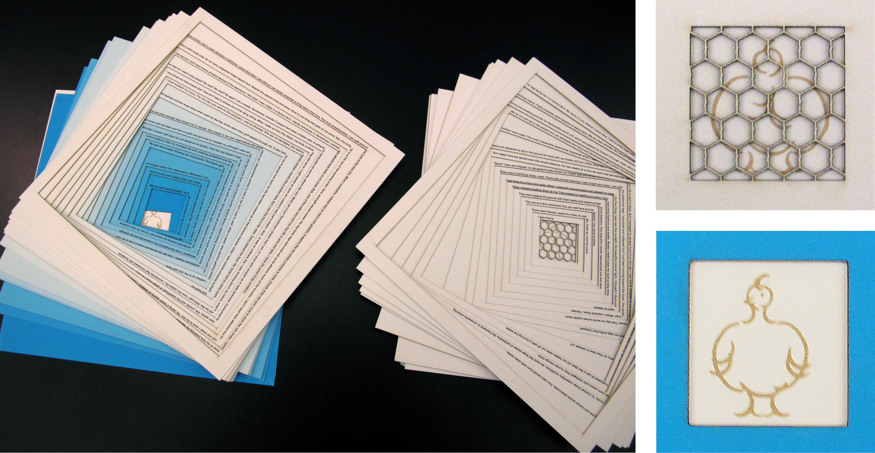
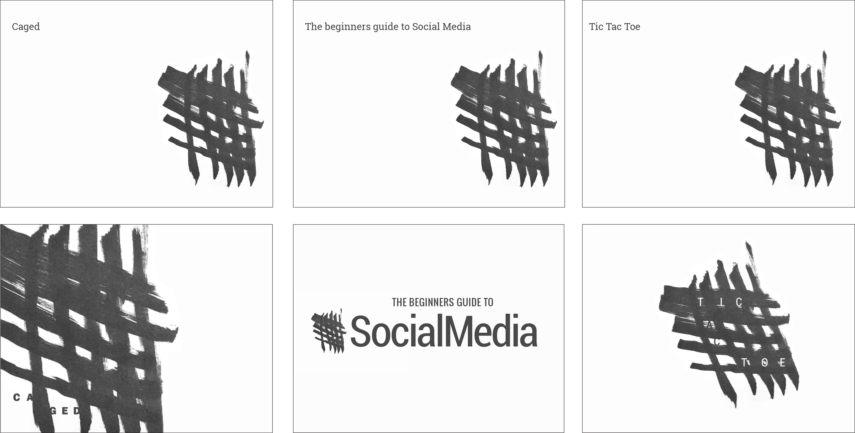
Jee Un An wrote an allegorical tale about two chickens. On the left side of this laser cut book, Victor describes living on a free-roaming “organic” farm. On the right-hand side, Lucy tells her story of growing up in a factory farm, inside a cage crammed with other chickens. Lucy eventually escapes, and meets Victor at the organic farm. Life is good, except they sense danger lurking, even in the sanctuary farm. Above, Jee Un reads to the class from her book.
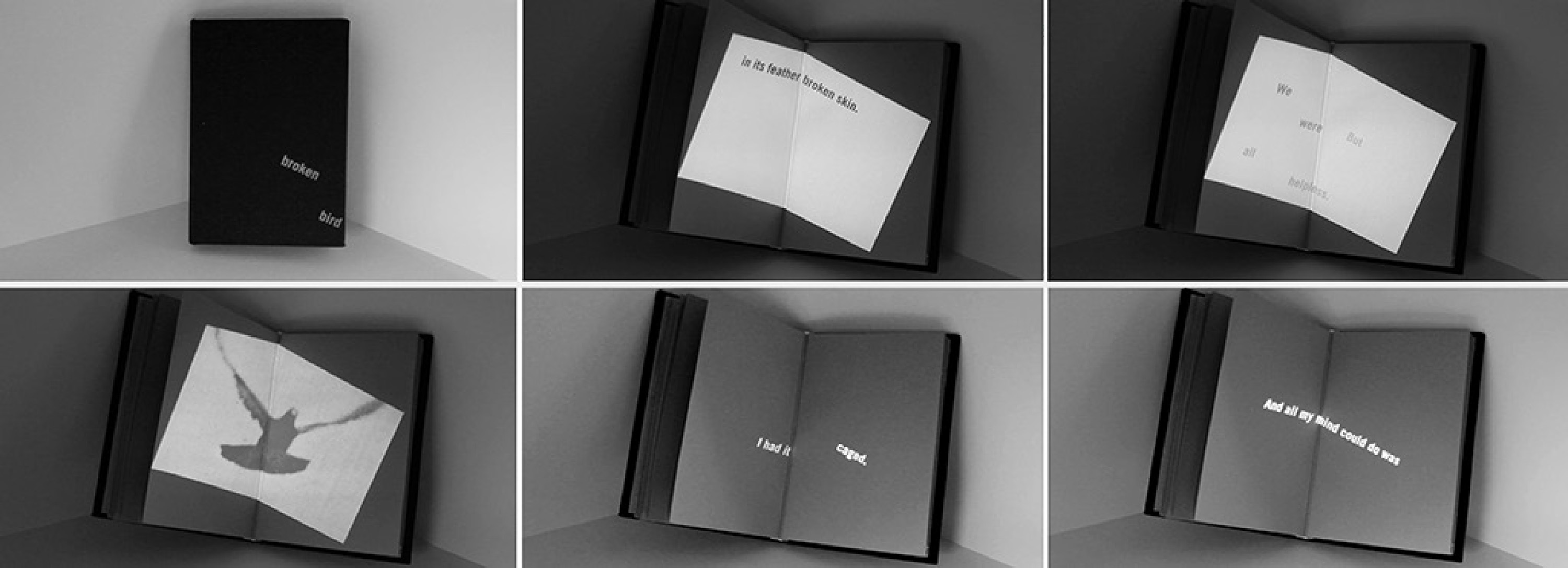
Najeebah Al-Ghadban’s book/installation A Broken Bird uses digital projection of kinetic typography and video onto a physical book. Dual narratives intersect on an open spread, one recalling the death of a pigeon; the other symbolizing the opening of the narrator’s heart.
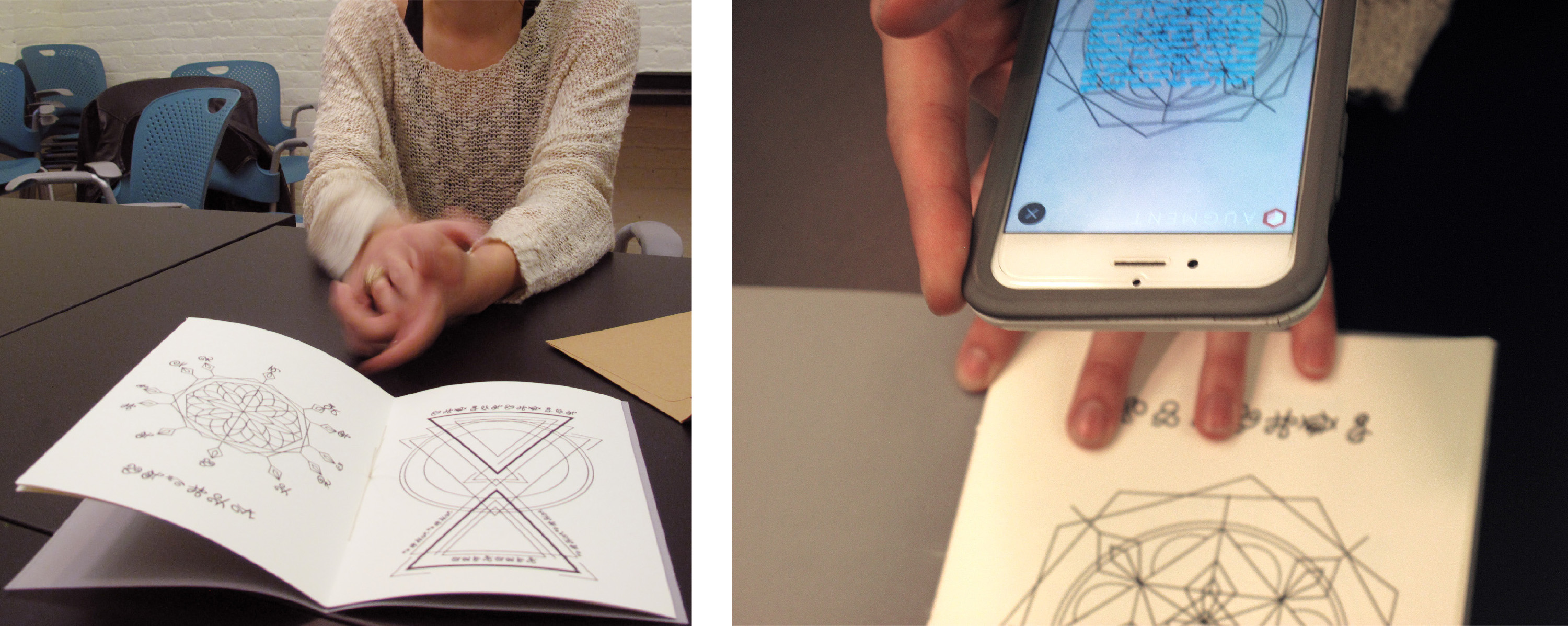
Lizzie Florece’s The Voynich Manuscript Decoded is based on the 15th century illustrated codex, which was written in an unknown language. Lizzie developed her own writing system and constructed charts—inspired by the original manuscript—to tell her version of the story. She used the Augment app to program the translation of the story into English, which can be scanned through mobile devices.
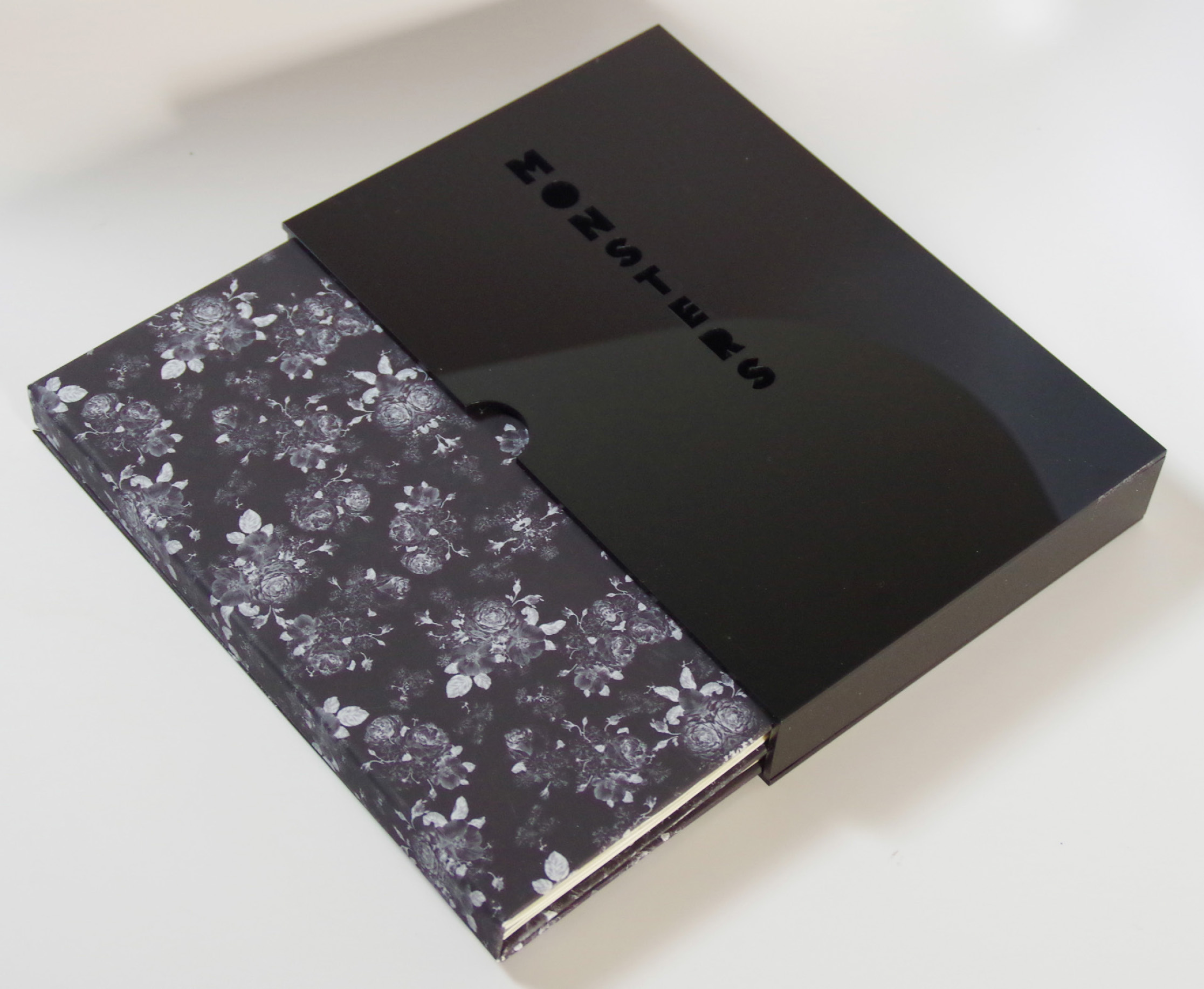
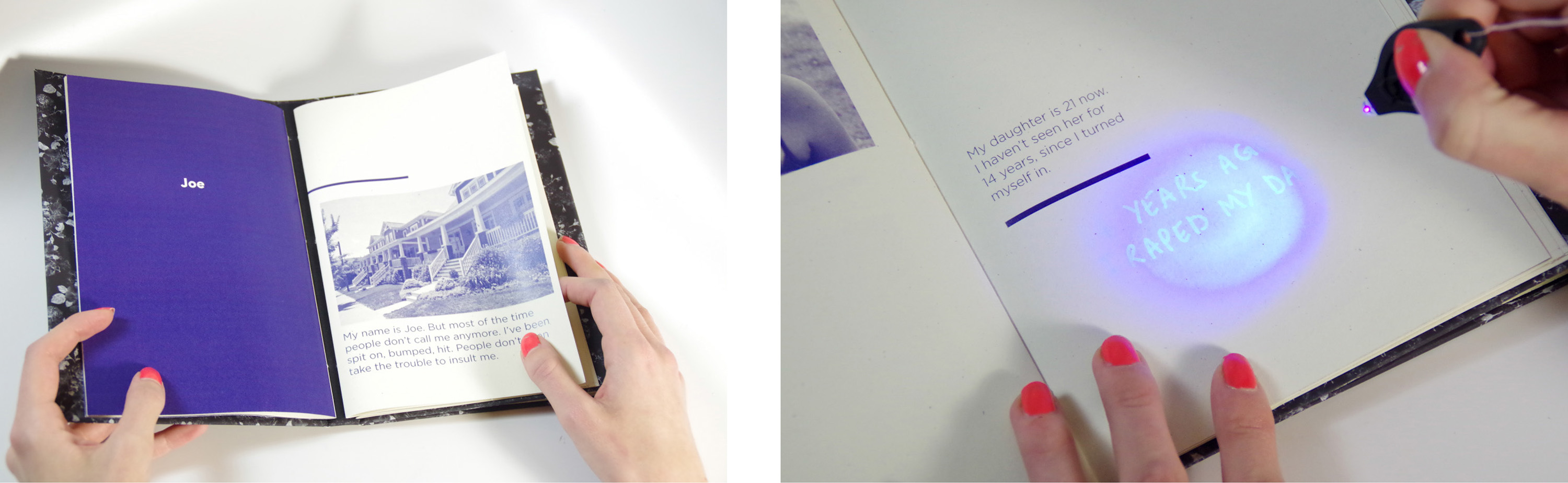
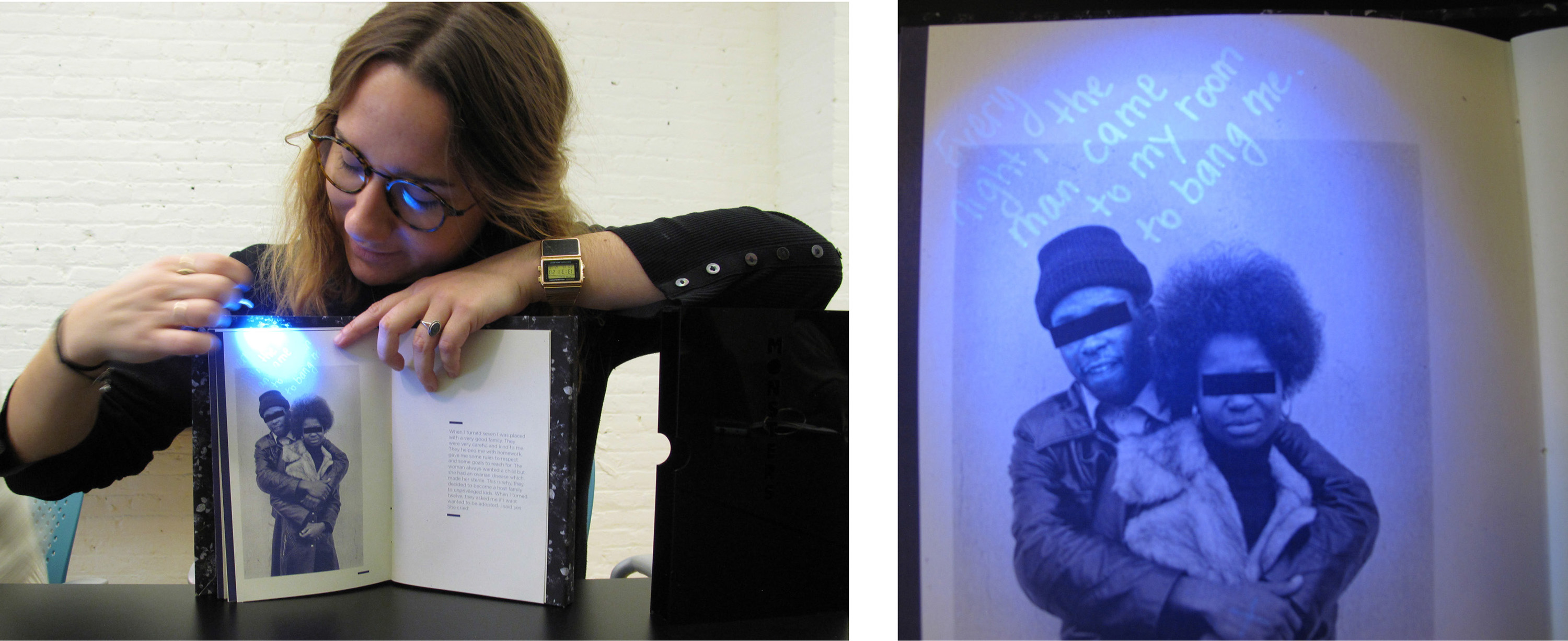
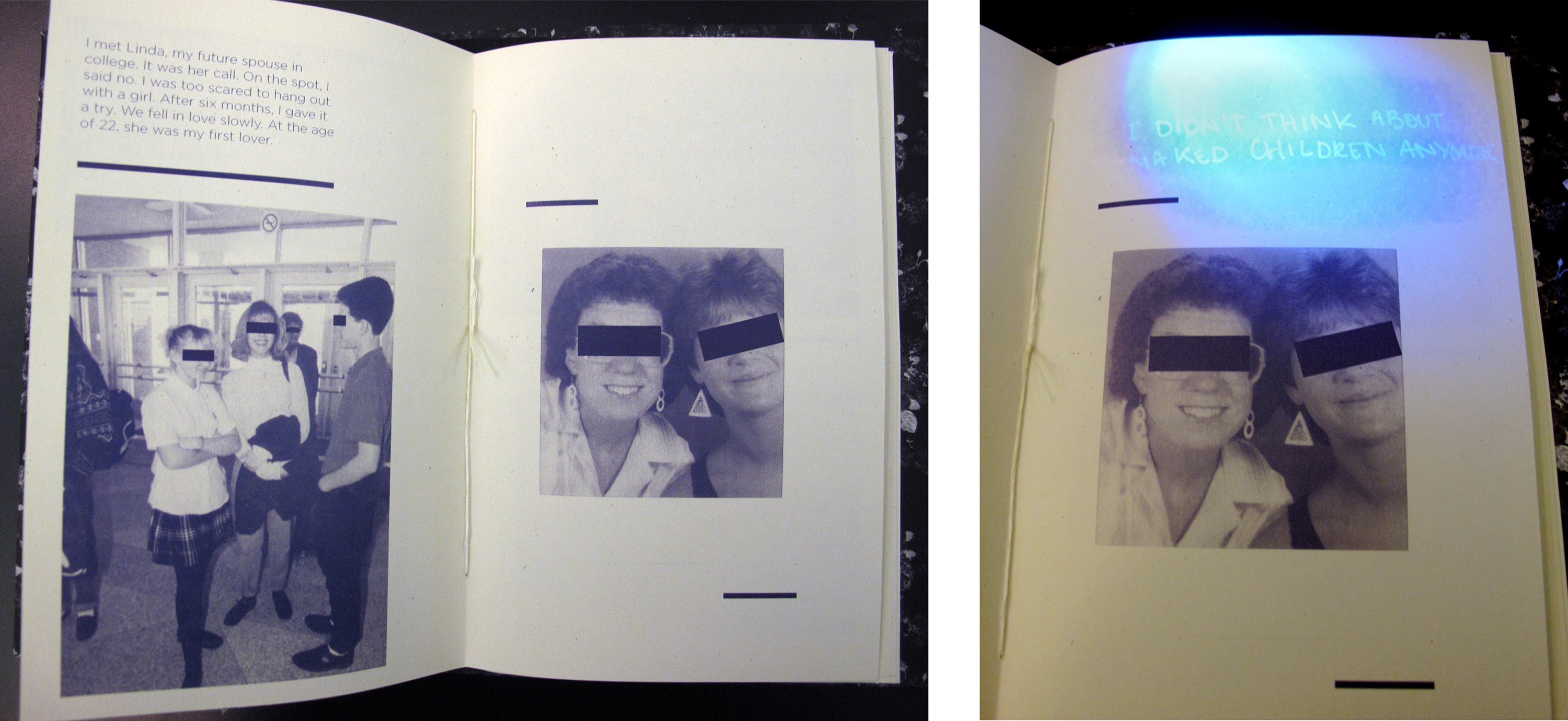
Anaelle Pellison uses a more low tech tool to augment her book, Monsters, a complex portrait of five people convicted of pedophilia. Their secrets are revealed to the reader, with help from a hand-held blue light which comes with her book. Although most people consider her subjects monsters, Pellison’s book is surprisingly empathetic.
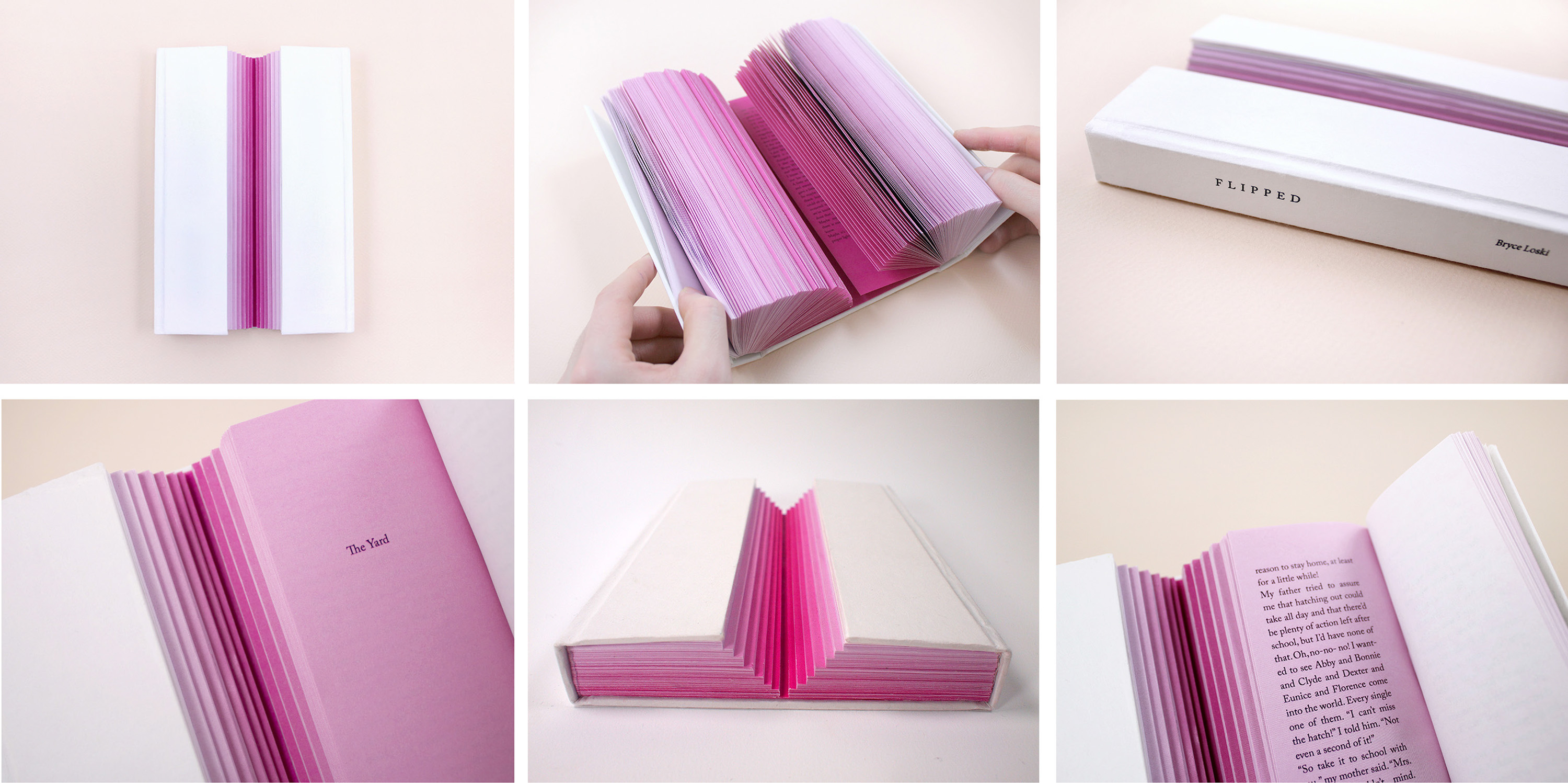
In Hee Bee’s re-interpretation of Wendelin Van Draanen’s novel Flipped is almost the opposite of Pieter Kienzle’s Apart. An unrequited love story, this book starts out with a gulf between the perspectives of a boy and a girl. As their relationship develops and they get closer, the stepped bifurcation draws closer, and eventually unites.
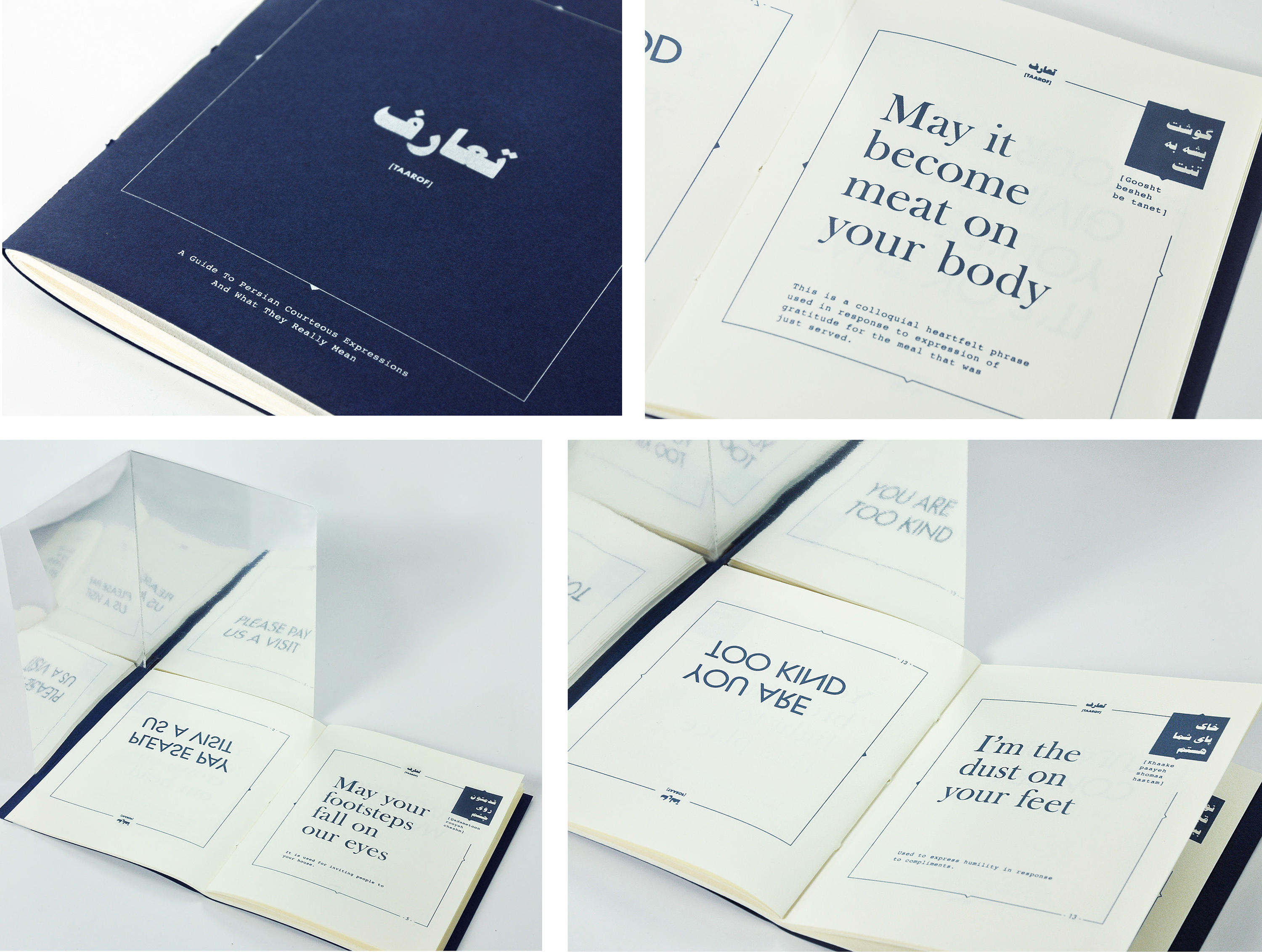
Mahya Soltani Nejadian is from Iran. Her book Taa’rof devises a method for translating Farsi proverbs and expressions which on the surface sound extremely polite, are often poetic, sometimes even flamboyant in their use of language. Each spread is dedicated to a common ‘taa’rof.’ On the right side is the literal translation of each phrase, its pronunciation, its setting in Farsi and its usage. On the left—with the help of a bound in mirror—the real meaning of the phrase is revealed.

Cecil Mariani’s three volume Brewing Tears into Tea celebrates the idea of seeing and rediscovering the beauty of used materials. It combines original poetry with found materials Cecil has been collecting since moving to New York. About her project, Cecil writes, “Finding the beauty in trash paper products and writing the poetry felt like brewing tears into tea. With this book I’d like to share the experience, tension and linkage between tears (the precious tangible extract of human emotion) and tea, an example of everyday life and simple consumption.”
Fiorella Basso composed a double flip book that forms a dialogue between a big city and a newcomer who is uncertain if it’s the right place for her. Unlike most flip books, this parallax work facilitates multiple readings, speeds, and interpretations.
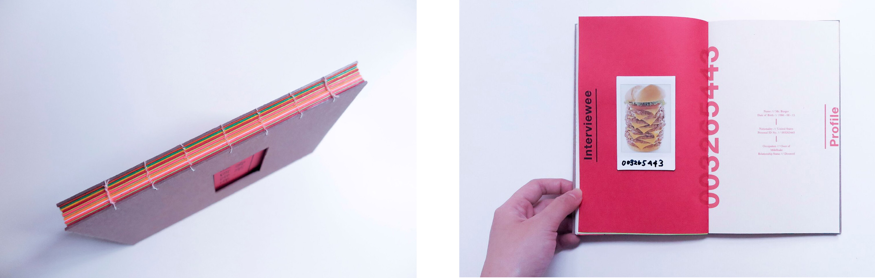

Jessica Lin interviews the containers of three very different sandwiches in her Book of Buns.
1. Pork Bun. 2. Fried Noodle Bun. 3. Burger Bun.
Zenzile Skylark’s poem turned book Never Light Enough, Never Dark Enough is composed from the memories she holds “living the complexities of life as a person of mixed decent… seeking validation in all of the wrong corners.” The design represents “the bouquet of roses I never received. I spent years seeking validation from each part of my ethnic makeup when in reality I am the one that should give myself my own validation.”
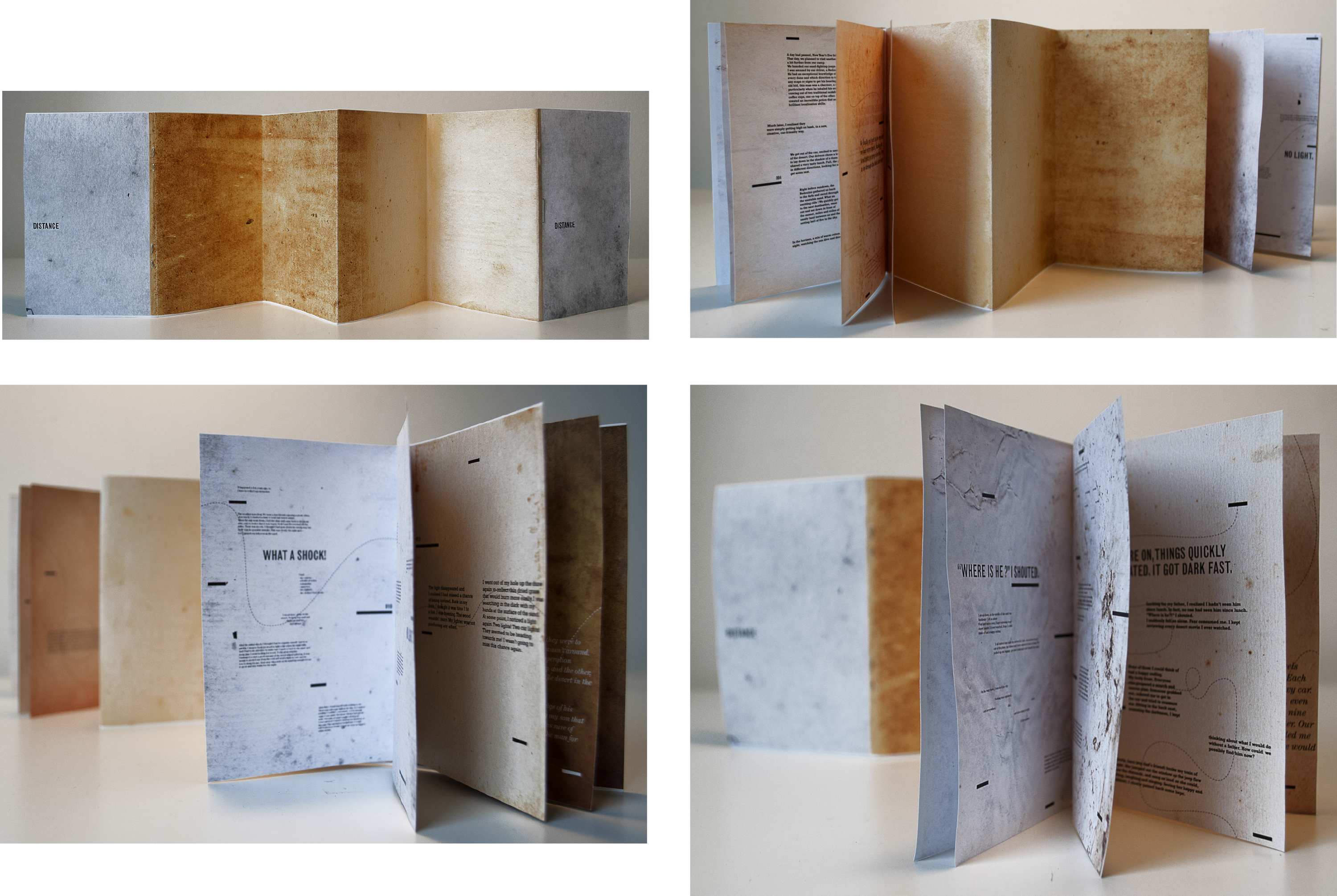
Based on his own experience as a child, Walid El-Khoury’s bifurcated book, Distance takes place in the Egyptian desert. A father and son each tell their own experience of losing one another in the immensity of the sand sea. Positioned on opposite ends of the book, father and son are bound together by an accordion desert. As the tale unfolds, the vast distance of being lost and frightened shrinks till father and son finally, gratefully, find each other.”
A few Final Projects from Writing and Designing the Visual Book

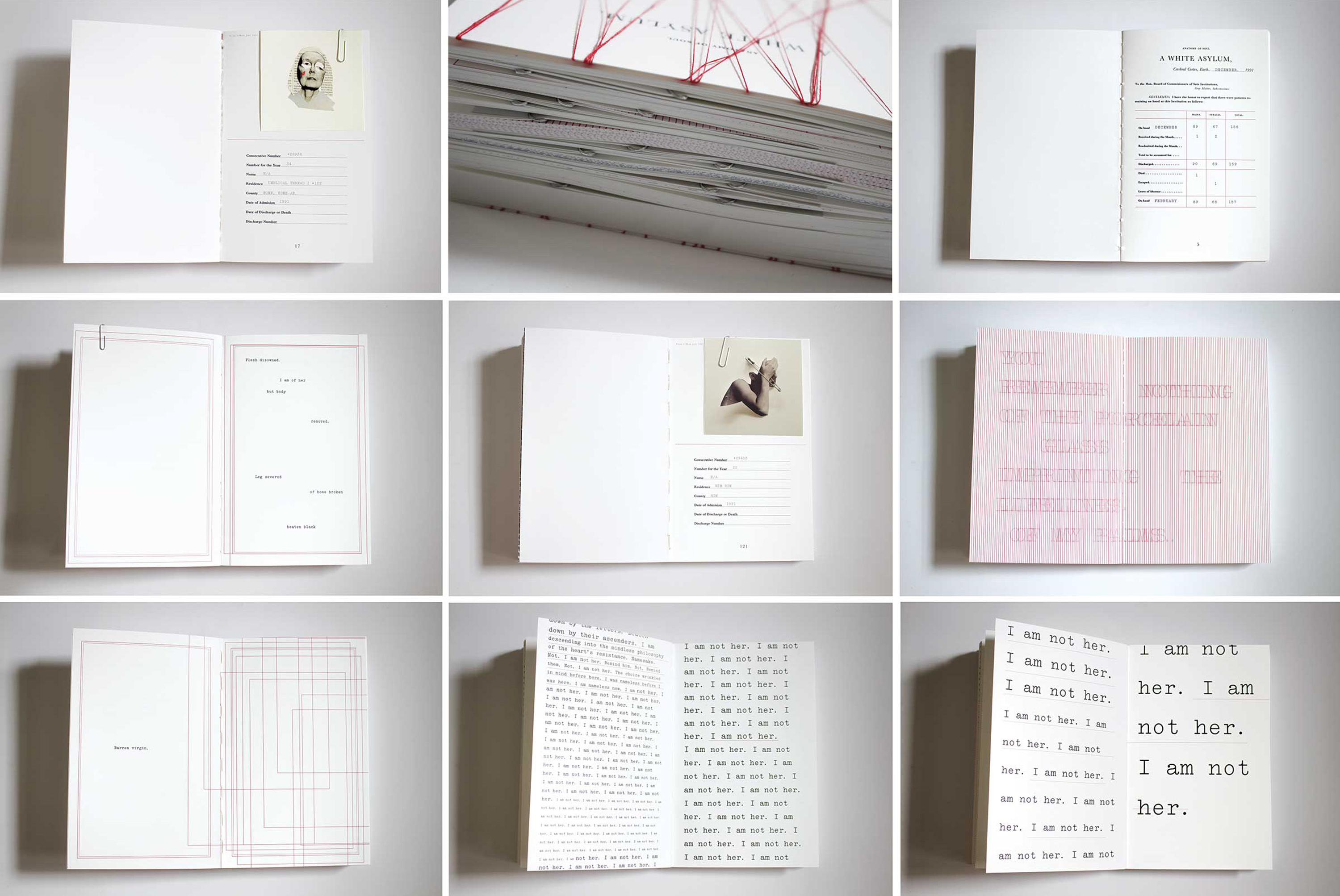
Najeebah Al-Ghadban’s “exploration of the human psyche” uses the institutional vernacular of mental health charts as a point of departure. Inside its exposed spine and threaded exterior, the collection of ten paper-clipped “files” that make up A White Asylum fluctuate between psychological profile and confessional prose revealing and a “discordance between expressions of heart and entrapment of mind.”
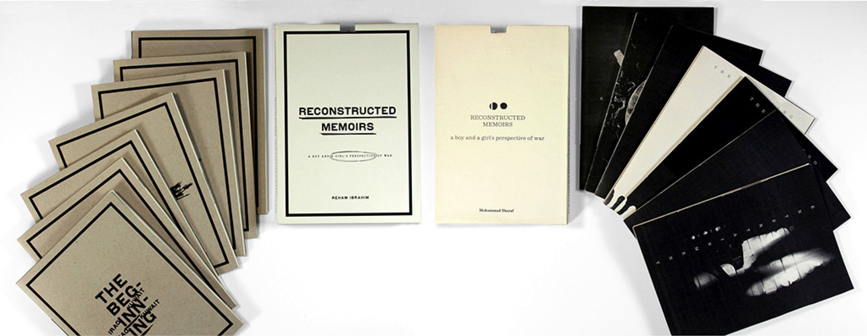
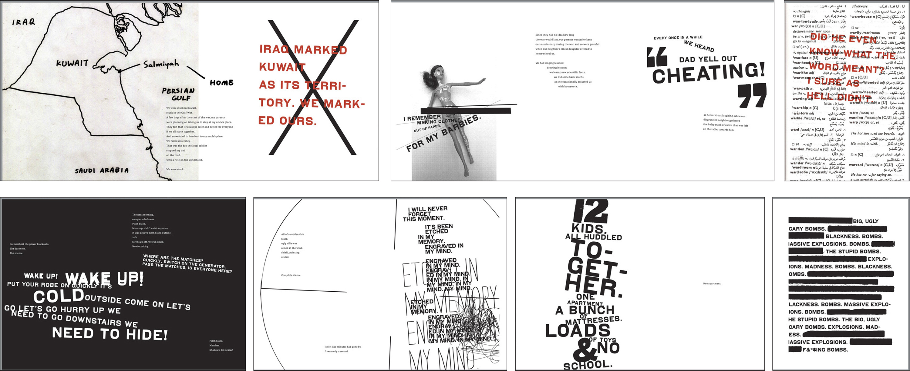

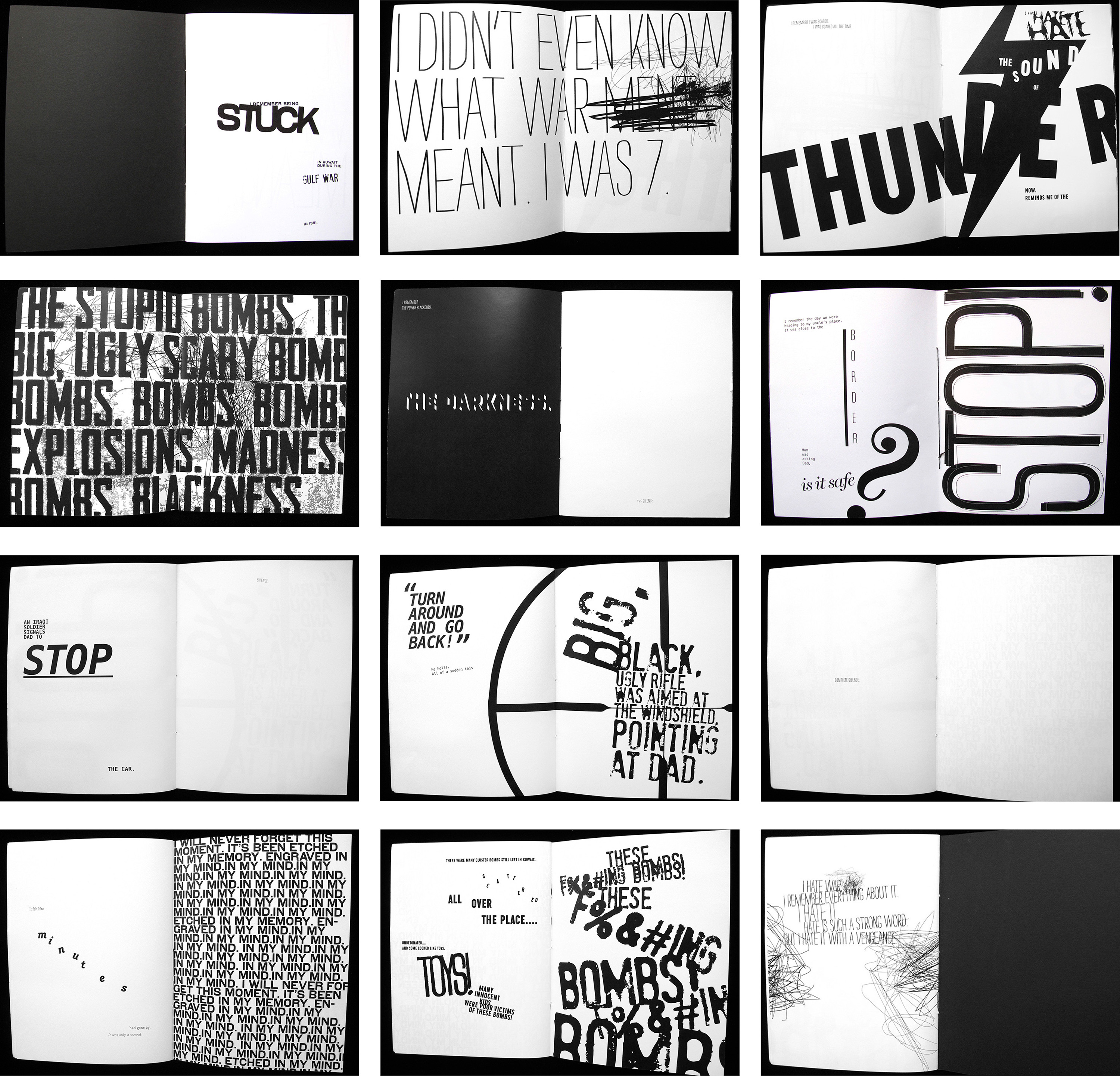
Covers and some selected pages and spreads from Reconstructed Memoirs—A Boy and a Girl’s Perspective of War, a collaborative final book project by Reham Ibrahim & Mohammad Sharaf. An offshoot of the bifurcated book project, this work—made up of two boxes each containing seven folios—explores the reconstructed memories of the 1990 Gulf War from the point of view of the authors’ own experiences as a seven year old Egyptian girl, born and raised in Kuwait, and a nine year old Kuwaiti boy. They use writing, typography, image, shadow and light to evoke the ordinariness—as well as the terror, playfulness, confusion, loss and affection—of growing up in the midst of a war.
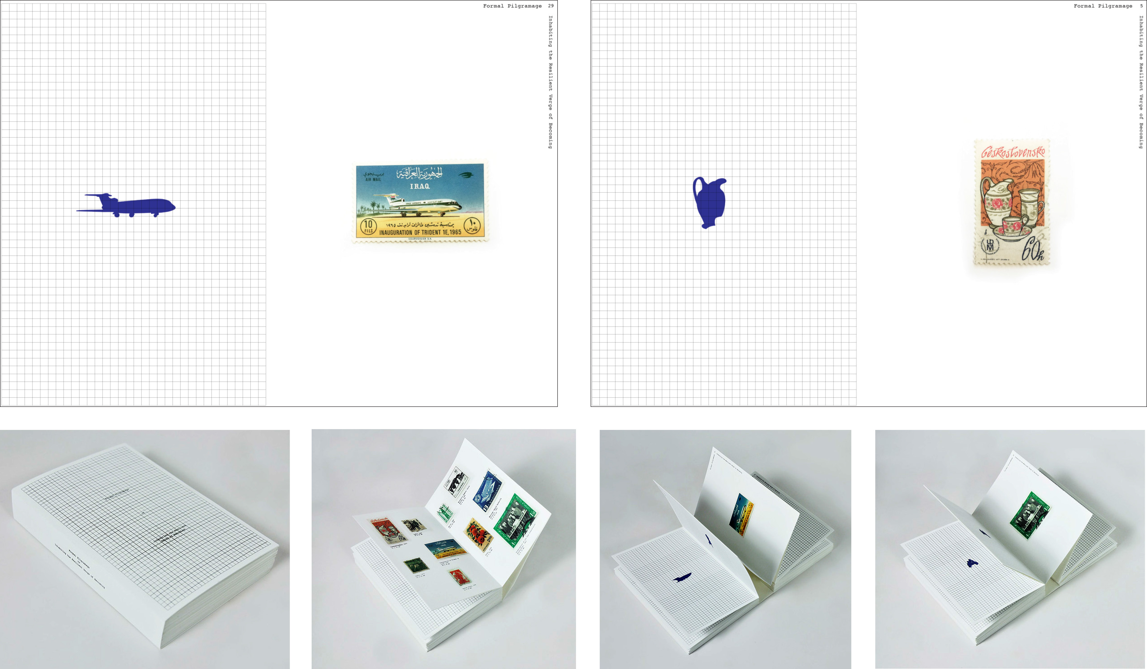
Mahya Soltani Nejadian’s final project—Formal Pilgrimage Or Inhabiting the Resilient Verge of Becoming—takes advantage of the filmic qualities of a book, as it animates the geographical journey of postage stamps and morphs the forms and figures of one stamp into another. “Every page represents a condition of becoming something else…”
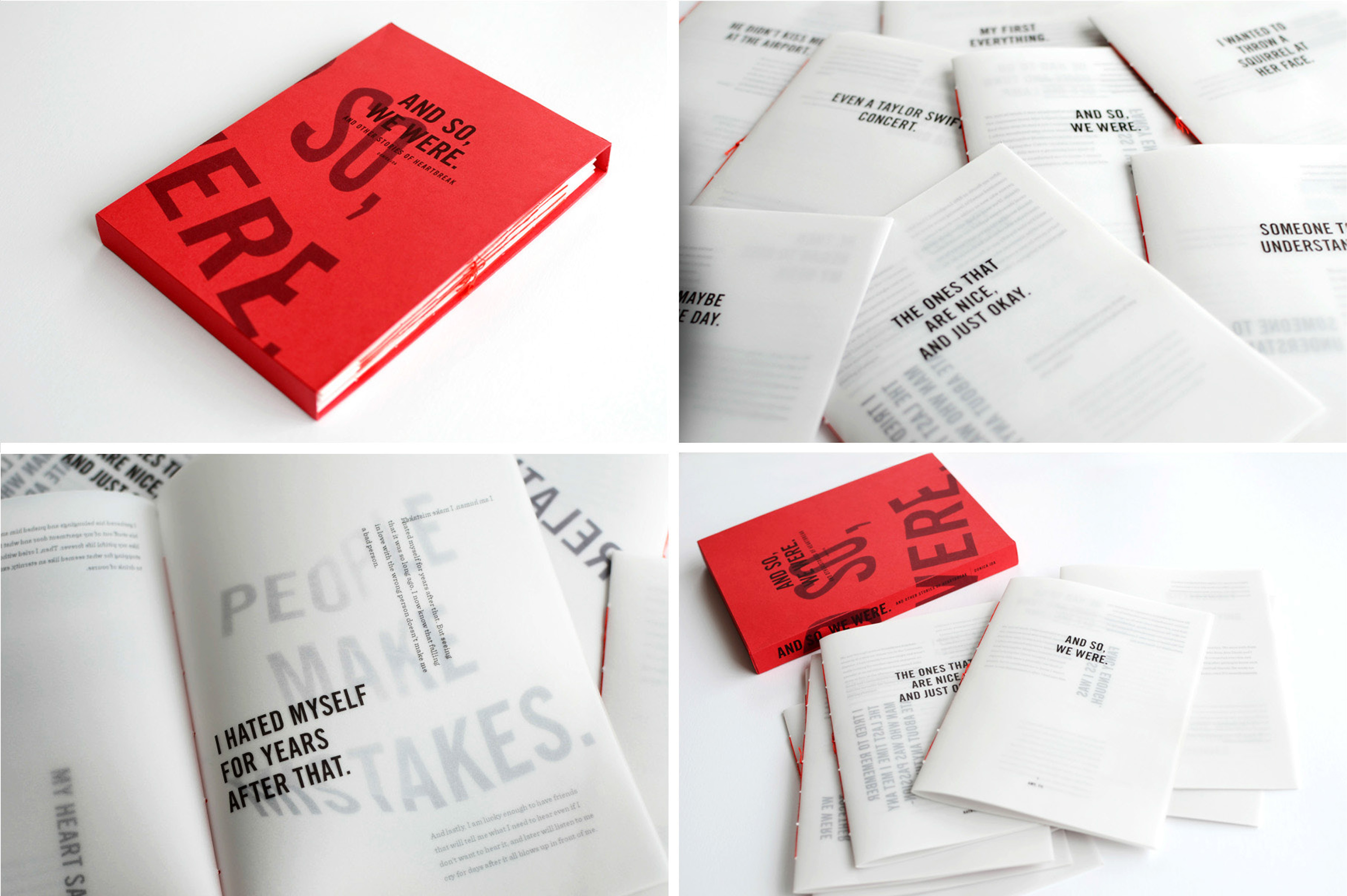
Donica Ida’s collection of heartbreak stories And So, We Were is based on the broken relationships of nine of Donica’s friends. “It is a visual study of the complexity of love, the physicality of heartbreak, and the lessons we learn after all is said and done.” Divided into nine individual books contained in a slip case, its form exemplifies a more open ended notion of a book as “a collection of leaves bound together.”

Celine Bouchard’s die-cut book Through Walls is a take off of Marcel Ayme’s short story The Man Who Walked Through Walls. Celine’s book pushes Aymes’ premise to more abstract, metaphorical dimensions.
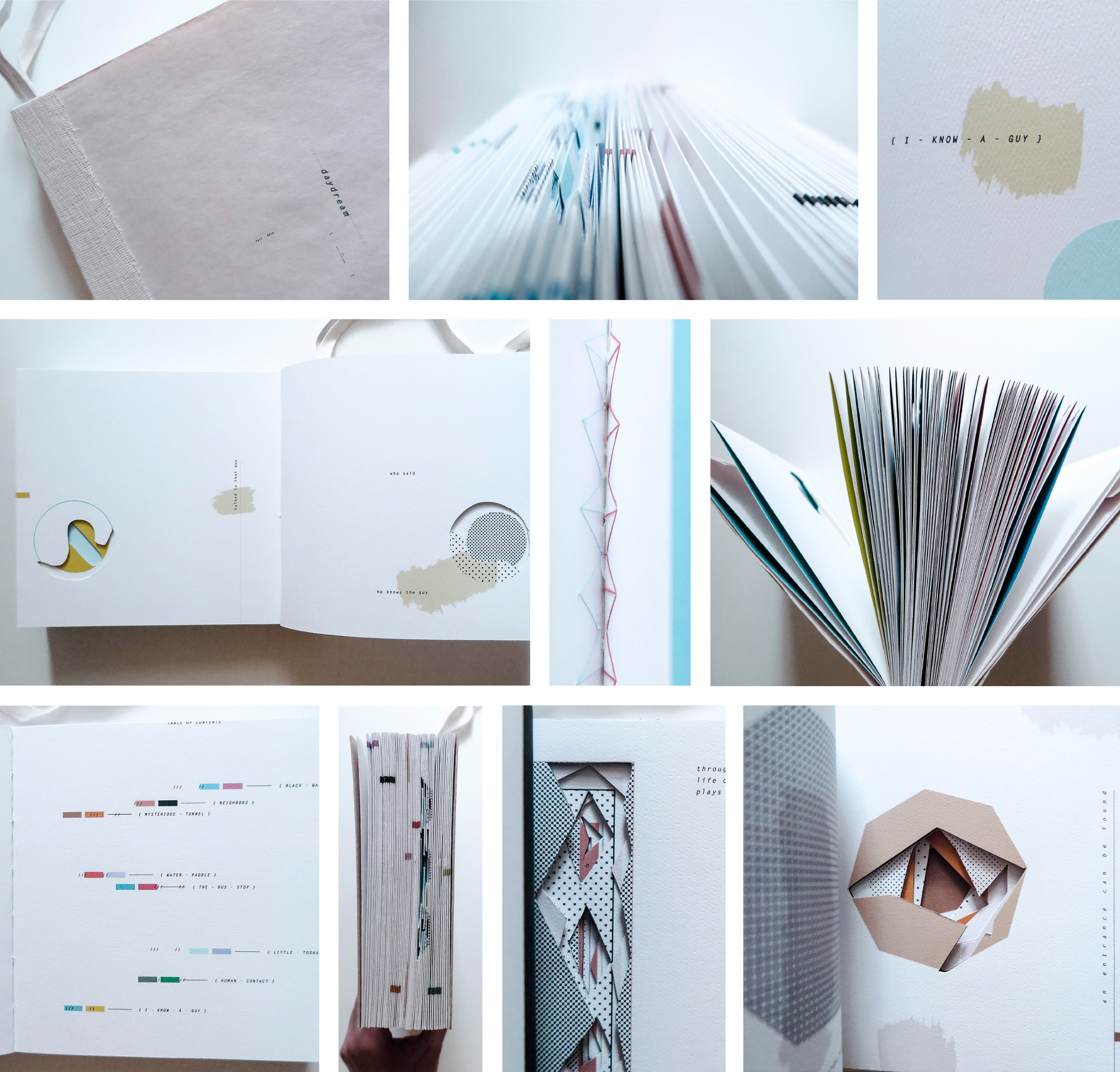
Jessica Lin’s die-cut book Seven Daydreams chronicles a variety of daydreams as (spatial) holes we go in, through, and out of on a daily basis.
In his essay “Starting from Zero, Teaching Writing to Designers” published in The Education of the Graphic Designer (Allworth Press), Lehrer describes beginning the Writing and Designing the Visual Book class with an alchemy project that explodes and remakes pre-existing works.
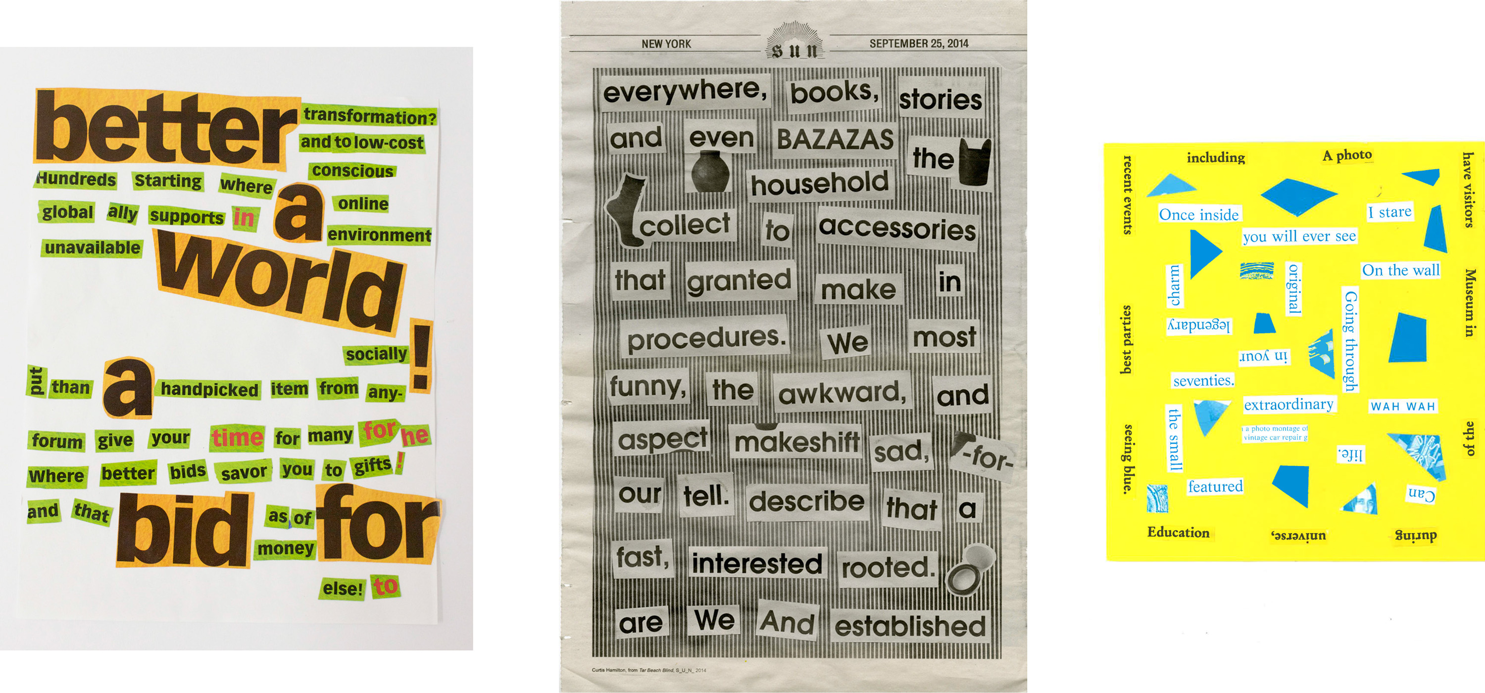
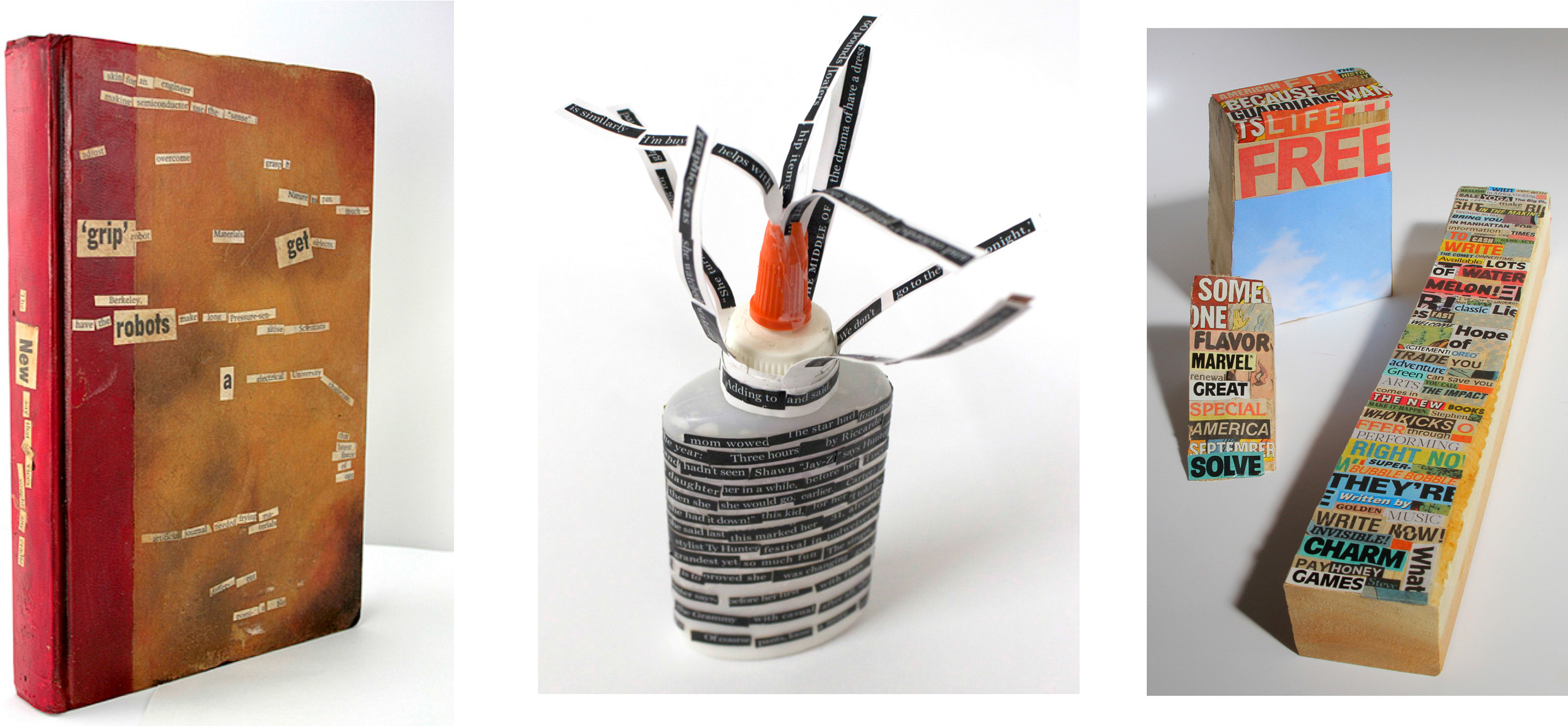
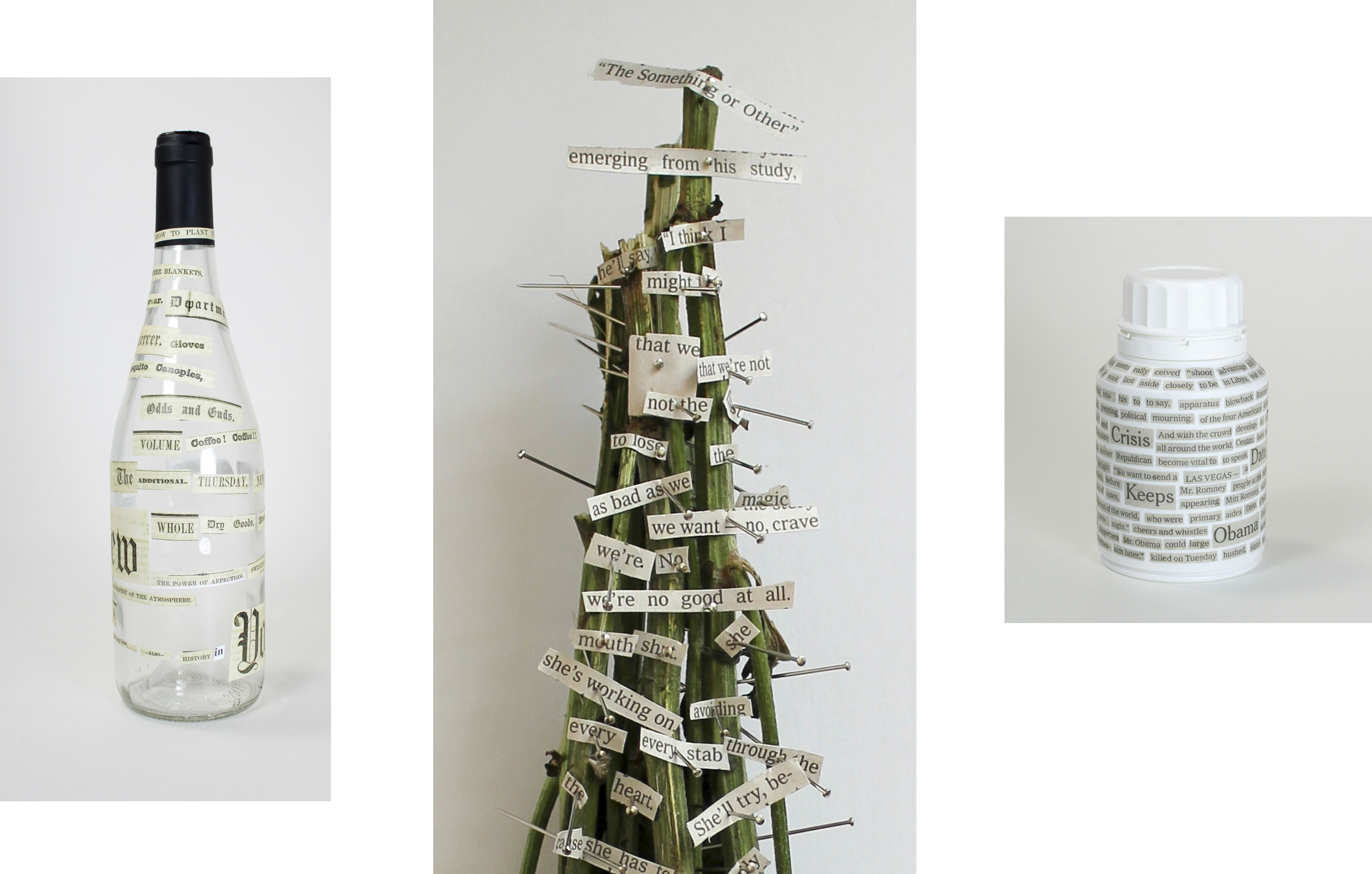
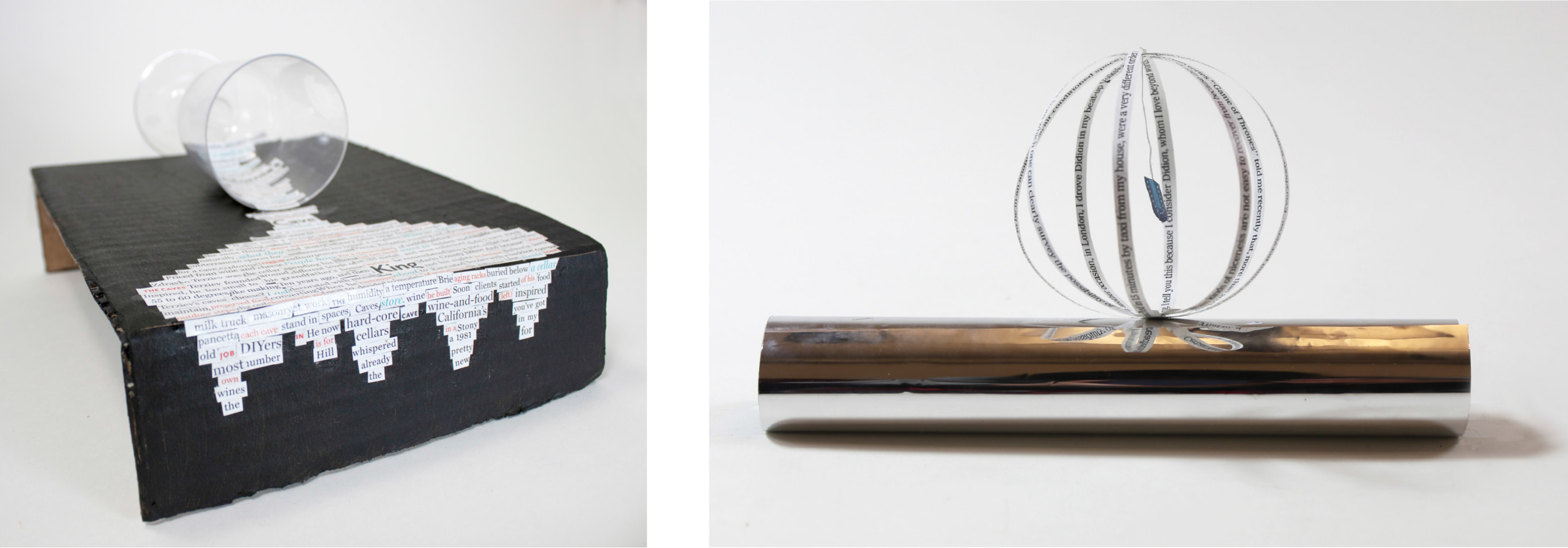
“Make a Dada Poem is a good alchemy project to start with. As instructed by Tristan Tzara, making a Dada Poem is essentially a matter of cutting up a found text and putting it back together, anew. As soon as the student is confronted with the freedom of undoing, they are faced with choices. First, what text to use? Then how should I put the words back together? In lines? In phrases? In fields? In columns? In the round? What kind of paper/material(s) should I use? I ask them to make several poems; a minimum of one 2-D and one 3-D (or 4-D) solution. Students present/read/perform their poems in class the following week. We study their literary and visual syntax. Surprising word combinations and unexpected metaphors ooze from the seeming randomness. As Tzara predicts, “And here you are—a writer! Infinitely original and endowed with a sensibility that is charming.”
Here are a few examples of that one week project, beginning with photos of Pedro Andrade performing his poems:
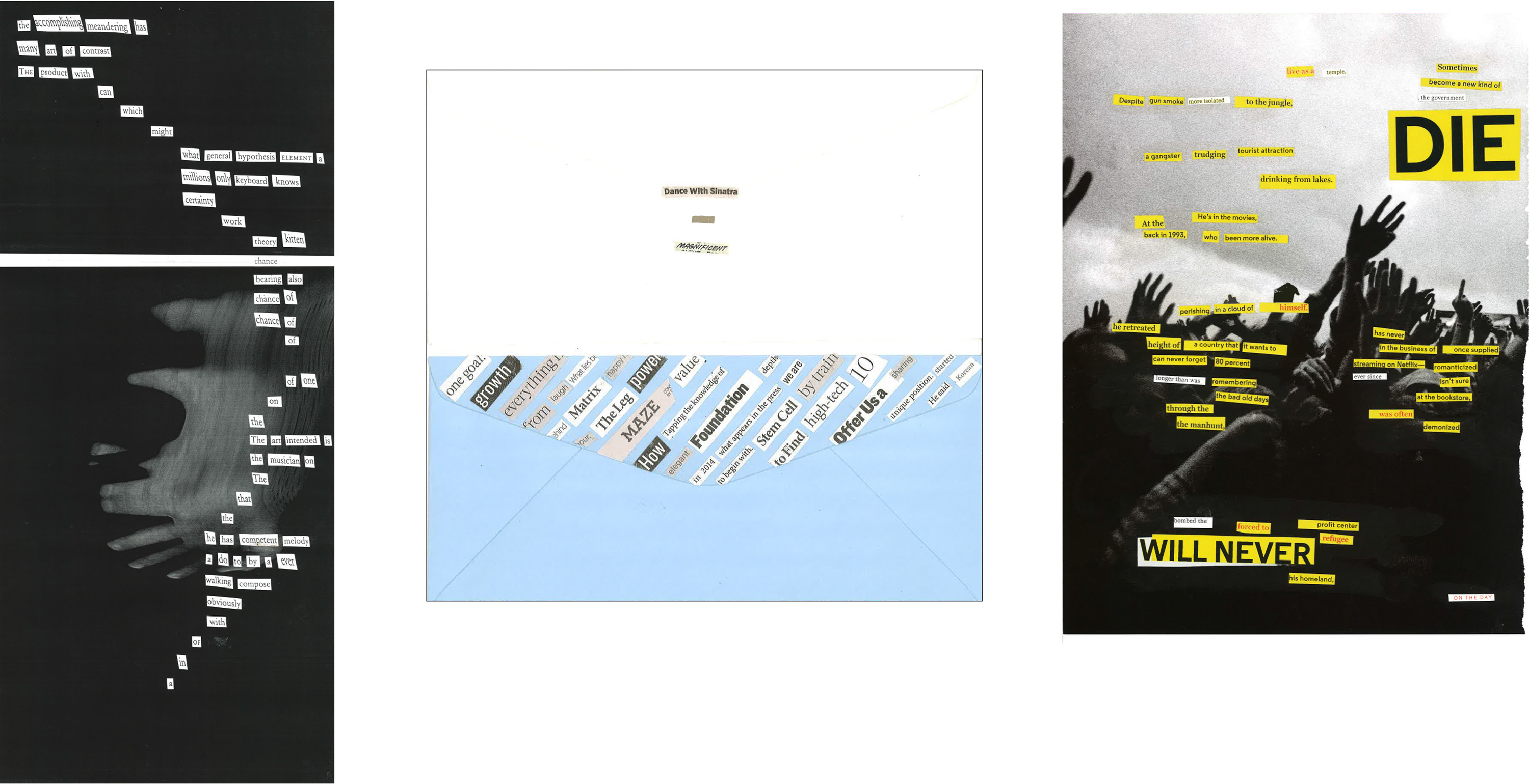
Dada poem videos above by Liz Florece and Liz Xiong.
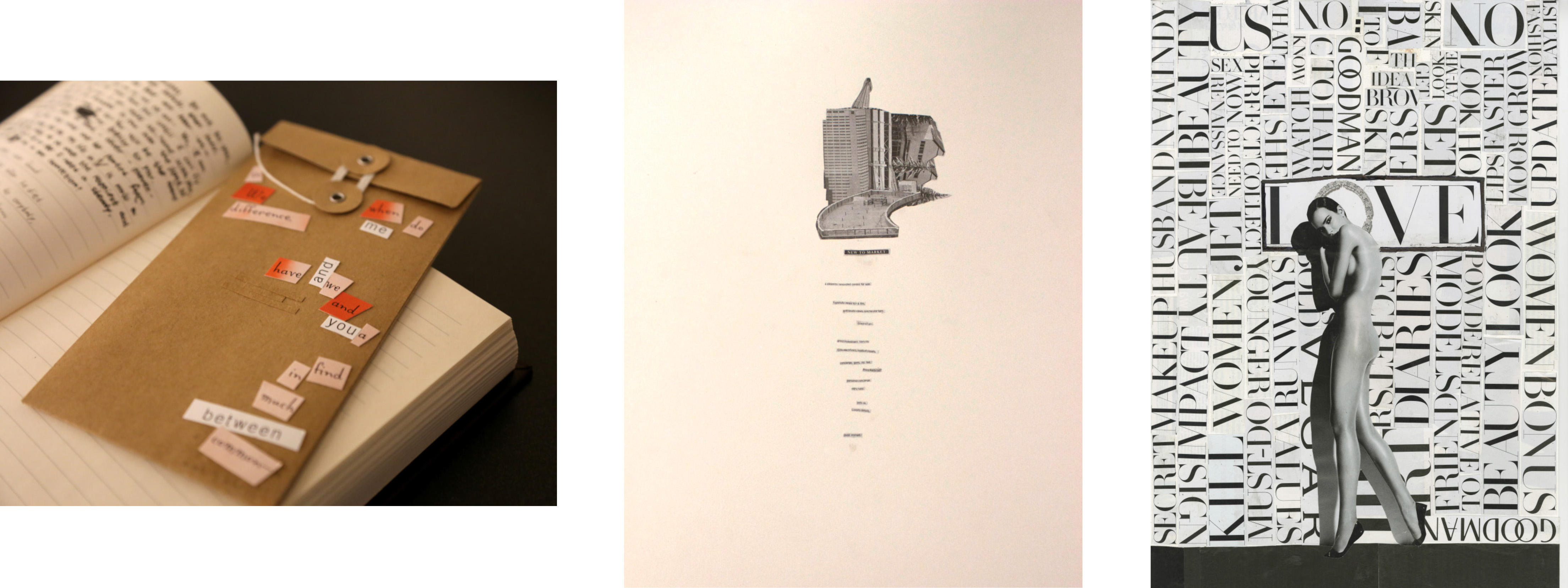
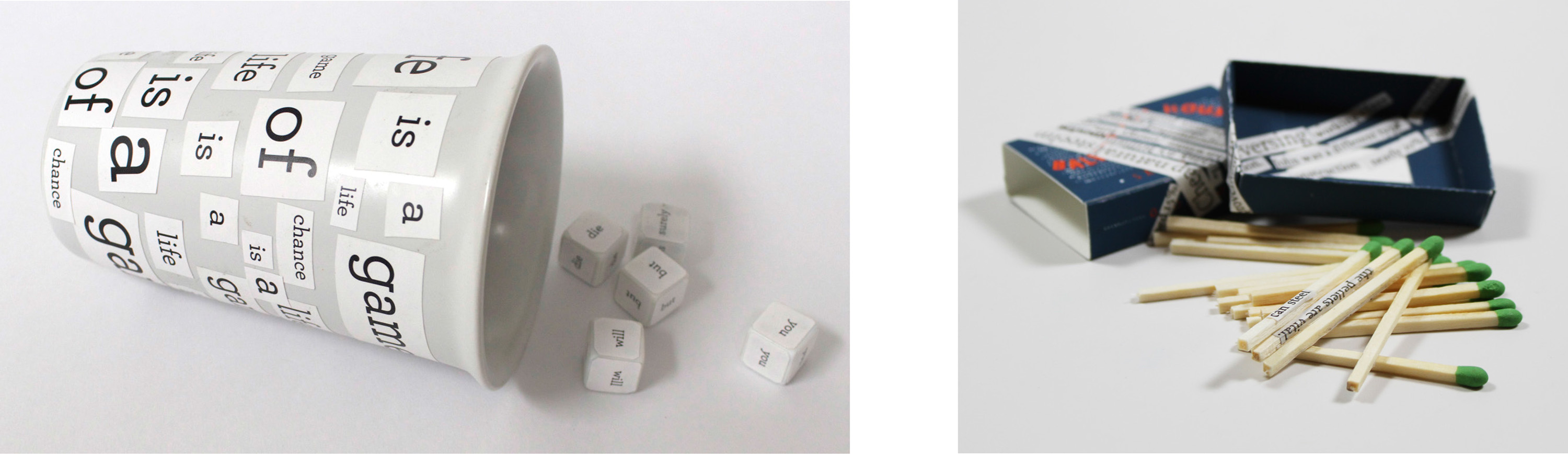
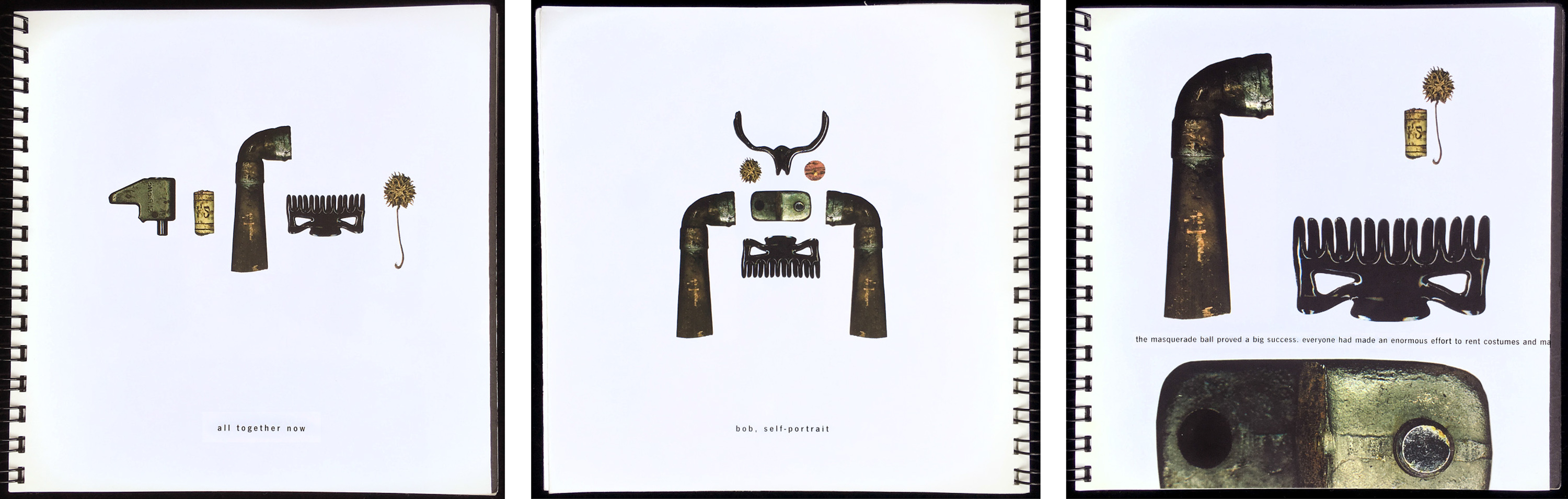
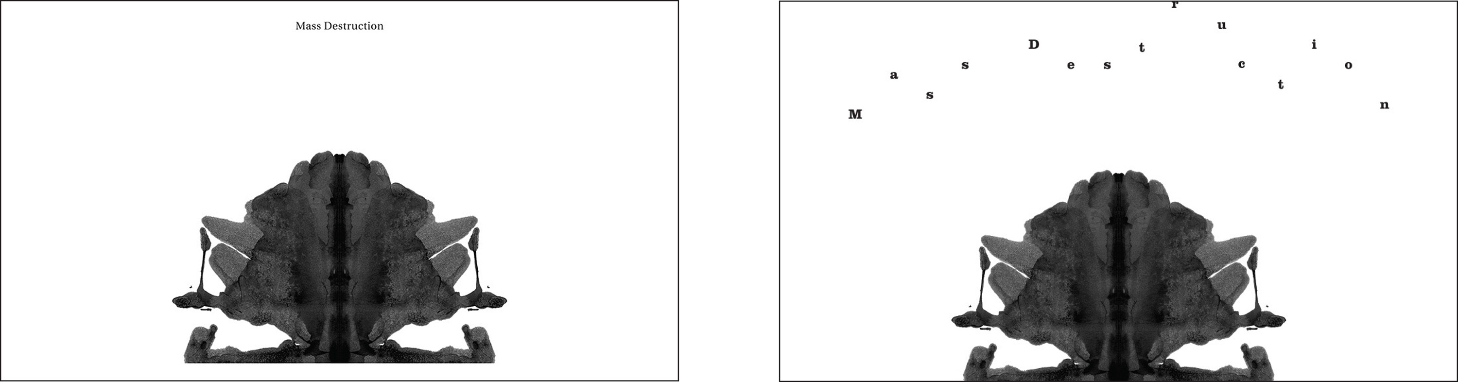
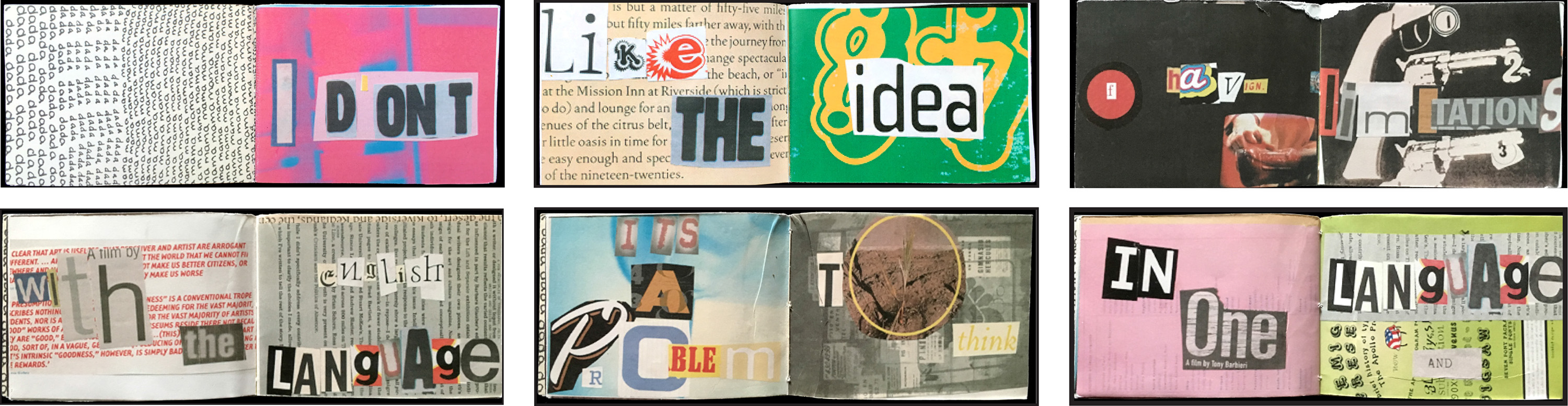
After exploding language and syntax and finding unexpected poetry and structure by engaging with chance, students begin to build meaning with a just a few words at a time in combination with images. In the Word/Image Equations: What’s in a Title project, each student makes, curates five images or objects. Then they write three very different titles for each image and then for the set of five—each title transforming how the image and set of images is perceived. The point of view, perspective, placement and cropping of images can change or remain constant. Students compose these Word/Image equations, first using a “neutral” approach to the typography (whatever that might mean to them), then using an expressive (or more visual) approach. Instead of having images illustrate the words, or vice versa, the goal is to create word+image relationships that work synergistically, and (perhaps) leave room for the reader/viewer to discover meaning(s) within their combination. Below, a few examples of word/image equations.

Three titles for the same image. Miriam Bossard
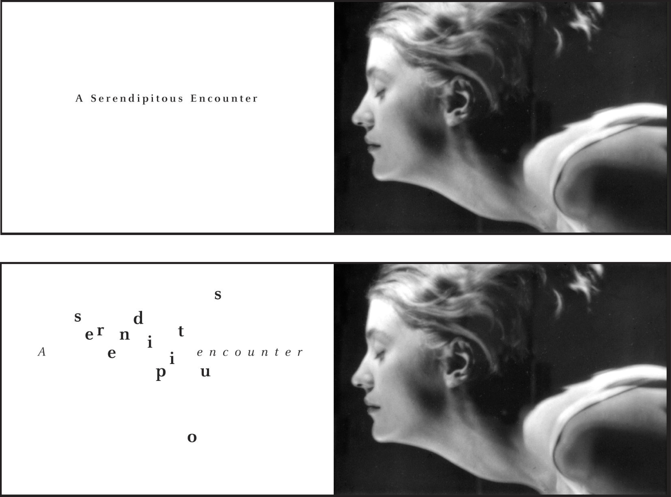
Example of a word image equation (title and image) set “straight” and with “expressive typography. Issa Mao.
Example of a 5 image/object set titled 3 times, with “neutral” typography. Len Khodorkovsky.

Abstract images with titles set with neutral type. Comparison of neutral expressive setting of title. Mohammad Sharaf.


Two pair of collaged images and titles set neutral (left) and expressive (right). Najeebah Al-Ghadban.
From Mira Kandpur’s What’s in a Title project. Neutral, top. Expressive, below.
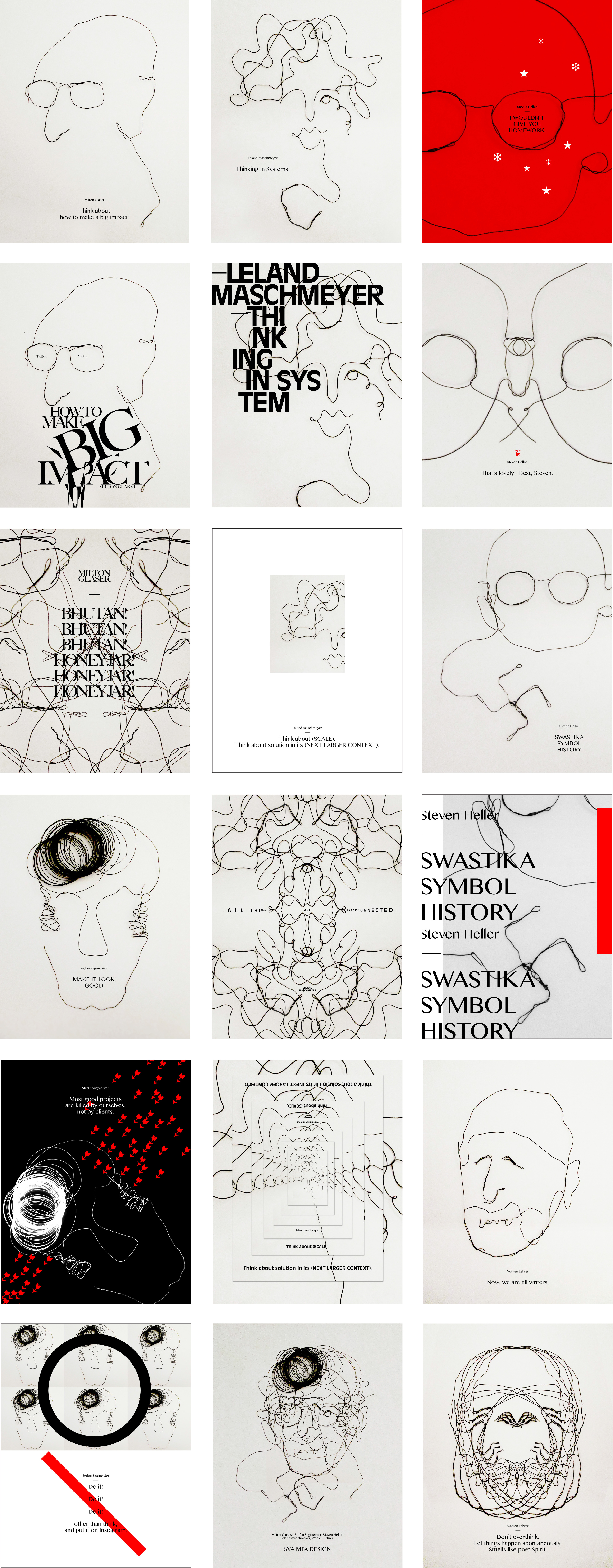
Jee Eun An drew some of her SVA faculty out of wire and titled the portraits with words she remembered that artist/teacher professed and/or things she associated with them.
Earlier versions of this project asked students to play out their word/image equations in the form of a book or box. Left: Bruno Zalum. Right: Melissa Gorman.
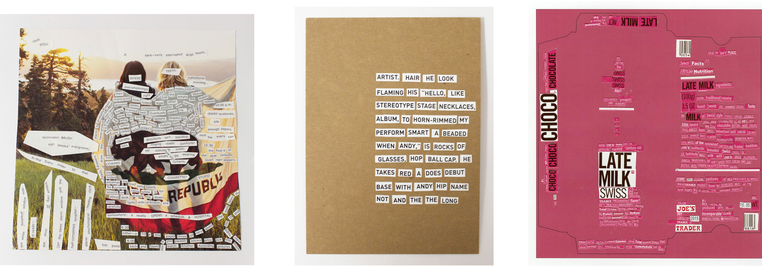
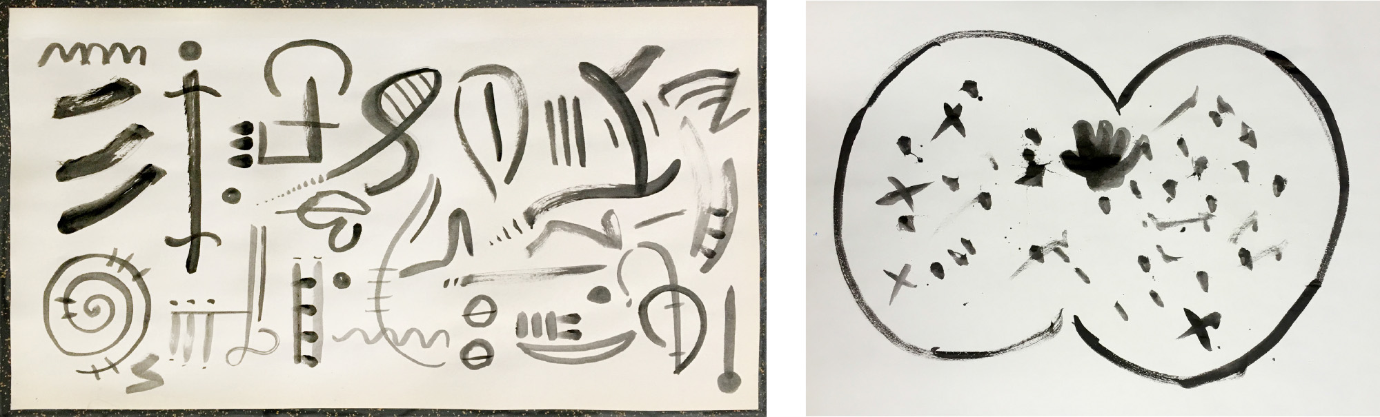
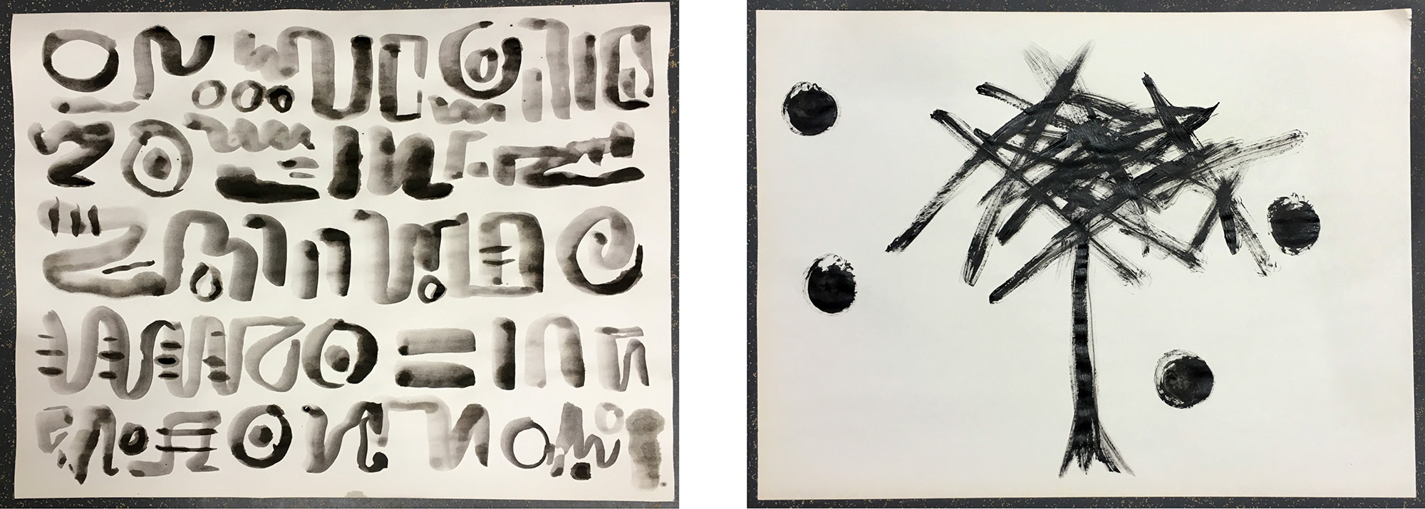
Students are asked to bring in brushes and ink, mark making tools like Conte crayons, charcoal, fat markers to class. Lehrer supplies large sheets of newsprint paper and introduces the class to the basic rules of continuous/automatic writing. He suggests a prompt and asks students to write. “But they can’t use words or any alphanumeric characters associated with a language known to them. Students think I’m crazy as they discover their own pre-literate writing systems, handwriting, and visual syntax. For twenty minutes or so they experience that place where writing and drawing come together.”
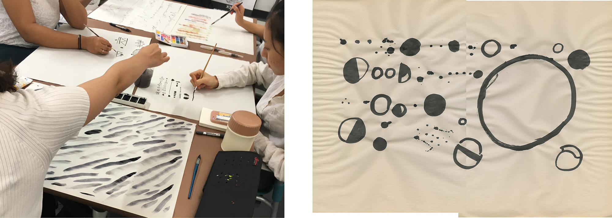
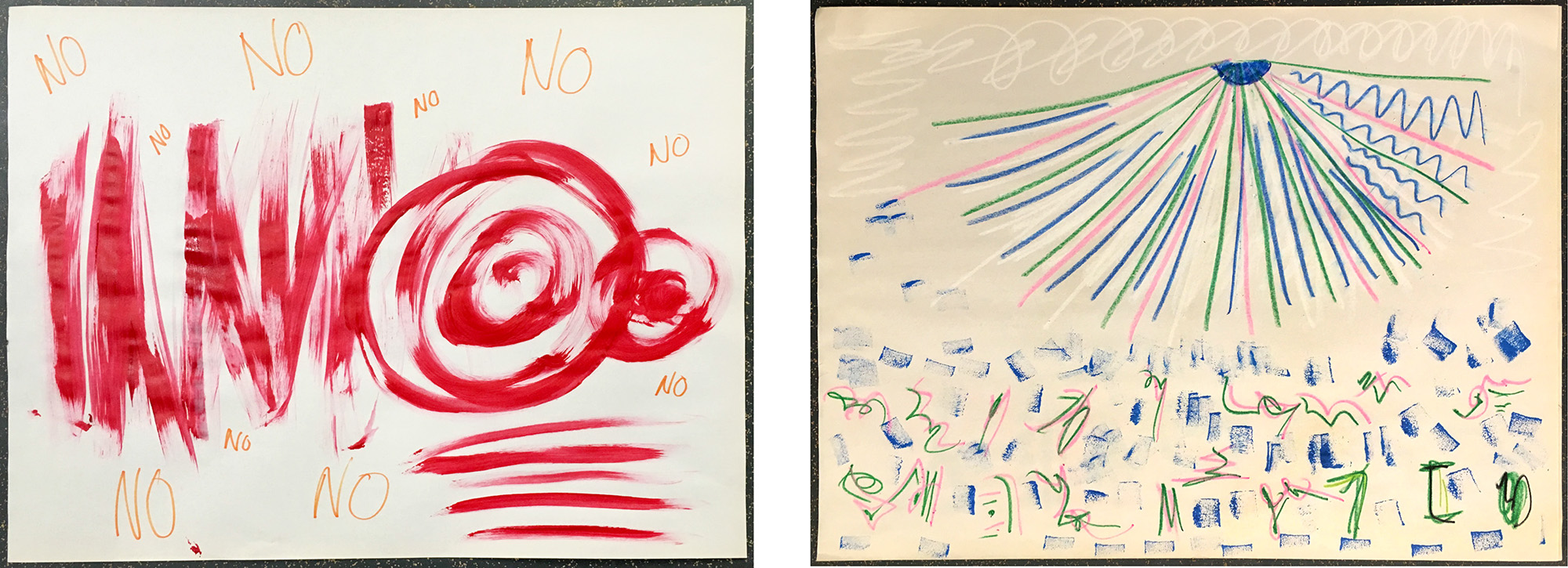
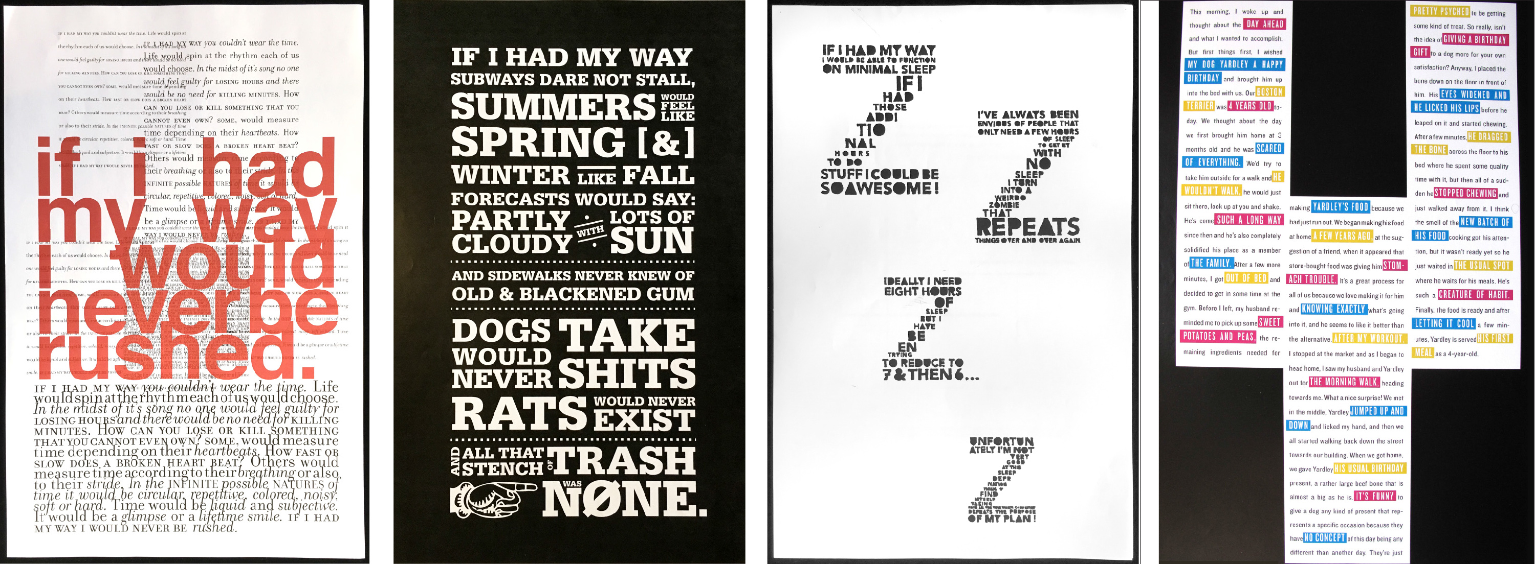
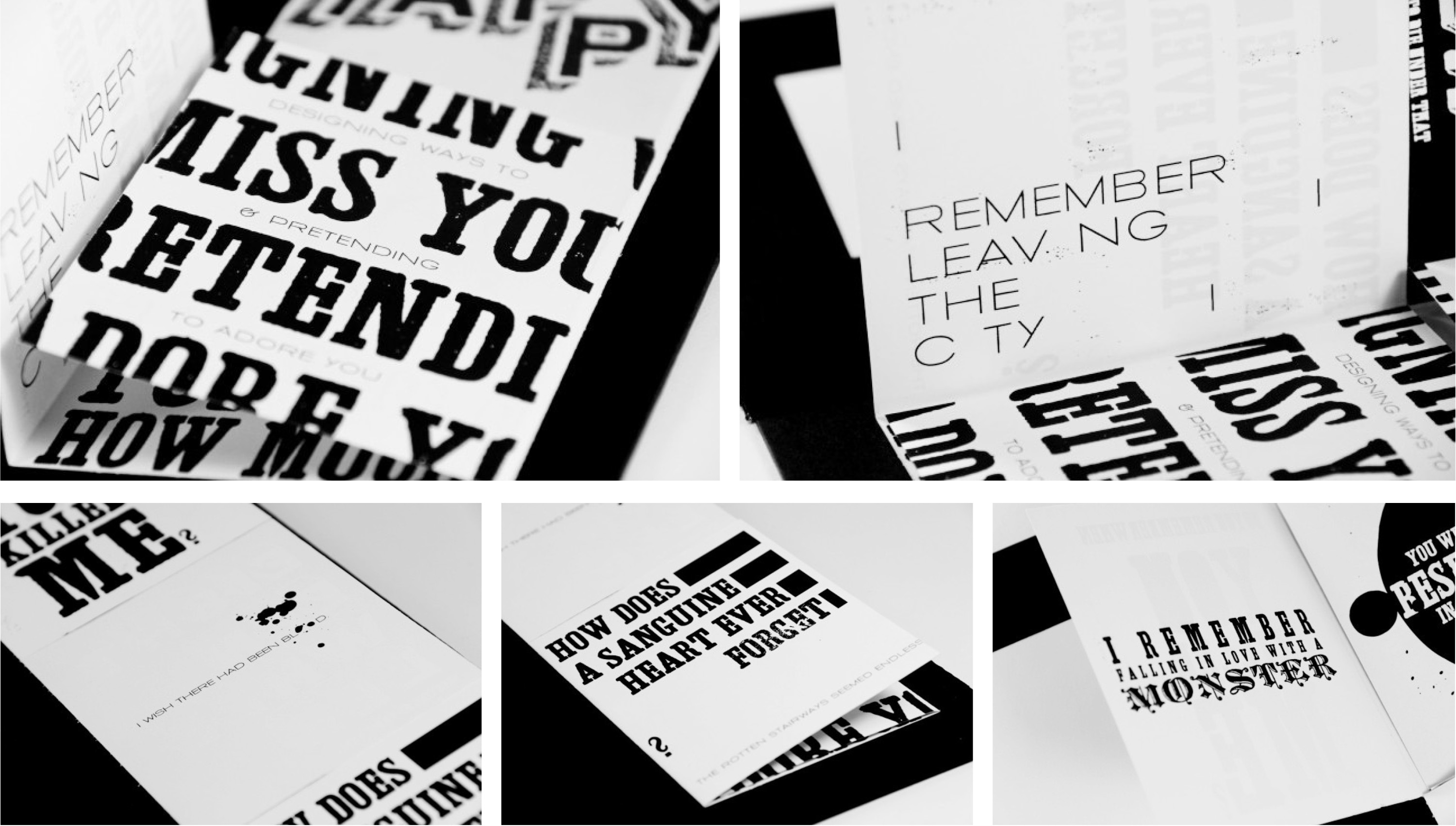
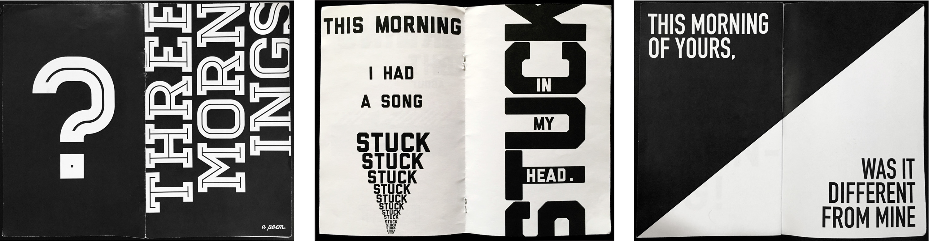
“Having loosened up, students are asked to continuous-write in 15-20 minute stretches, (no scratching out, no edits, no worrying about writing masterpieces, no lifting brush or pen off the paper). But from now on they do write with actual words. Prompts like, ‘This morning’ ‘I Remember’ ‘Growing Up’ ‘If I had my way’ are starting points. Suddenly they are writing non-stop. During the week they are asked to edit, re-write and shape two short prose pieces (or poems), and then compose four typographic variations of each piece within 11×17 inch paper (minimum size). Each student confronts the notion of composing their own writing through typography, not as style or convention, but as an integral expression/vehicle for meaning, rhythm, connotation, evocation, metaphor, voice, structure. In the same one week assignment, students are asked to set one of the two edited pieces into a small book, minimum 16 pages. Students are encouraged to take full advantage of the book as a time-based, 3-dimentional medium, considering pacing, sequencing, the turning of the page, surprise, juxtaposition, etc. In class, we analyze how the different settings affect the reading of the same text.”

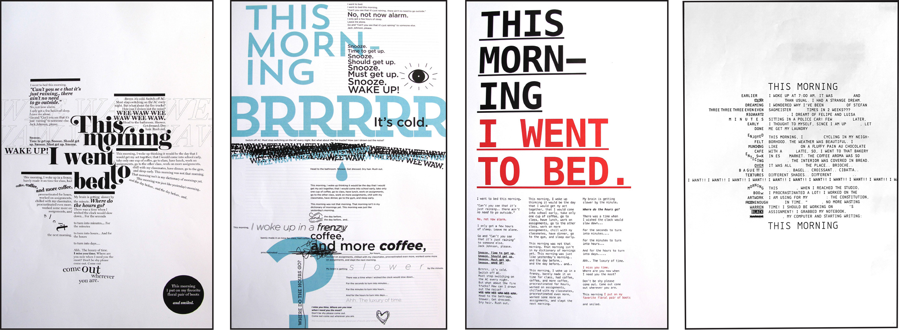
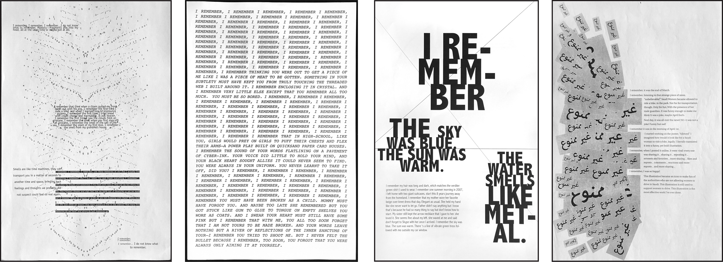
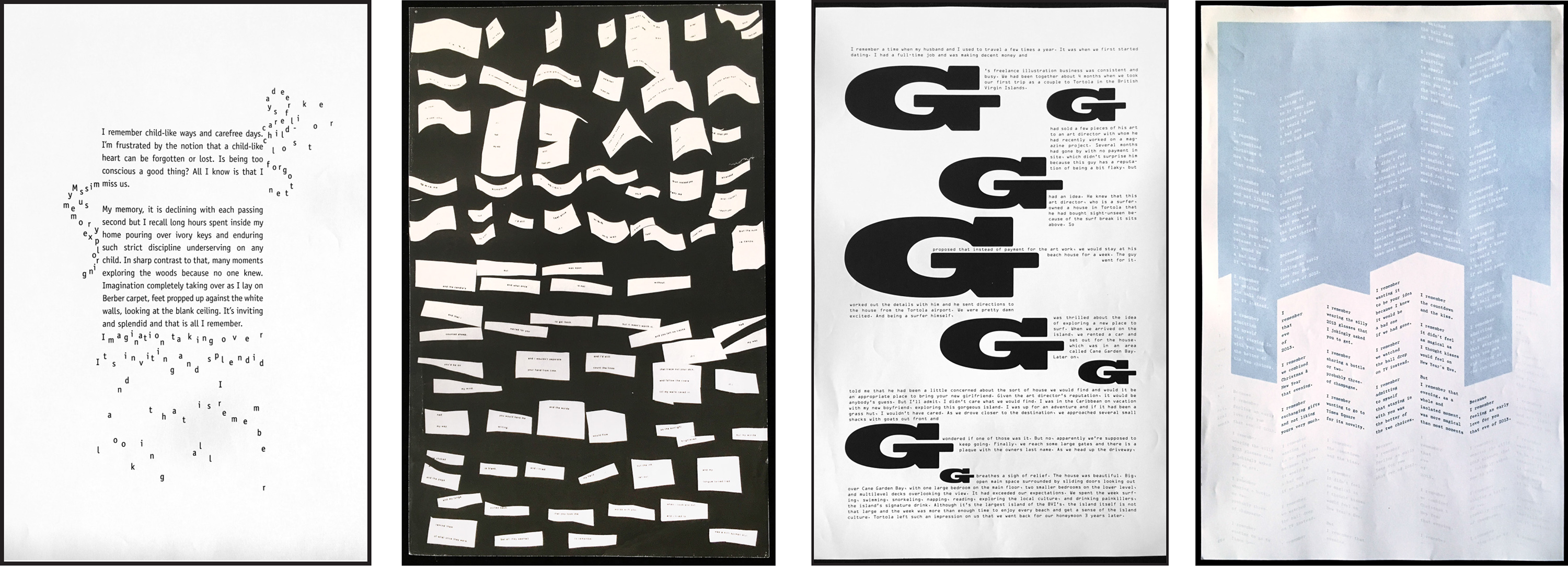
Below, a few examples of the 16 page books students compose in the same one week project.
Bruno Zalum
Reham Ibrahim
Allison Henry
Camille McMorrow
David Hartman
Nick Acemoglu
“Additional writing workshops and exercises—in verb usage, sense writing, writing well-crafted sentences, basic grammar and parts of speech—help students become critical wordsmiths. Non-linear, “experimental” writing is valued and explored side by side with more traditional writing structures. Before presenting the bifurcated book project, students do in-class writing exercises in writing from multiple points of view, character and voice development, ‘world building,’ and different ways to develop and shape stories. Throughout the semester, students see many examples of historical and contemporary works of visual literature and discuss the changing role of the book in a digital world, and discuss and experiment with new ways of envisioning, writing, designing, producing, delivering the visual book.”
Thesis Project. Several MFA thesis projects have grown from seeds planted during the Writing and Designing the Visual Book class. Here is an example of one such project where Lehrer served as principal advisor.
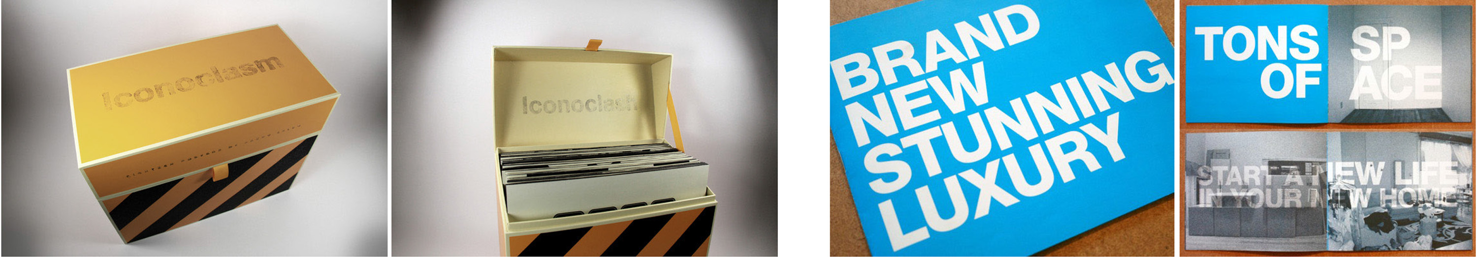
Najeebah Al-Ghadban’s’ thesis project, Four Fold, presents a digital publishing platform for artists’ books written and designed for the iPad, which launched with a trio of digital books by Najeebah that portray three fictional characters, Yara, Inez, and Ezra. Four Fold was an Adobe Design Achievement Award Finalist.
Community Design, Purchase College, SUNY
Lehrer has taught the Community Design class at SUNY Purchase since the mid-1980s. The senior level, one semester class functions as a pre-professional design studio serving the campus and non-profit communities (primarily arts, social justice and human rights organizations). Students work with real clients and collaborators, real briefs, deadlines, budgets, printers, fabricators, vendors and technologies of all kinds. They shepherd projects from the research stage, idea generation and development through production and launches. In addition to bridging academic and professional practice, the class (also taught by Robin Lynch in the spring semester) interrogates ideas of community, civic involvement and the expanding role of the designer with an emphasis on projects that make a difference. Through the years, Community Design has worked on hundreds of projects that include motion graphics, exhibition design, elevator installations, identities, educational and activist campaigns, banners, signage, posters, brochures, publication design, and speculative design projects. For ten years, The Elias Foundation funded 3-4 projects a year enabling social justice organizations to produce selected solutions. Non-profit clients include: For Freedoms, Women for Afghan Women, The United Way, NY State Department of Health, NYPIRG, Martin Luther King Foundation, WESPAC Foundation, Community Voices Heard, Hispanic Resource Center, Voices Unbroken, Grandpower Advocates, Family Service Society of Yonkers, Hudson Valley Community Coalition, Westchester Hispanic Coalition, Groundwork Hudson Valley, Steppin’ Up, VCS Gaypride Rockland, The Hudson River Museum, Blue Morph Collective, Red Dive, Elmsford Animal Shelter, Exponents, Westmoreland Sanctuary, and White Plains BID. Campus clients include the Dance, Music and Theater Arts & Film Conservatories, School of Art+Design, Schools of Humanities and Natural & Social Sciences, the Neuberger Museum, Performing Arts Center, Library, Sustainability Office, Admissions, etc.
VISUAL POETRY IN VACANT STOREFRONTS PROJECT, 2015-2019
The Problem: Concerned about the appearance of vacant storefronts and blighted streets in downtown White Plains (22% street-level store vacancy rate in 2015), Brittany Brandwein of the White Plains BID (Business Improvement District) approached the School of Art+Design Dean Ravi Rajan, seeking a way to improve the visual appearance of vacant storefronts and enhance the overall ambiance and pedestrian experience in downtown White Plains. Rajan told Brandwein about Lehrer and his Community Design class, and made the introduction.
The Creative Response: In the first year of the project, Lehrer and the students reframed “the brief” to go beyond “aesthetic enhancement” of the vacant storefronts, by creating works of visual poetry that reflect the conditions of downtown White Plains and the people who inhabit it. The class had ten other projects on its plate that semester, so Lehrer brought Judith Sloan into the storefront project to research and interview people in White Plains and write site-specific poems. That first year, Sloan wrote five poems making sure to leave room for evocative interpretation by student designers. The students then visualized the poems—in collaboration with Sloan and with guidance from Lehrer—via design, typography, color, shape, and (sometimes) images. The resulting windows stimulated conversation, enchantment and a transformation of the neighborhood through the fusion of poetry and art. The response was so positive, the project continued for another four years. The BID, the Mayor, the local press and many members of the community credited The Vacant Storefront Project with helping to lower vacancy rates and revitalize the downtown. Here below are select examples from each of the five years of the project.
2015
Photos of some of the vacant storefronts prior to their transformation.  Eight storefronts (each with multiple windows) launched in December, 2015. Seven featured below.
Reverse Commute
Most people think of White Plains as a suburb of New York City and assume the commute to work is always from White Plains to NYC. Commuting is central to the White Plains experience, but after listening to many residents, Judith Sloan discovered that a lot people work in White Plains and live in NYC. Here’s the text of her short poem:
I live in White Plains. I work in the City. I take the train every day to work.I live in the City. I work in White Plains. I take the train every day to work. 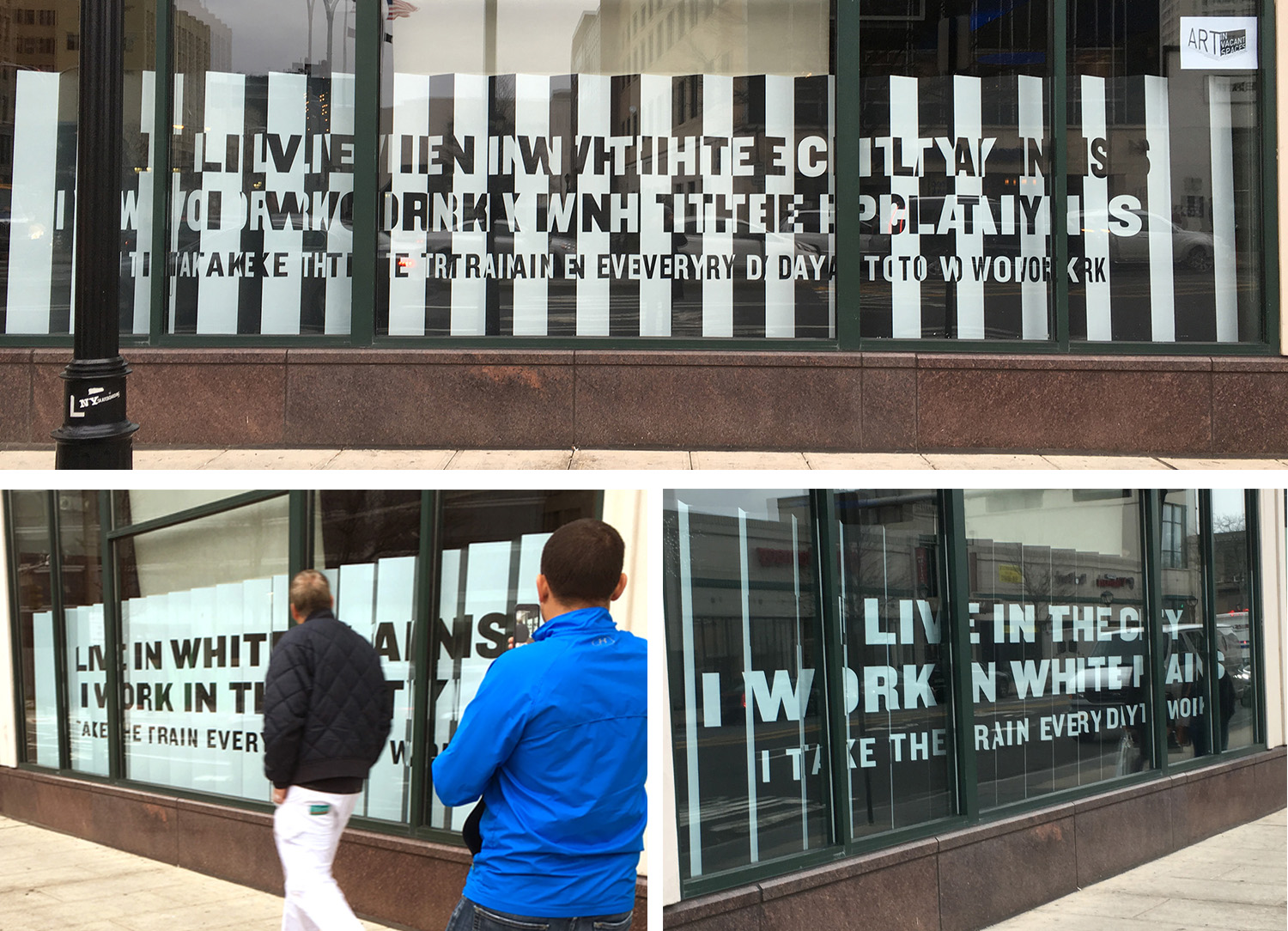
In Courtney Brown’s brilliant lenticular design, you experience Reverse Commute differently depending on the direction you’re walking. On top, a straight on view crossing the street. Below that, views from both directions.
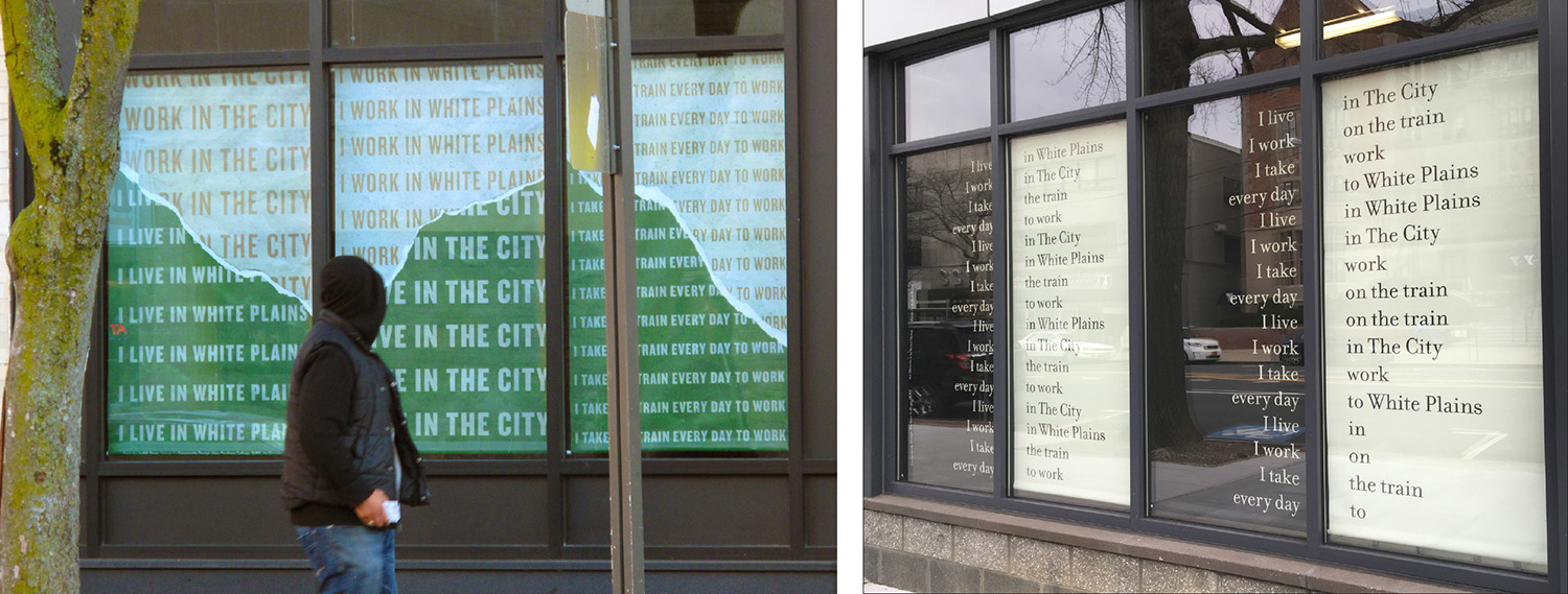 Left: Repetition plays a big role in Tessa Goode’s interpretation of Reverse Commute, as do the colors of concrete and grass, the textures of paper—layered and torn, and the trajectory/ebb and flow of taking the train every day down and up the Harlem River Line. Right: Due to a change in storefront venue and configuration of windows, Erica Zhang had to re-work her design of Reverse Commute. She worked together with Sloan finding new permutations within the poem so street readers could read down and/or across panels, allowing for multiple readings. Lesson learned: Out of crisis, opportunity!
Hold On
Sloan’s poem evokes the feeling of being in limbo. It begins: Hold on. Soon we will be more accessible. We are in between a small town and a city. We are between a rock and the highway. . . 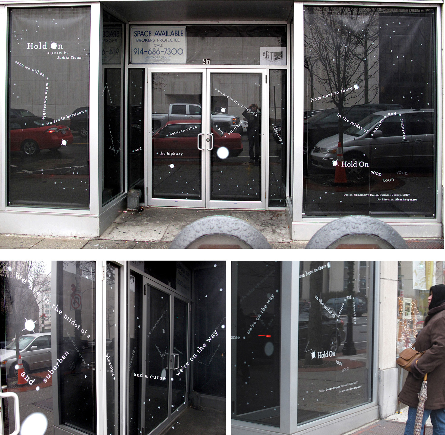 Alex Dragonetti’s design covers every inch of this full-window wraparound storefront, evoking interstellar spaces, and the spaces between, betwixt, and on their way toward becoming. The reflections bouncing between right-angled and opposing windows create a celestial hall of mirrors effect, as readers think of their city’s and their own pathways through harder and better times.
Positive Thinking
Here’s the text of Sloan’s short poem: Positive thinking going on behind the scenes. I stay open. Things will turn around. Your customers are the best source of information. Same people come in year after year.  Courtney Brown’s solution for this poem of hope effectively usurps the vernacular of storefront signs such as Come In We’re Open and Be Back Shortly. While some passersby didn’t notice the poem, those who did stop and read were smiling all the way to the bank (or wherever they were going).
The Future
This poem was inspired by a conversation with a White Plains resident who was asking interesting questions about the future of reading and storytelling. Sloan was also thinking about the way people interact with each other in our mobile/digital culture and wondering about the experience of reading a poem in a store window. “Is there someone standing behind you reading? Can you see their reflection in the glass? Sometimes you just have to inquire.” 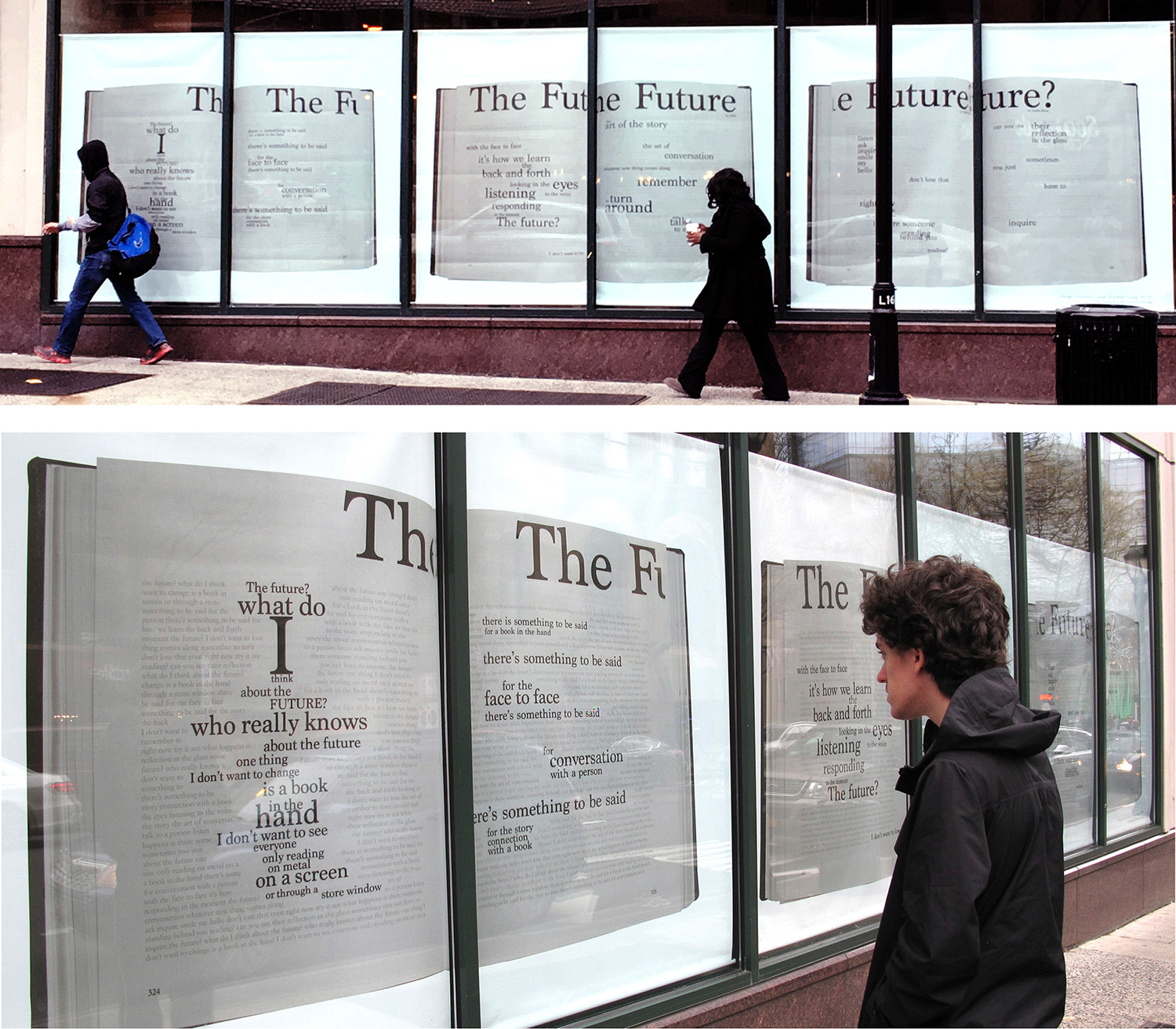 William Pineda selected this poem (about the future of books and storytelling) and created a design to be situated in the vacant store next to the White Plains Barnes & Noble. The text of the poem emerges out of open book spreads, like word clouds coalescing above word farms.
A Place
Sloan’s poem begins: A place is more than the empty spaces. Marshes and plains turn to farms and towns and generations who fill empty spaces where more than buildings remain to recreate a city.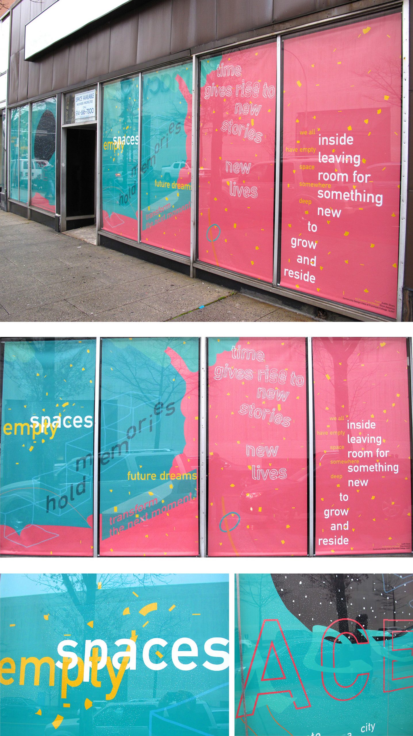 Elise Assenza saw this as a sad and dark poem. Her design uses bright and pastel colors, amorphic shapes, and expressive typography to bring out the hopefulness on the other side of emptiness.
2016
Photos of some of the vacant storefronts prior to their transformation. 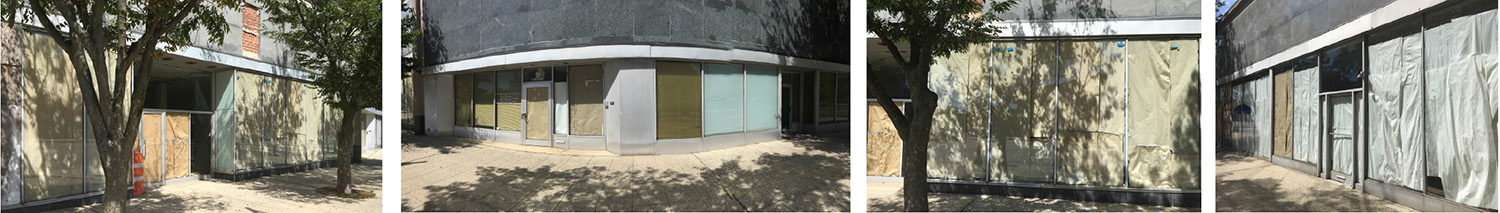
For the second year of the project, the White Plains BID came to Lehrer and the Community Design class with one entire block of ten contiguous vacant storefronts amounting to 50+ windows and doorways (a most desolate scene). They also had a larger budget set aside for the project so students were able to expand the media of their window displays beyond printed vinyls and lenticulars, to include laser cutting, lights, digital monitors, video and animated projections. The transformed storefronts had a dramatic impact on the blighted block on East Post Road. That year, the BID also incorporated the free downloadable public art app Otocast into the project which enables viewers to read detailed information about each piece on their cell phones The Otocast app component remained a feature of the project in the years to come. The 2016 iteration included four of the eight storefronts still on view from the 2015 project. Nine of the ten new storefronts are featured here.
I Remember
Sloan’s poem reflects the vast changes that have taken place in White Plains over the past eight decades and how memory bridges the present to the past.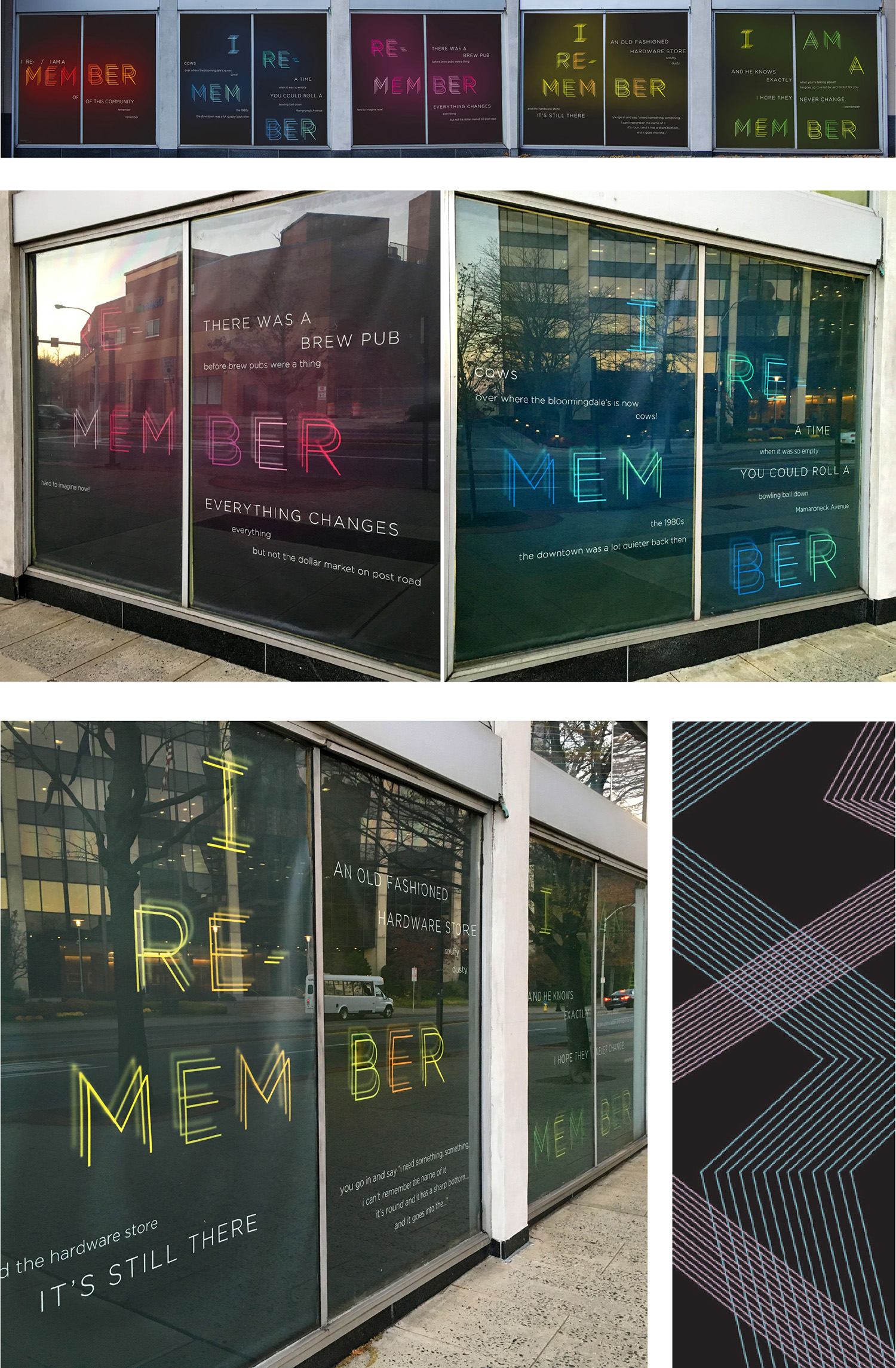 Danielle Foti designed two interpretations of Sloan’s poem I Remember. Both were selected for production and installation by the BID. The 10 window version embraces the layering of memories as years go by, as times change, as generations come and go. As you walk down the street, the stanzas actively jump around, from window to window, through an expanse of time and space; eyes follow the words, up, down, and across. The design embraces the reality of change but illustrates how the past is not forgotten. Each moment is built on that which preceded it. The layers are made up of people, buildings, and events; though sometimes blurry with time, they are still remembered.
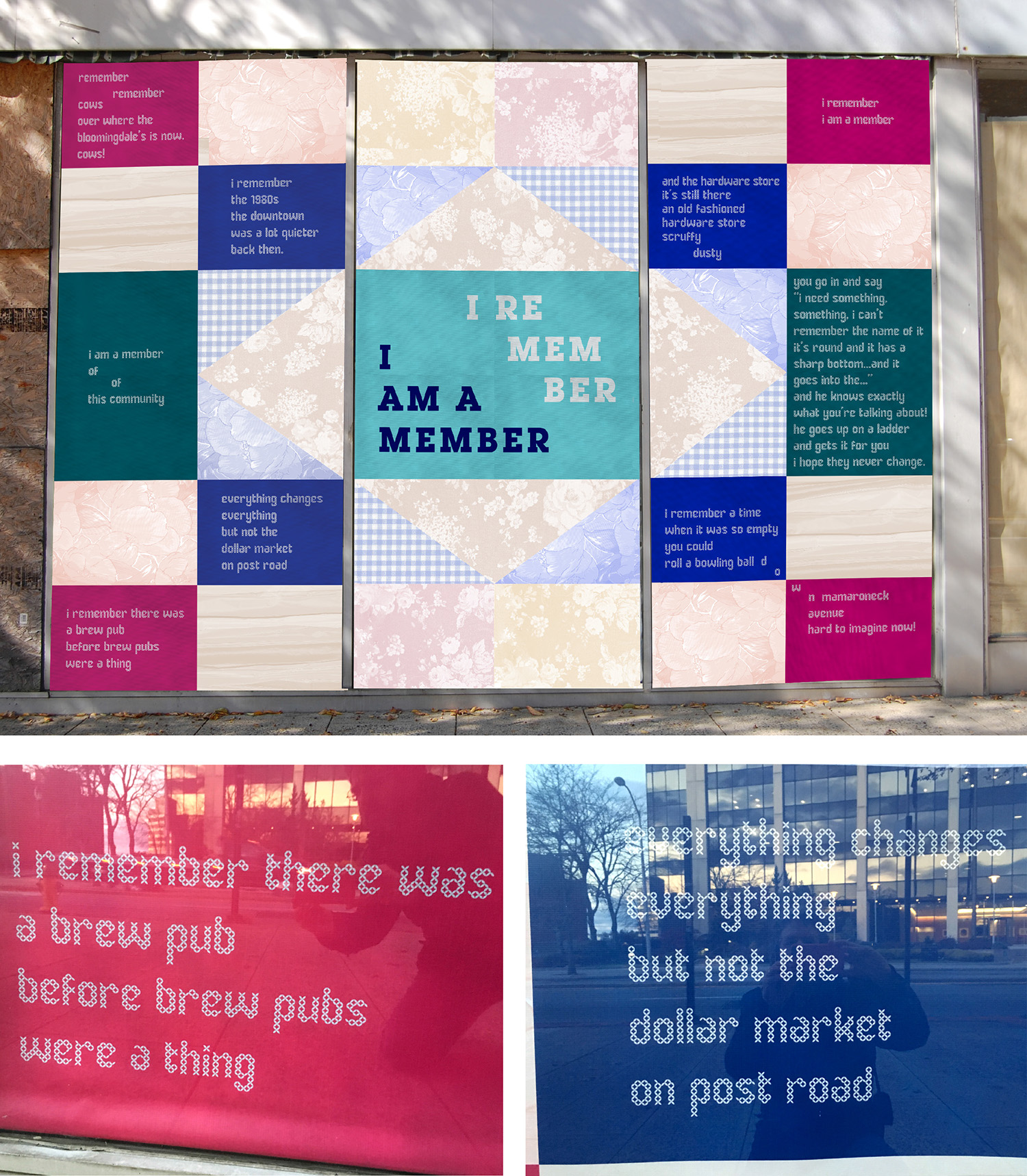 “Memories are like a quilt, stitched together over time,” wrote Danielle Foti about her second interpretation of Sloan’s poem I Remember. The design is inspired by the rich and longstanding history of quilts. Family, ancestry, sharing, community, repurposing of old materials — the quilt reminds us of a past time and reminds us of those people that brought us to where we are. Foti’s quilt design speaks to the passerby in a poem about remembering, and re-ordering stories of the White Plains experience, the way it once was, and the specialness and history of the spot you stand on as you read the poem. Brittany Brandwein, Project Director of The White Plains BID was so impressed with Danielle Foti—she hired her for a full-time design position the moment she graduated. Danielle then became one of the client/collaborators in the next three years of the project.
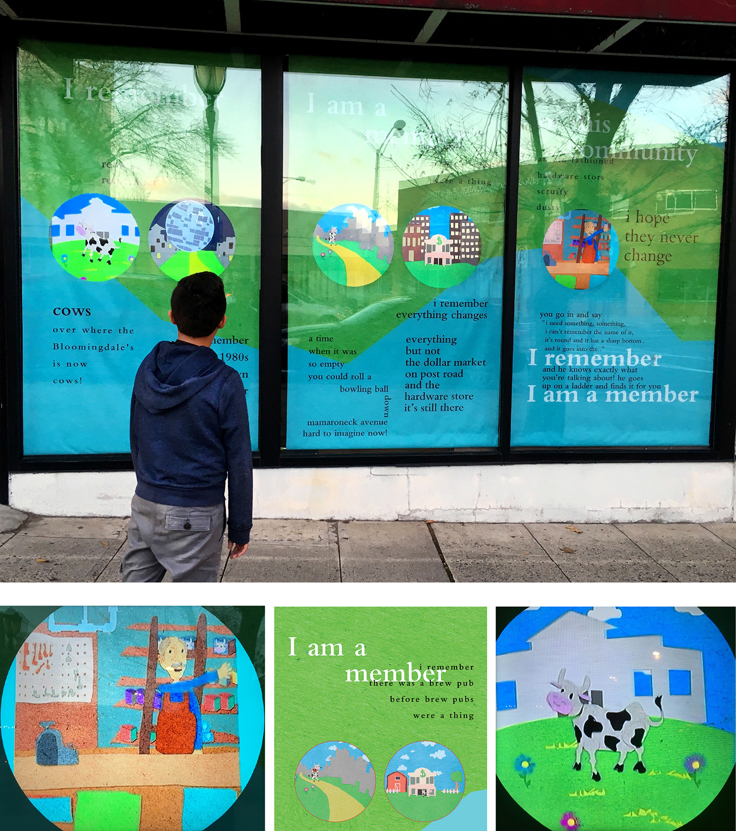 Julianne Waber’s rendering of Sloan’s I Remember incorporates imagery and five original animations. By using a colorful hand-cut construction paper style she aimed to brighten the desolate street and represent a simpler time. The animations set behind die-cut openings in vinyl printed flats, stopped people in their tracks, and got them “to stop and look a little closer at their surroundings.” Waber depicted the transformation of a town like White Plains, from farmland to a city using the cow as a character moving through time and across and between all five round video portals.
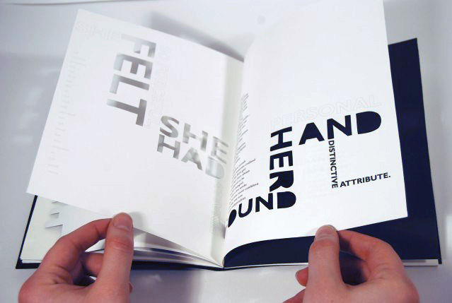
That Guy
Sloan’s poem portrays a character who feels alienated when he first moves to a new city, and receives some help from strangers. Eventually, he finds his footing and becomes ‘that guy’ who helps the newcomer. 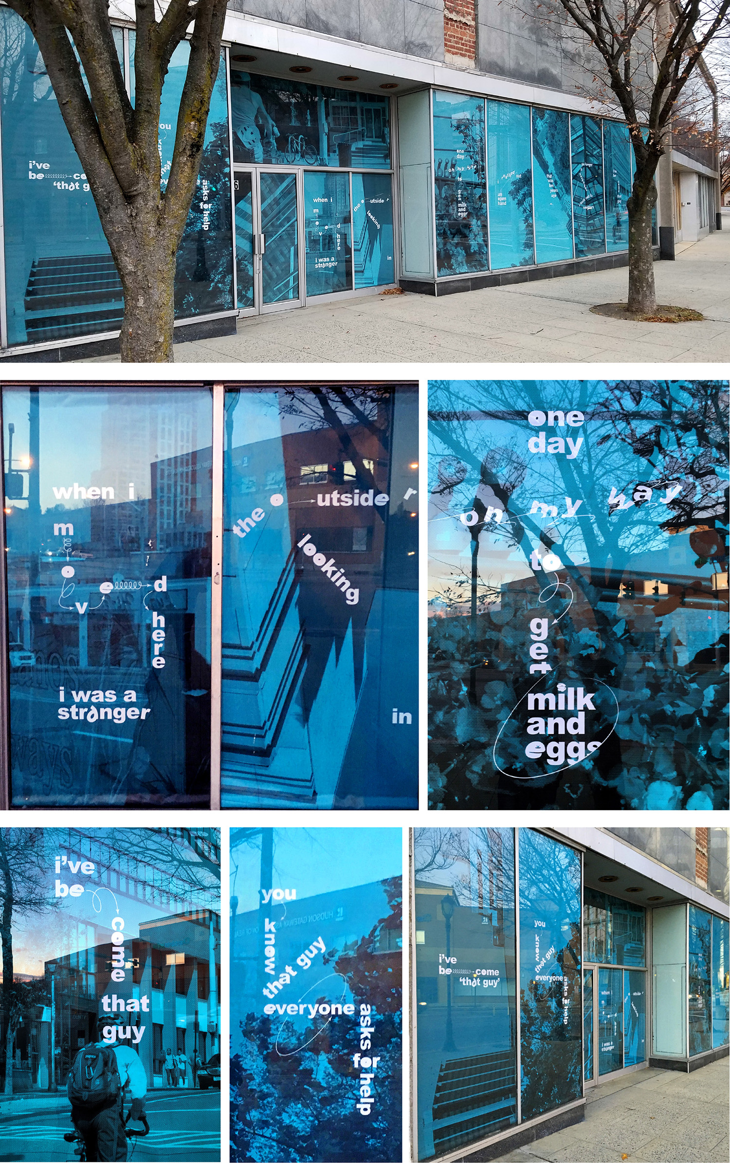 Alexander Beach’s visualization of Sloan’s poem That Guy spans ten windows. He took photographs around downtown White Plains focusing on cityscapes, trees, a building with a glass ceiling, a bicyclist riding down the street. By changing the orientation of some of the photos and using typography to diagram aspects of the poem, he places the viewer in the shoes of the outsider looking in. The protagonist is alienated at first in the new place till someone reaches out to them. Eventually he/she/they become that guy. We (the viewer) see the town and ourselves reflected in the windows and complete the cycle.
Urbia
Sloan spent days sifting through recordings from the White Plains Public Library Oral History site. Struggling to explain White Plains, someone used the word “Urbia.” This notion of a city feeling both urban and suburban came up in many conversations and became the seed for this poem.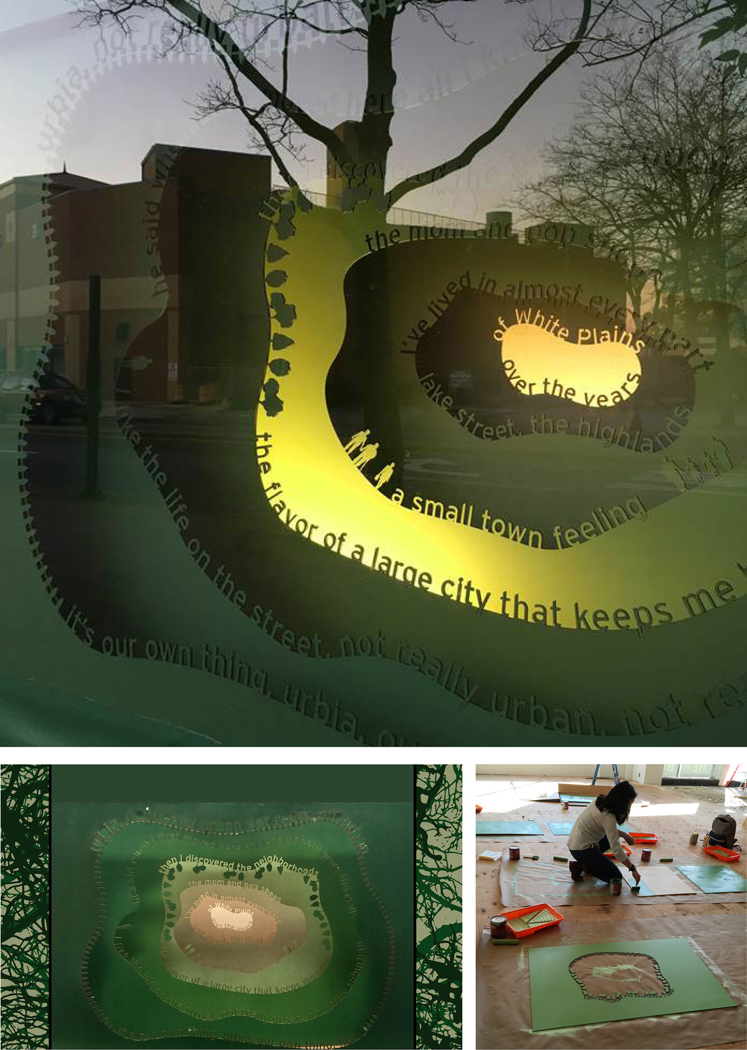 Emily Seto’s artwork and Sloan’s poem encapsulate what it means to live in White Plains. There are the tall office buildings and there are the mom and pop shops. A center hub for many people, some move through White Plains every day, some commute there, some live there. Each layer of Seto’s tunnel-book-like construction was laser cut out of masonite and painted in shades of green to create the feeling of seeing through urban and suburban at the same moment. Bottom right photo: Seto painting the panels on location before installation.
Off the Drawing Board
Sloan’s poem is about bringing one’s inspirations to life whether that inspiration leads to creating a piece of art, building relationships or physical structures. It’s also about recognizing what is valuable in ourselves and our communities. Gunnar Artin’s’ design turns the words of the poem into masks and openings. Through the openings we see video projections of people in White Plains who took their inspiration off the board into public festivals and live events in the White Plains BID. Artin’s design solution allows these people to literally come “off the drawing board” and out towards the viewer.
Seat of the County
Sloan’s rhythmic poem consists of interchangeable, permutating phrases. The heart, the light, the seat, the pulse…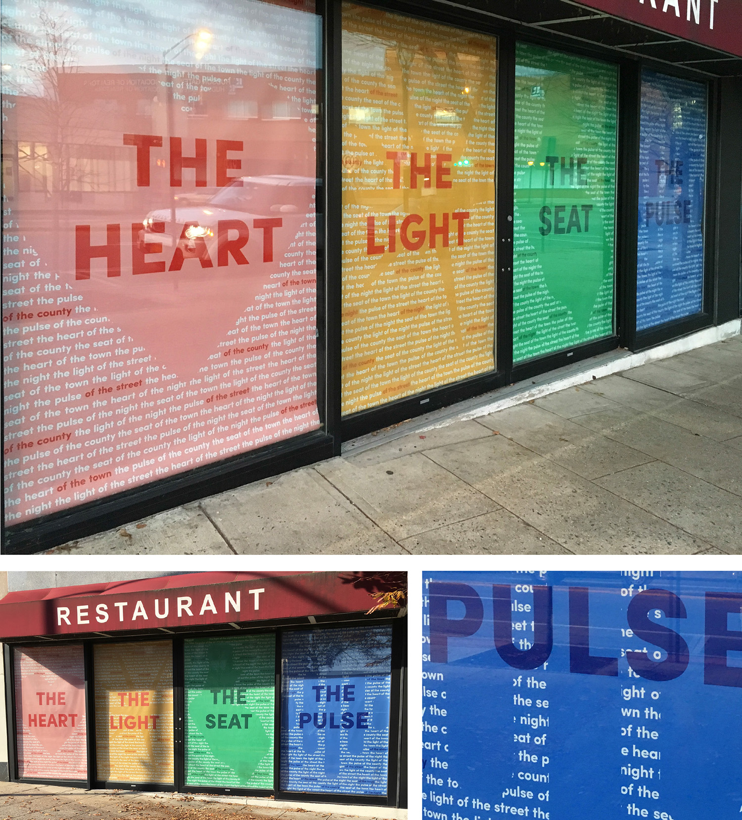 Sarah Yalaju’s interpretation of Sloan’s poem moves from the literal to the metaphoric, in four panels. THE HEART reveals an image of a heart, THE LIGHT displays an abstract representation of light, THE SEAT panel displays a map of White Plains, THE PULSE, an abstract representation of a pulse. The viewer can read these words from quite a distance, at the center of all-over fields made of white type dropped out of full-bleed colors. When the viewer comes closer they see the field of words (the full text of the poem repeating over and over) and colored words popping from the pattern that reveal the second half of sentences that rotate and change: “Seat of the county, Light of the night, Pulse of the street, Heart of the town.” Multiple variations repeat on each panel.
 Paige Nehlsen’s interpretation of Seat of the County is kinetic. When she read Sloan’s poem out loud to herself, she immediately heard the connection between how the verses sounded and the rhythm of a heart beat. Her design solution animates the verses to the rhythm of the poem, displayed on a large tv monitor. The first part slowly fades in and out, then speeds up as the poem progresses. Nehlsen’s animated typographic design highlights the permutational wordplay of the poem as it celebrates the energy and atmosphere of White Plains. The white words emerge as small bursts of light out of a field of black.
I Remember/I Am a Member
A reworking of Sloan’s poem I Remember. . .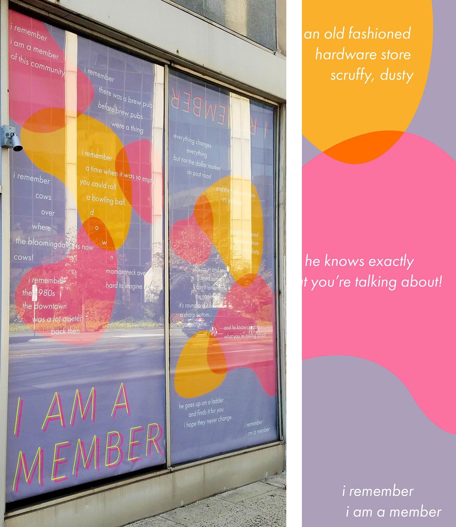 Ashley Yalaju’s interpretation of Sloan’s I Remember poem incorporates bright, colorful organic shapes that overlap and create the illusion of transparency. It evokes the liveliness and vibrancy of the city of White Plains. The words of the poem fit inside, curve, cascade around shapes and overlap with them evoking the motion, lightness and joy of being a member of a community that remembers.
2017
Photos of the vacant storefronts prior to their transformation. 
This is an unusual design project—where success results in taking down your designs because a store is rented, and because more people feel better about their community, and small businesses are populating once vacant spaces. By the fall semester of 2017, the Community Design class only had three vacant storefronts to work with, resulting in more (healthy) competition between students working on the Art in Vacant Spaces team. (Through these years, while working on the White Plains project, Community Design worked on anywhere from 8 to 12 other projects a semester. In 2017 the class was able to take on more projects). The BID made it known early in the 2017 process that they were interested in poems and designs that were upbeat and colorful, which you’ll see reflected in the results, though both the poet and designers made sure the work remained deep and provocative. Here below are examples of storefront designs that were selected and installed and a few that were excellent but not chosen by the BID. Installations went up in December 2017. One of the three came down within two months because the store had rented.
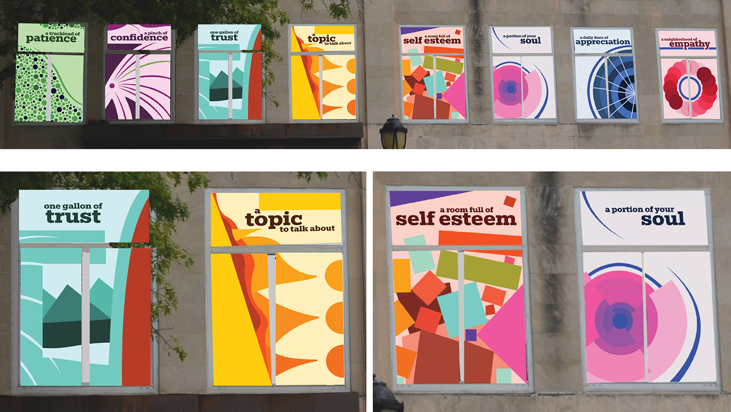
Recipe for a Loving Community
In this aspirational poem, Sloan adapts the vernacular of cooking to the ingredients needed for a healthy if not loving community. Windows not only serve as a source of natural light and views of the world outside but also provide the outside world with a momentary snapshot of the lives of the people inside. Madeline Friedman’s visual setting of Sloan’s poem provides viewers with silhouetted fragments of people going about their daily lives. Each set of windows, inspired by one line of the poem, illustrates a different narrative scene, suggesting characters, relationships, and stories—all open to interpretation. The windows at ground level serve not only as an opportune placement for the poem’s title but as a way of drawing the viewer’s attention to the images on the upper level windows. Sloan’s words, brought into the visual realm by Friedman, invite the public to engage their imagination and enter the worlds of the second floor inhabitants of this dual use building on Mamaroneck Ave.
 Alexander Shear’s setting for Recipe for a Loving Community creates discrete typo-geometric compositions for each window that evokes an abstract/metaphoric expression of the quality mentioned in that panel. It was a close runner up.
I’m Here
In this poem Sloan affirms and celebrates people of different cultures and backgrounds from around the world coexisting within the city of White Plains.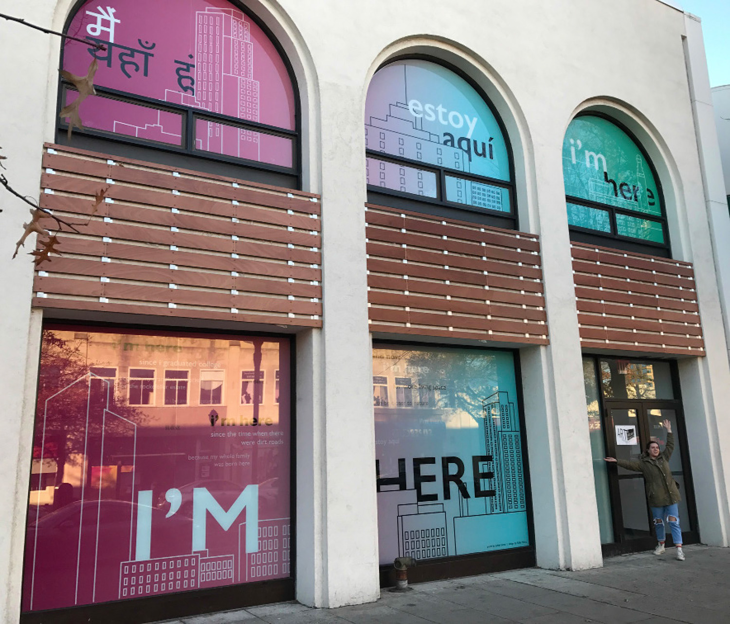 Kelly Mertz’ design gets to the essence of Sloan’s poem. She made line drawings of specific buildings in White Plains and used the text to interact with and weave throughout the drawn urban landscape. The typography evokes the voices of White Plains inhabitants echoing “I’m here” and describing their reasons for living there. The interaction between the buildings and the type conjure a global city where a range of languages are spoken. The colors suggest the passing of time from sunrise to sunset.
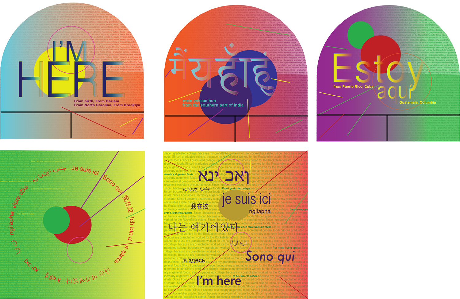 Sibulelo Mnisi’s design for I’m Here emphasized the multiple languages spoken in White Plains and the mix of different cultures, backgrounds, flavors, spices, and colors experienced, smelled, worn and seen in the diverse city. It too was a close runner up.
New Rhythm
This poem celebrates the seasons of life cycling through time.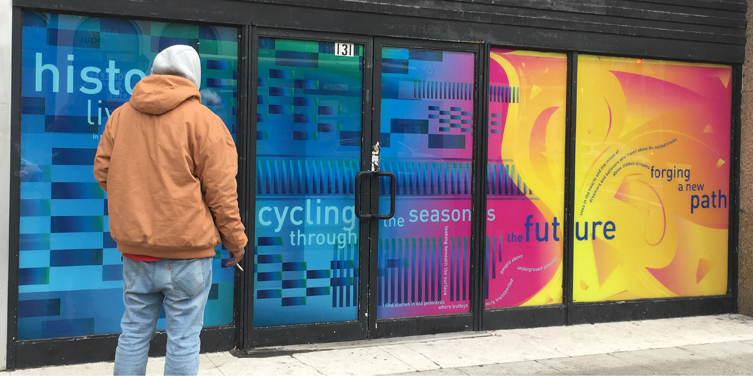 Hailee Knadle’s design echoes Sloan’s poem through the use of vibrant colors and eye-catching shapes that interact and overlap. The brick-like shapes moving through the rhythmic tracks honor White Plains’ history which includes a trolley service that once cheerfully transported passengers up and down Mamaroneck Avenue. A curtain of vibrant yellow and magenta morphs into a blue and green field symbolizing an unwritten, undiscovered future filled with potential.
2018
The class worked on six storefronts in 2018.
I Want
Sloan’s poem presents an optimistic vision of the future while reflecting the movements for political and cultural change. The poem follows a pattern, which repeats the phrase, “I want” followed by a desired action/change.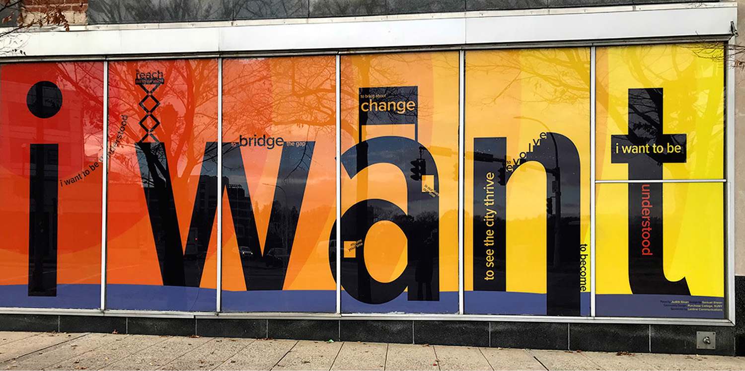 In Samuel Sheen’s visual representation the very large scale letterforms spelling I Want take on a larger than life presence, evoking buildings one might see in White Plains. Attracted by the bold typography and colorful panels, pedestrians from across the street or down the block draw closer to see what exactly is being said. The inverse is also true: someone viewing this piece close up might not realize what the poem is saying until they take a step back. The background colors create a sunset-like radial effect that change in hue from left to right and contrast with the large black letters. Standing in front of these six windows, the reader is confronted with their own desires for change within themselves and their community.
How Did I Get Here?
Sloan’s poem forms a brief journey through the multi-generational history of a family and how each individual ended up where they are today.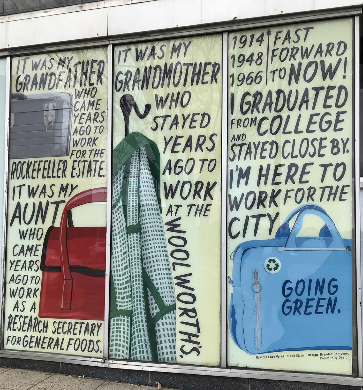 Brandon Gambone picked up on the diaristic approach to the writing by handlettering the text. His illustrations are based on the family’s professions and the tools and clothing they would bring to work during the time periods referenced: 1914, 1948, 1966, 2018, plus looking toward the future. During the early 1900s there was a fire at the Rockefeller Estate due to faulty wiring. Brandon researched what an electrician’s toolbox looked like during that time period. Additionally, the handbag reflects a color and style popular for woman’s handbags in the 1940s, a uniform worn in 1960s Woolworths, a bag used for a laptop case, etc.
Resilience
Sloan’s poem explores the positive side of experiencing difficult situations. In fact, resilience plays a role in all the poems she wrote for the White Plains Storefront Project that year. 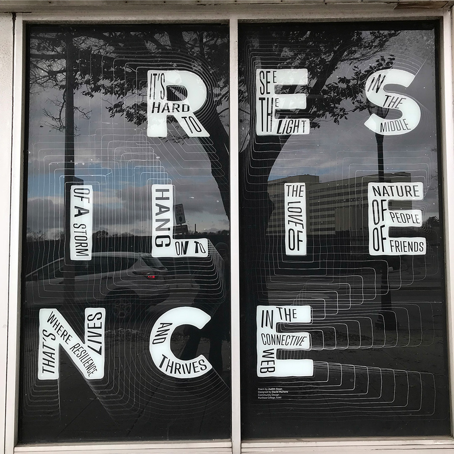 David Marten’s zeroed in on his own experiences turning to family and friends for support during difficult times. Together, these very human connections form a web of support that can guide you to the light when you feel like you’re in the dark. They help you work through obstacles standing in your way. David also was a student in Lehrer’s Advanced Typography class and was able to draw from what he learned from doing his Type As Metaphor project in that class.
The Tree, the Wind, the Leaf, the Sky
Sloan wrote this short poem for the 2018 storefront project as a companion to the 2016 piece she wrote called The Seat of The County which was also very spare and used repetition. “The tree, the leaf, the plains, the grass, the sky, the cloud, the mist, the wind” is a response to elements of the Seat of the County poem that focuses on the city of White Plains, and ends with “the pulse, the heart, the seat, the light.” Sloan knew that a new piece would be going up next to the earlier work, and wanted to focus on some of the essential aspects of landscape and nature.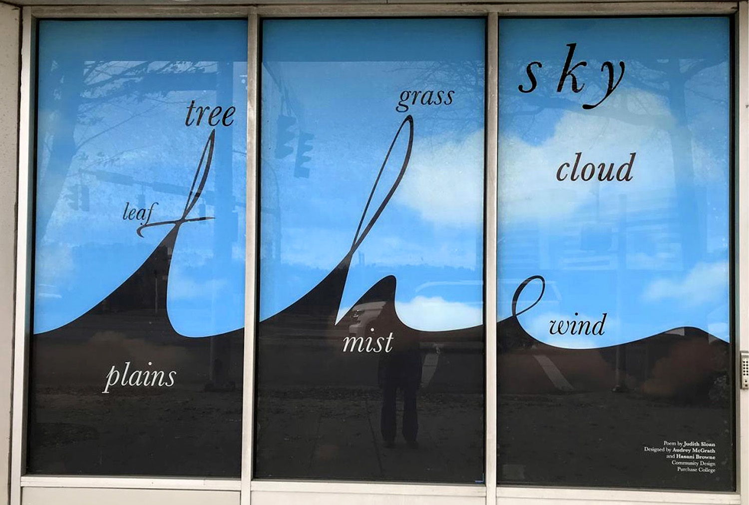 Hassani Brown noticed that the entire poem was tied together with the repetition of the word “the.” She decided to make ”the” a central visual theme within a landscape for the other words to hang on, above, below. She thought about the way things in nature tend to flow into one another. Clouds become mist when they get very low. Grass sprouts out of the plains, as do trees, which sprout leaves. Audrey McGrath assisted with the lettering.
In a Building
In this poem Sloan gives life to a building by embodying the voice of a long time resident who witnesses the lives and changes that take place within and outside the building. The building is a vessel for memories and observations.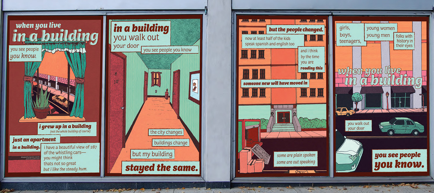
Damian Colavito was struck by the very vivid images in the poem and set about illustrating some of them. His design took cues from the comic/graphic novel tradition so when viewers walk by they have the feeling of reading a storybook. Damian focused on architectural details in this piece referencing various White Plains locations, and to the hallway of a building, to the small little fern on the window sill. We the reader become the figures who inhabit these spaces.
2019
There were very few vacant stores in downtown White Plains by this point, but there was construction going on. Instead of occupying windows and storefronts, the canvas for this year’s visual poems was a plywood construction wall along Mamaroneck Ave and East Post Road that blocked an in-progress mixed-use development project. The final art was printed on flex vinyls that were grommeted and screwed to the walls.
More Than a Roadmap
Sloan and Lehrer were thinking this could be an opportunity for one poem to have a lot breathing room as it wraps around two corners and 78 panels that made up the long construction wall. Sloan wrote a piece that could be broken up and interpreted in different ways, poetically and structurally. Each of five sections began with different phrases followed by alternative endings. In addition to the wildfires raging in California, Sloan was reading about the push for green energy in White Plains. While addressing the overwhelming devastation of the climate crisis, which can lead to a feeling of paralysis, the poem also embraces the future of sustainable energy, which can lead to a feeling of hope and motivate action. Students came up with very different interpretations and ways of structuring the poem. In the end, the wall was divvied up between three selected designs.
The phrases that begin the five sections: • It takes more than a road map • Raise the level of ambition, raise your game • Raise your imagination, rise to the occasion • The heat is on, we cannot wait • Good things can happen.
Here below is some of the student art that made it to print and installation and some that didn’t get picked but were nonetheless terrific.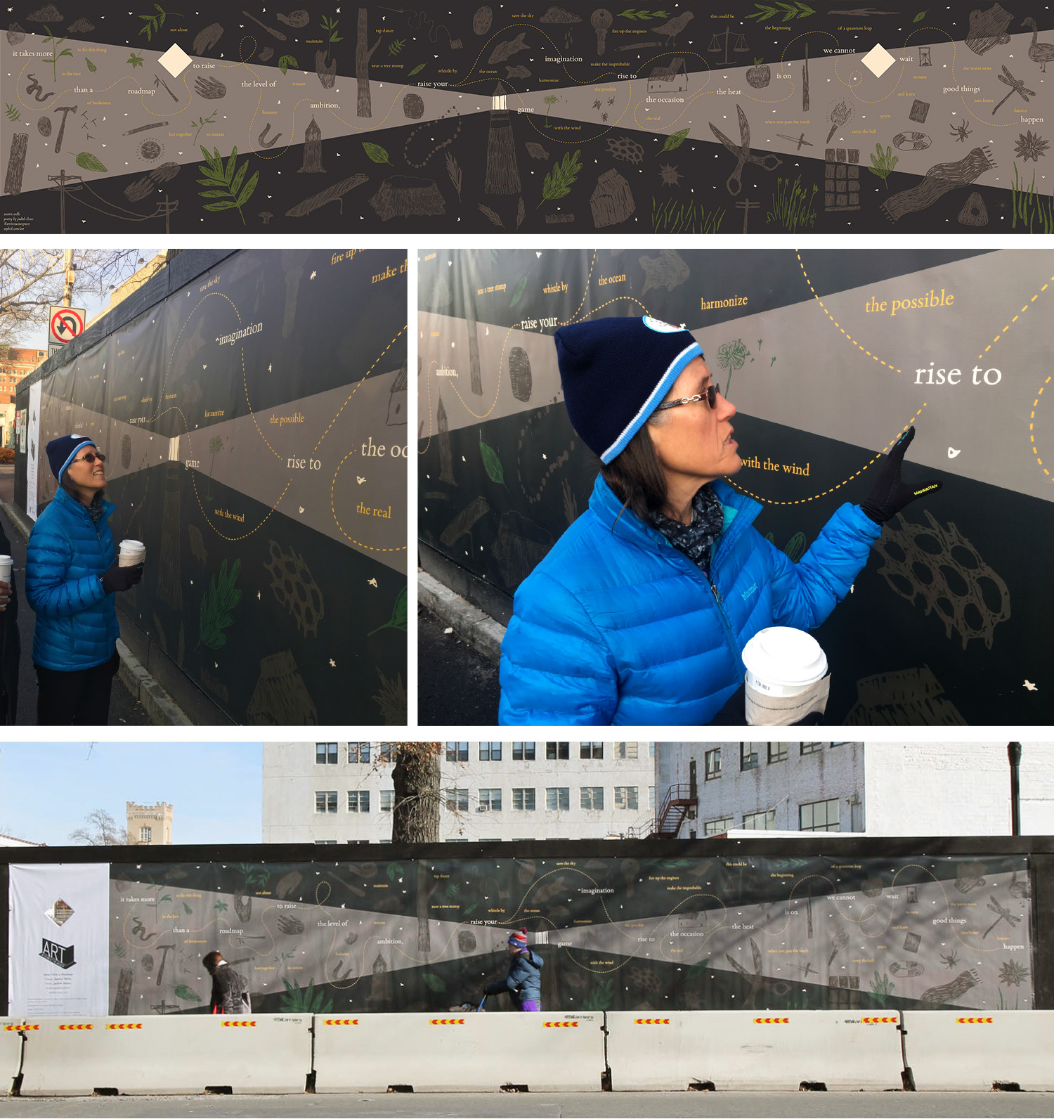 Austin Wells’ stunning interpretation of More Than a Roadmap disperses the text in a non-linear structure throughout a landscape that is centered around a lighthouse spraying beams of light into the darkness. The initial phrases of each section are set in white type and can be threaded to all the other white phrases, creating one sentence, or they can be seen/read with the yellow phrases around it.
 Lucas McBath visualized the poem into abstracted road maps. His minimalist designs are aesthetically pleasing and relatable to people who live and walk these streets. All the student designs had to adhere to Buildings Department regulations that require diamond shaped cut-outs that enable people to see the construction site. The cut-outs in McBath’s panels all frame the construction site and distant buildings in interesting ways.
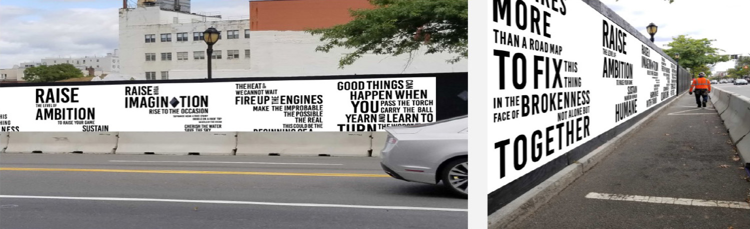 Shaun Conner emphasized verbs and actions within the poem: RAISE your IMAGINATION, FIRE UP the ENGINES. His bold use of typography is at once in your face and lyrical. The gutsy design and black and white palette could get passersby to make a choice to think boldly.
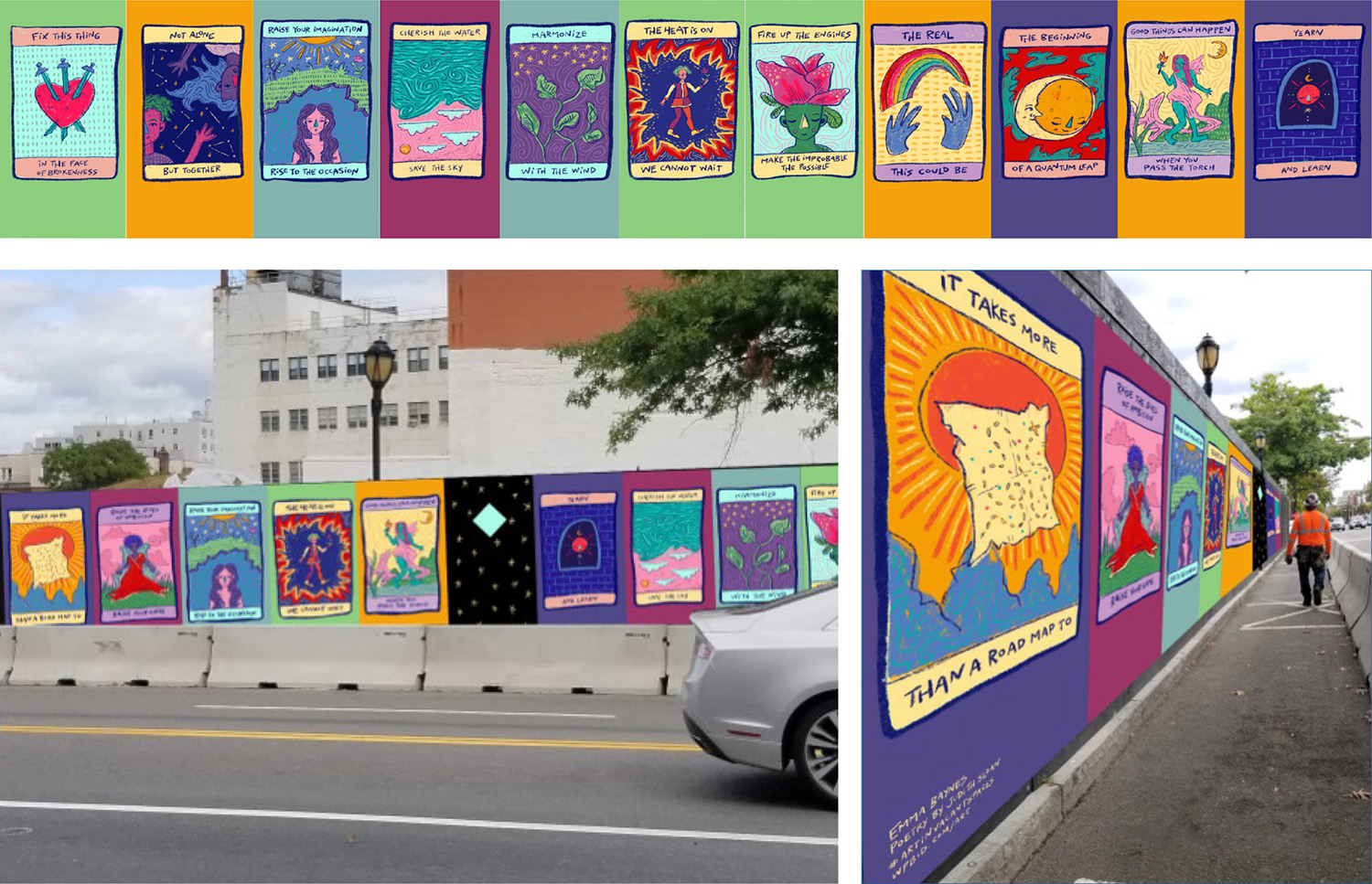 Emma Baynes recast the poem as tarot cards, each card and original drawing based on a different phrase. Baynes cast the panels with diamond cut-outs in black with white dots, giving viewers a visual pause between the colorful declarative card-panels and time to peer into the construction site.
 Inspired by the idea of designing for a construction site, Harrison Issac photographed existing architecture in White Plains and incorporated cropped architectural moments into his photo-typographical compositions. The empty spaces between words and images were also important to him. Like Shaun Conner, Issac emphasized action words from the poem. Highlighted phrases like SAVE THE and INTO BETTER FUTURES are meant to provoke curiosity and draw people in for a closer read