

Winner TDC Award
(Type Directors Club)
Winner STA Special Recognition Award
(Society of Typographic Arts)
Exhibited internationally including at the Georges Pompidue Centre’s L’image Des Mots exhibition, and as a solo exhibit at the Pieter Brattinga Gallery in Amsterdam. Copies of French Fries are also in the collections of the Museum of Modern Art, LA Country Museum of Art, Tate Museum, Getty Museum, etc…
French Fries has been written about and pages reprinted in dozens of books on design, experimental literature, and the art of the book.
“French Fries is one of the most fascinating books I have ever seen or read… The pages throb with energy and graphic vitality… French Fries proves that the book can be a movie, an existential feast, and a pastiche of literature and art…”
AIGA Journal Philip Meggs
“The tastiest book this season and for seasons to come, French Fries, Warren Lehrer’s latest tour de force is a remarkable accomplishment. Each page becomes theater and you are the voyeur…”
High Performance Magazine Judith Hoffberg
“Perhaps the biggest leap came (in my life as a book collector) when attracted by a four line description in a catalogue, I ordered a copy of Dennis Bernstein’s and Warren Lehrer’s French Fries… Never had I seen a book like it, nor have I since… Each page is a riot of homespun wisdom and raucous exchanges, overlapping life’s daily events… French Fries has also been my wisest investment, as I have watched the book increase tenfold in value…”
Bookworks Rose M. Glennon
“Lehrer pioneered what might be best termed ‘typographic performance’ in his 1984 book/play French Fries, a hot type cacophony of word and image that is today considered by historians one of the lynchpins of the deconstructionist era…”
Eye Magazine Steven Heller
“Without a discernable grid, the typography [in French Fries] flows freely across the pages, interspersed with images and marks evoking the ambiance and mood of the situation. Except for the work of the famous French designer Robert Massin, I had never seen an approach to typography quite like this before… I could experience the relationship between the text and its visualization, and I saw how effective it could be. Somewhere between seeing the books of Edward Rusha and Warren Lehrer’s French Fries, I discovered that my options as a graphic designer had expanded by tenfold.”
Emigre Magazine, The Last Issue Rudy VanderLans
“French Fries (1984) anticipates many of the design techniques later made possible by computer technology…. This high watermark in the preparation of art for offset printing pales in comparison to its design—to its imaginative uses of typefaces, scale, signs, symbols, and images to convey a nonlinear drama of everyday life. The spatial syntax of this remarkable tour de force is complex, uninhibited, and unconstrained by the norms of page design.”
U.S. Design 1975-2000 American Craft Museum Catalogue
“French Fries’ active and colorful pages are a triumph…. How much of what is audible can be made visible? This book asks and shows us how to push our habitual limits… and stretch our literacy.”
Fine Print Betsy Davids
“French Fries is a delicious, outrageous, funny, funky, sad, sometimes lyrical, warm, weird, mad, off the wall, on target, right on the mark, crazy, digestible, hilarious, word-laden book. I loved it.”
Collette Inez, writer
“Books such as French Fries [1984] challenge readers to explore the act of reading; to break with the usual linear pattern, vary the pace, look back on earlier passages, or skip ahead… [It is] a fiction of great visual complexity in which dozens of typefaces, images, shapes, and hundreds of screen tints build up to form densely layered compositions of immense energy…”
No More Rules: Graphic Design and Postmodernism Rick Poynor
(In French Fries), Lehrer and Bernstein have not merely presented us with a play… but with a remarkably sophisticated artist’s book.”
The Cutting Edge of Reading: Artists’ Books Renée Riese Hubert & Judd D. Hubert
“To fully appreciate Lehrer’s books, readers must suspend preconceptions about how books are to be read; for his defy tradition, redefining both form and function. Lehrer’s page spreads serve as stages for the characters in his books, enabling readers to participate in the drama by determining the pacing and the order of events. In French Fries, a book that is also a play and a metaphor for life, Lehrer presents a group portrait set in the Dream Queen Restaurant. Once into the book the reader is guided into the back door of the restaurant into a dynamic world of type, images, pictographs, and symbols… It is a quick-service circus of culinary discourse, dream, memory, and twisted aspiration.”
American Typography Today: 24 Innovators Rob Carter
“Lehrer’s acclaimed and influential 1984 book French Fries broke the grid—and possibly the crystal goblet—creating a work in which the design was not mere accessory to story but an integral mode of its performance. ..”
Eye Magazine David Banash
“In the early 1980s, Warren Lehrer designed and set the text of a play he had co-written with Dennis Bernstein. The title of the play is French Fries, and its setting is a fast-food joint. The printed text is less a script than a typographic performance, full of drama, full of action, and every bit as garish as the setting may deserve—extending the tradition of typographic theater dating back to Russian printer and playwright Ilya Zdanevich’s 1923 typographic performance of his play Lidantyu Faram.”
A Short History of the Printed Word Robert Bringhurst, Warren Chappell
“French Fries achieves an expressionistic resonance and throbbing graphic vitality rarely seen on the printed page. Its space is acoustical (having visual qualities that denote the properties of speech, sound, and music), plastic (possessing the spatial properties of twentieth century painting), and typographic.”
Type & Image Philip Meggs

Written by Dennis Bernstein & Warren Lehrer. Designed by Warren Lehrer.
Published 1984 by Visual Studies Workshop Press and EarSay Books.
8”x11”x 104 pages. Three colors on acid-free Mohawk Superfine. Hardcover [ketchup-resistant faux-leather cloth, die-cut over boards]. Color separation by Phil Zimmermann.
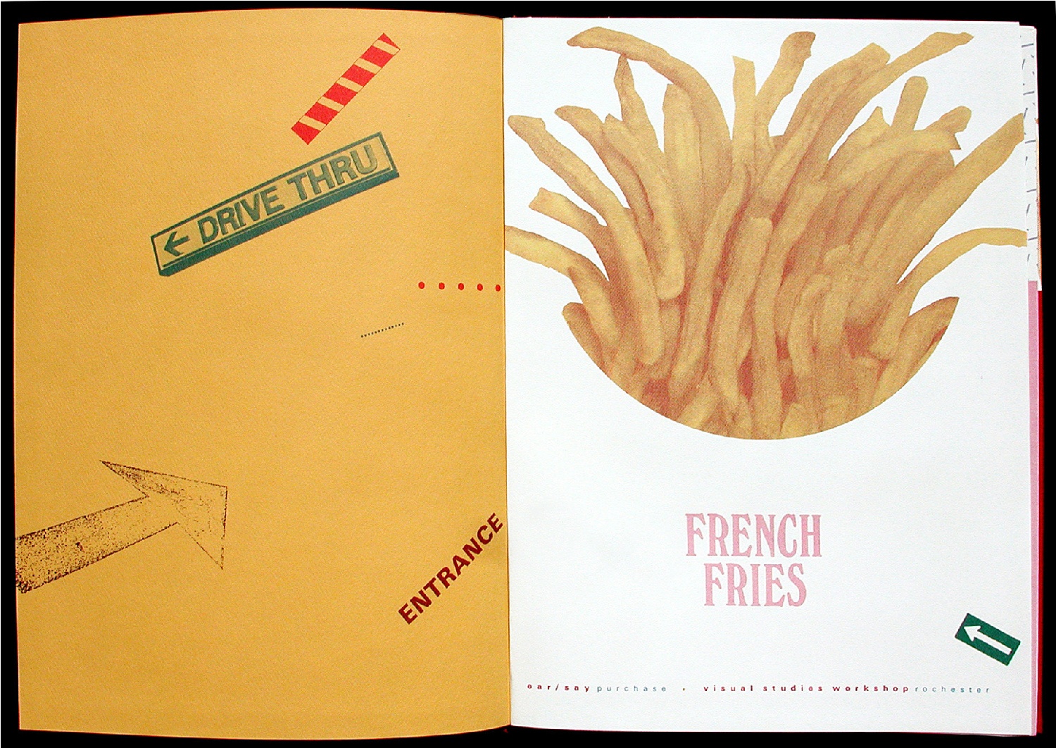
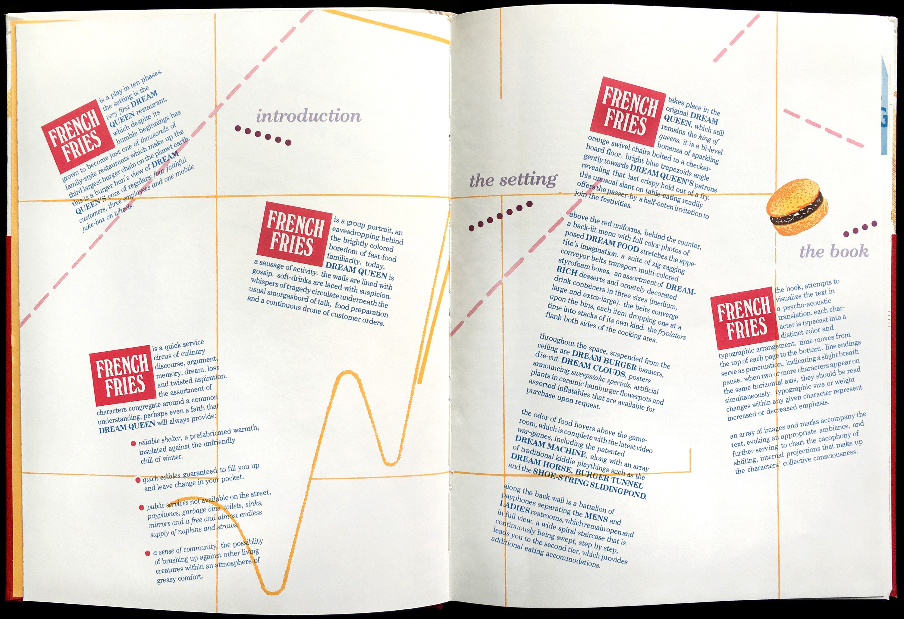
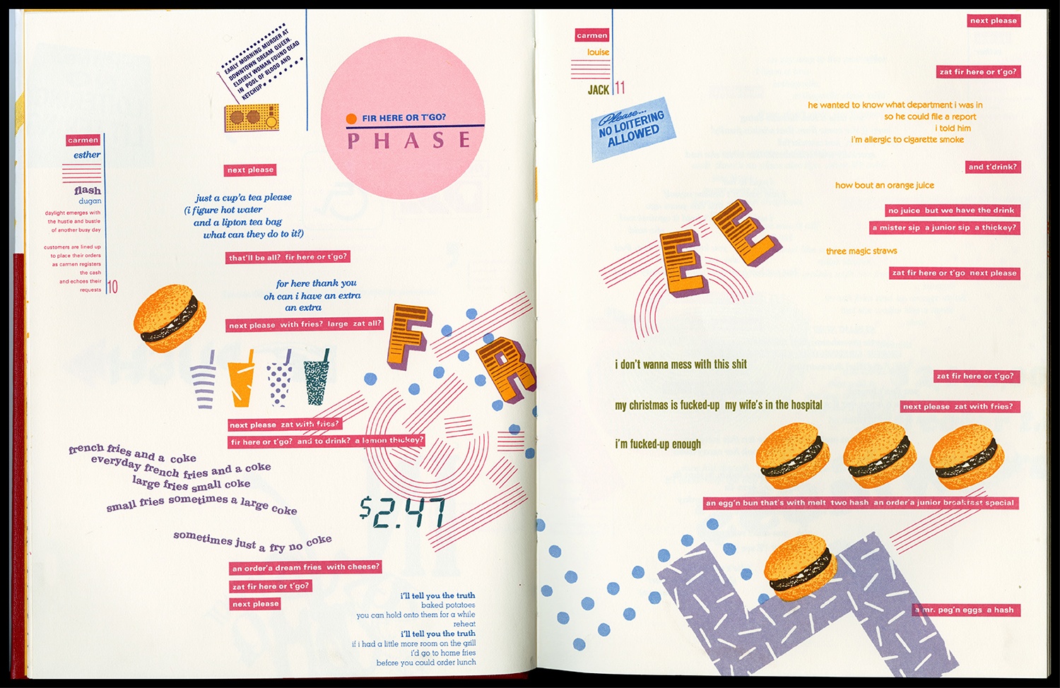
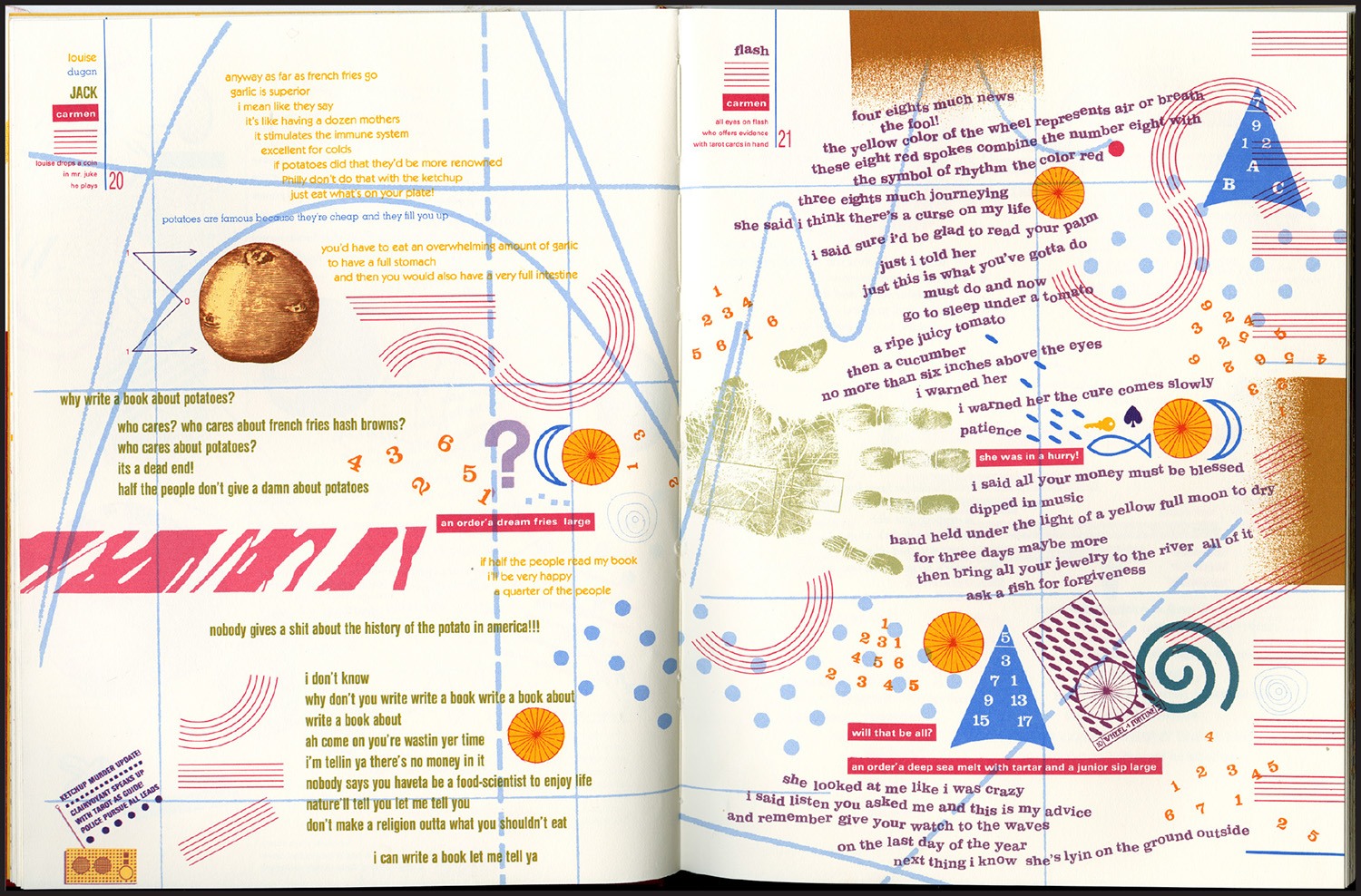
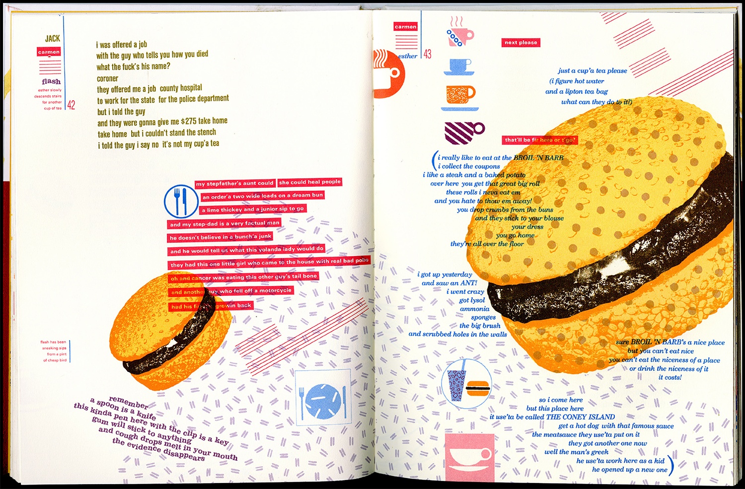
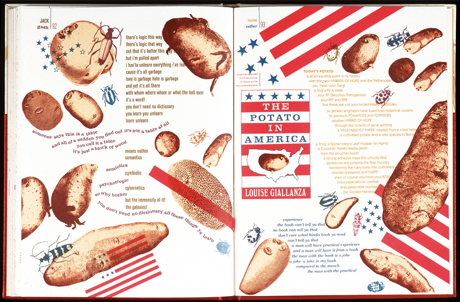
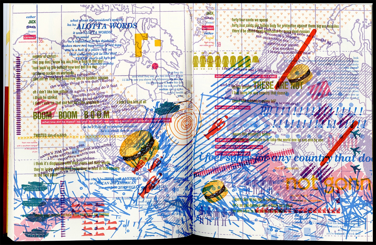
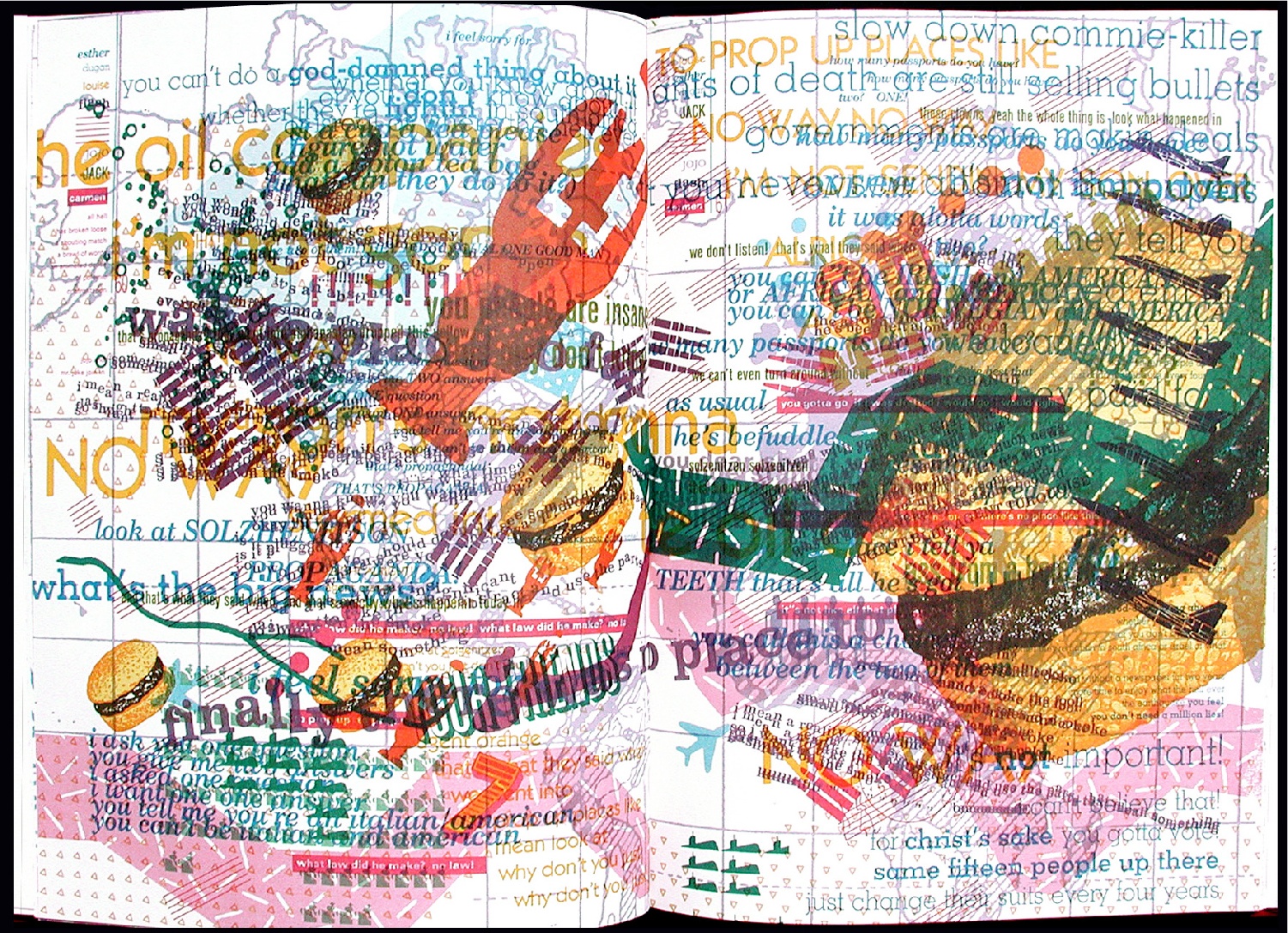
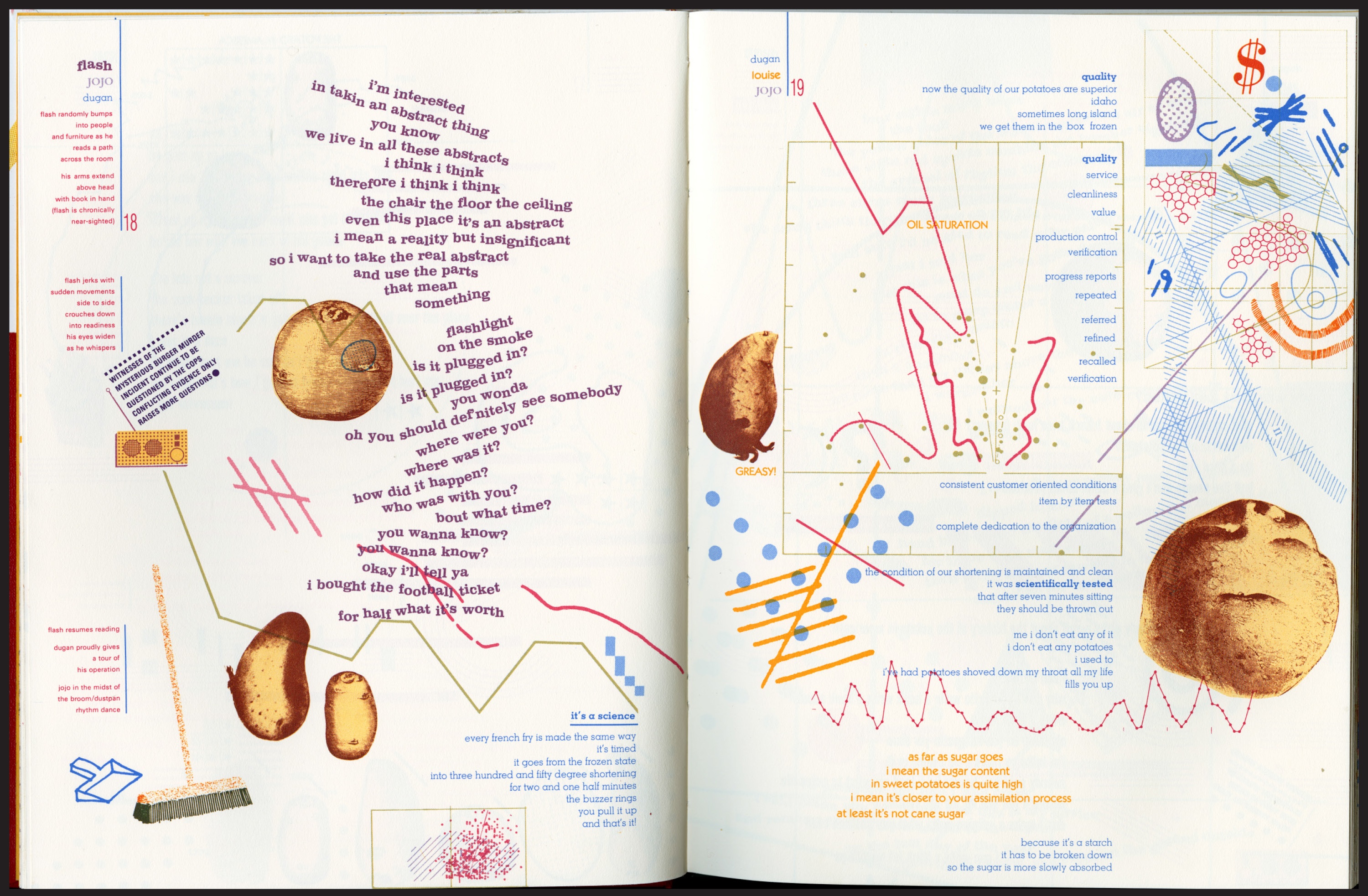
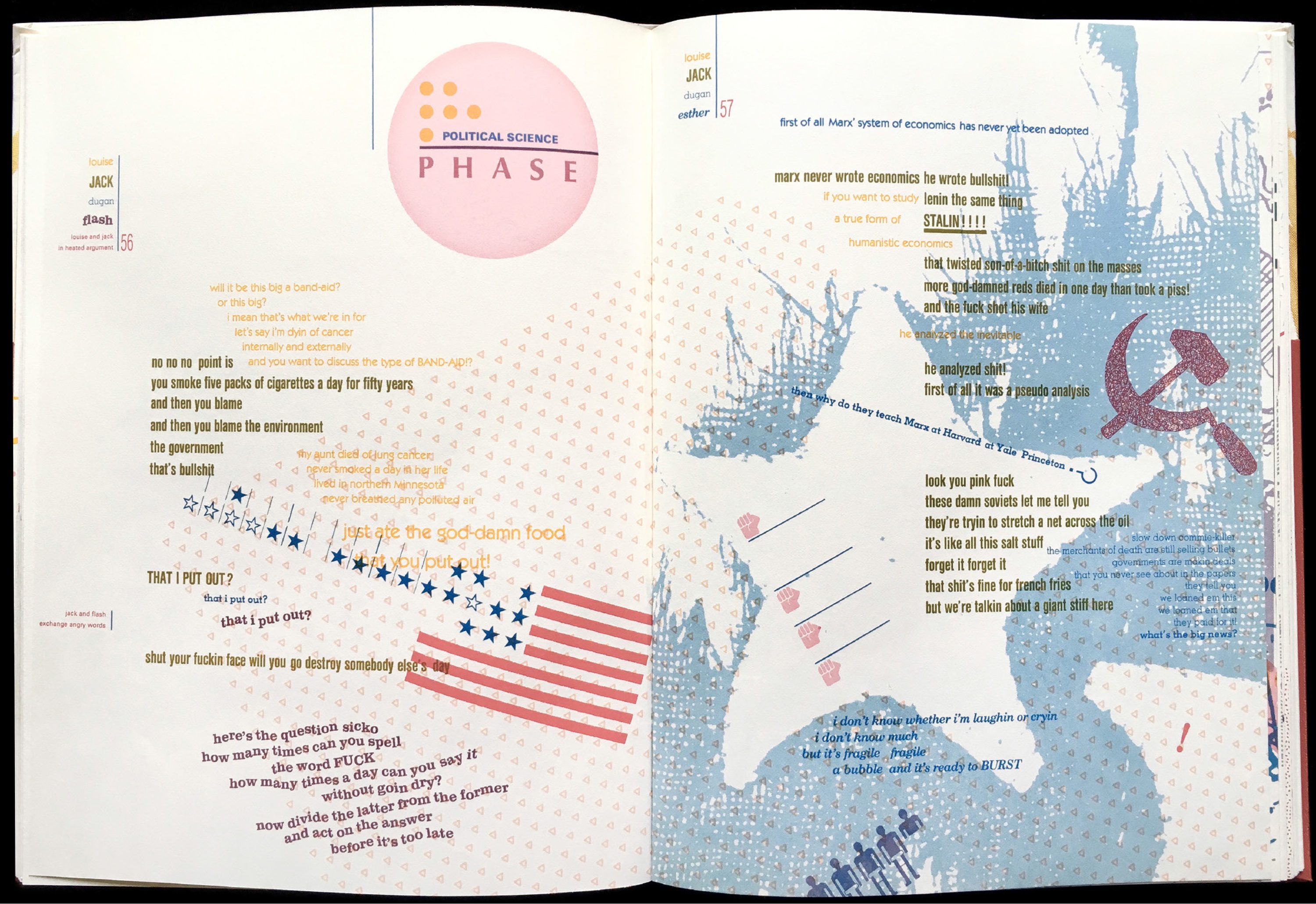
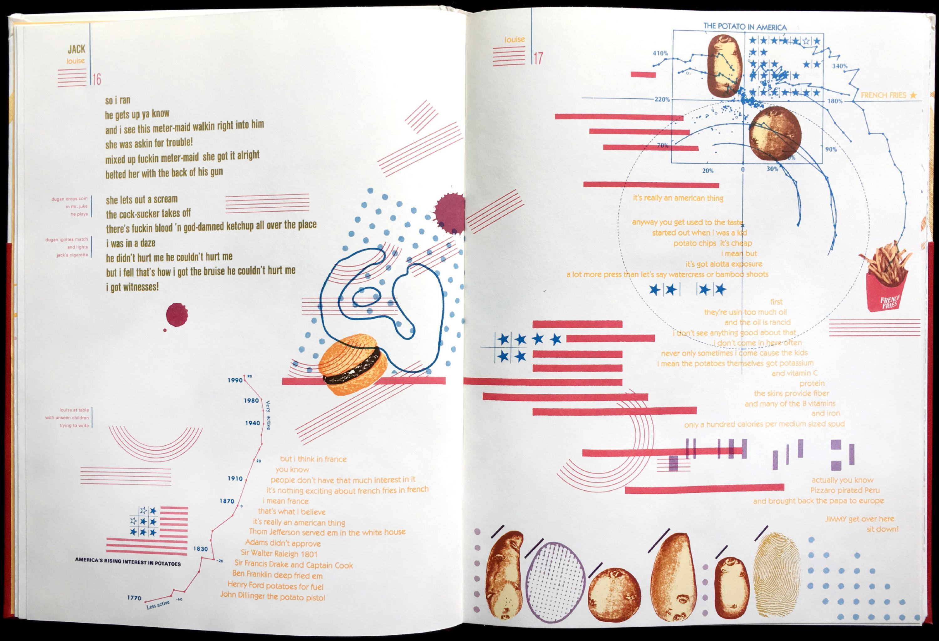
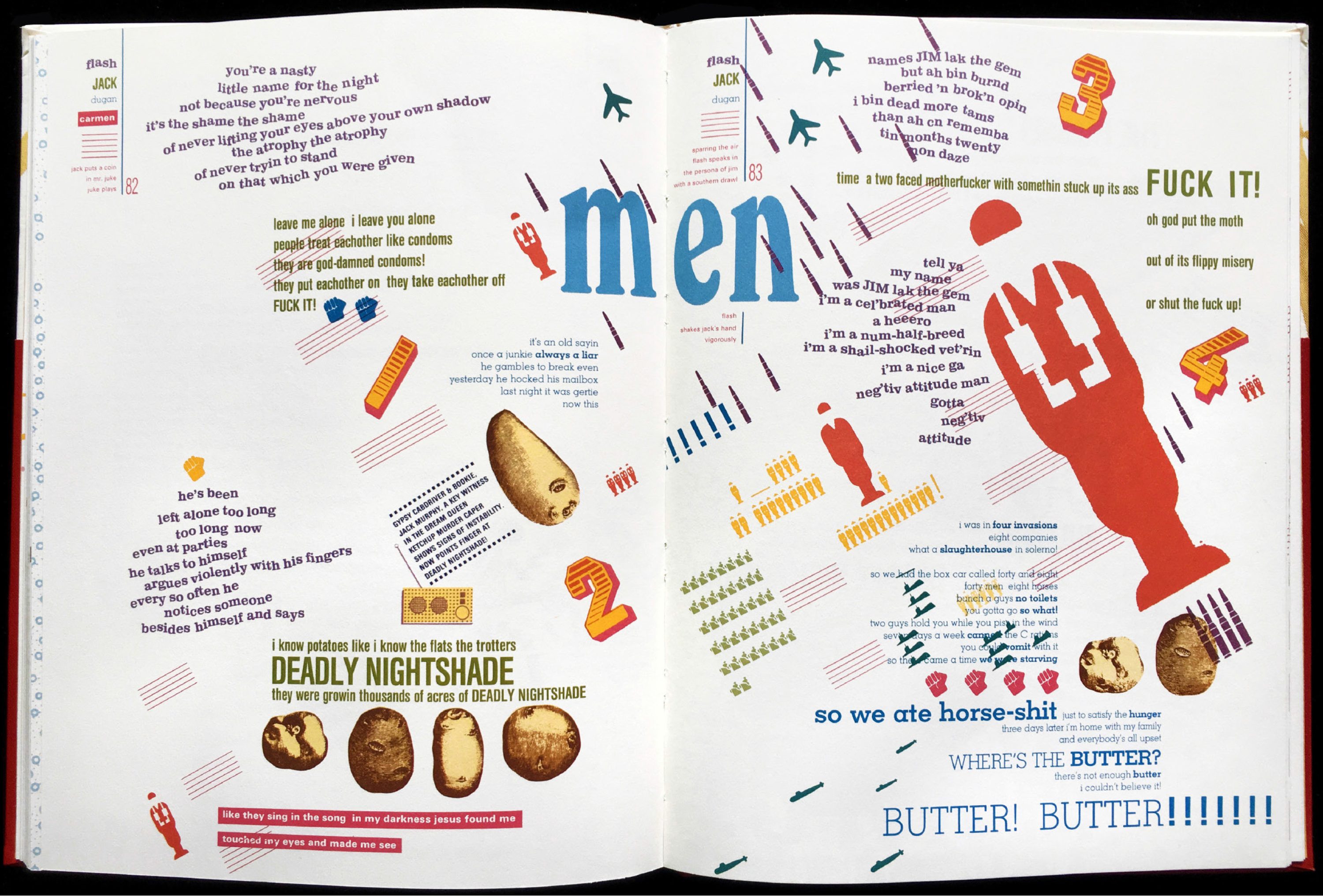
The book/play presents a day in the life of the original DREAM QUEEN restaurant (a restaurant that grew to become the third largest burger chain in the western hemisphere). Before the book/play begins, 83-year-old Gertie Greenbaum is found dead in a pool of blood and ketchup. Four customers and three employees (each set in his or her own typographic voice and color) give testimony to how Gerite died. They also continue their day discussing food, money, religion, politics (at the height of the Cold War), love, loss, dreams, memories, and transforming aspirations. The text is illuminated with icons and images that evoke the fast food tableau and the internal projections of the characters.
ISBN: 0961387106
Out of print. collector’s copies available
BUY NOW Original First Edition: Pristine condition, limited number available, $4,000.
BUY NOW Original First Edition: Slightly damaged or irregular copies, $800.
INQUIRE
sample page spreads


![]()
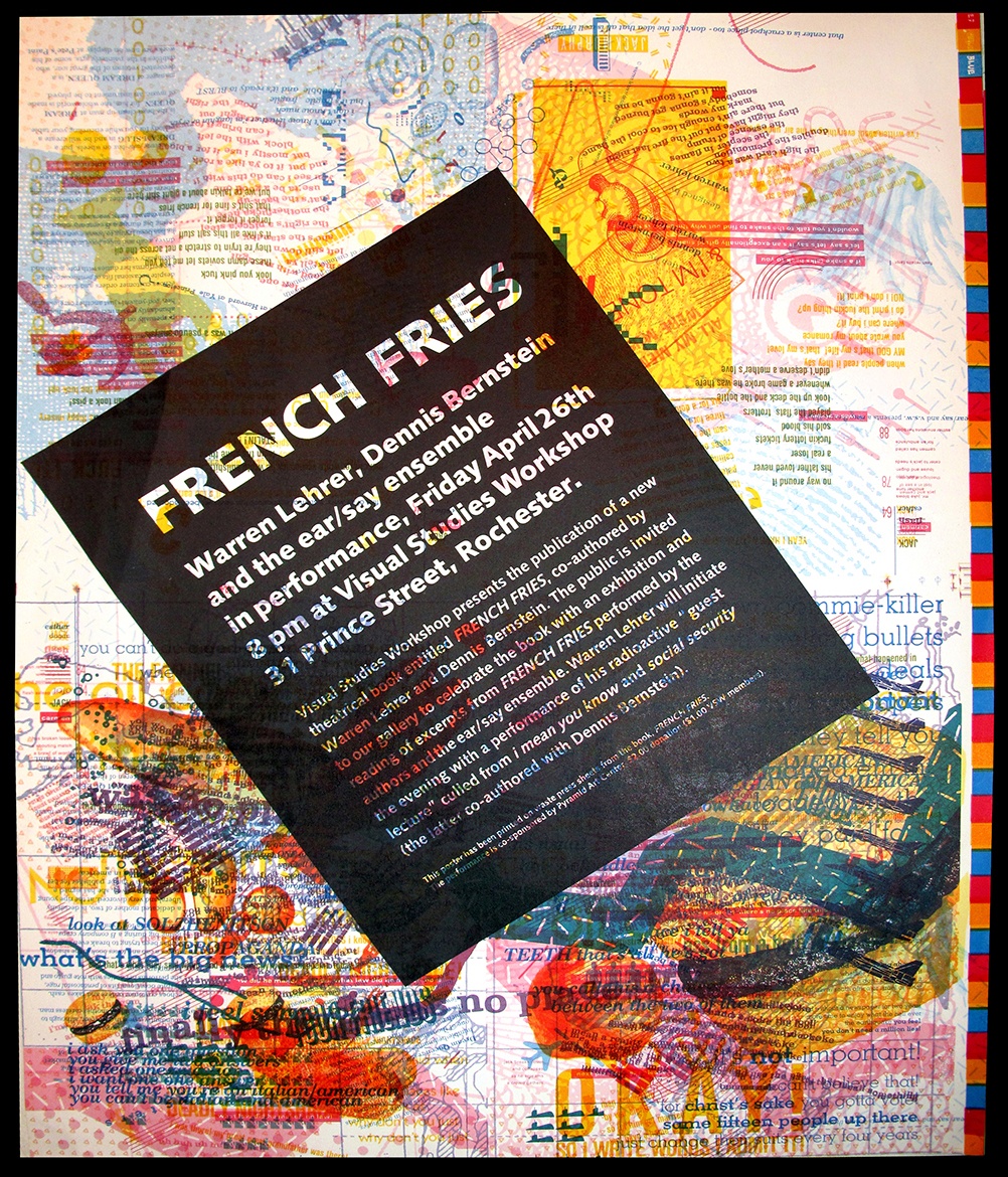
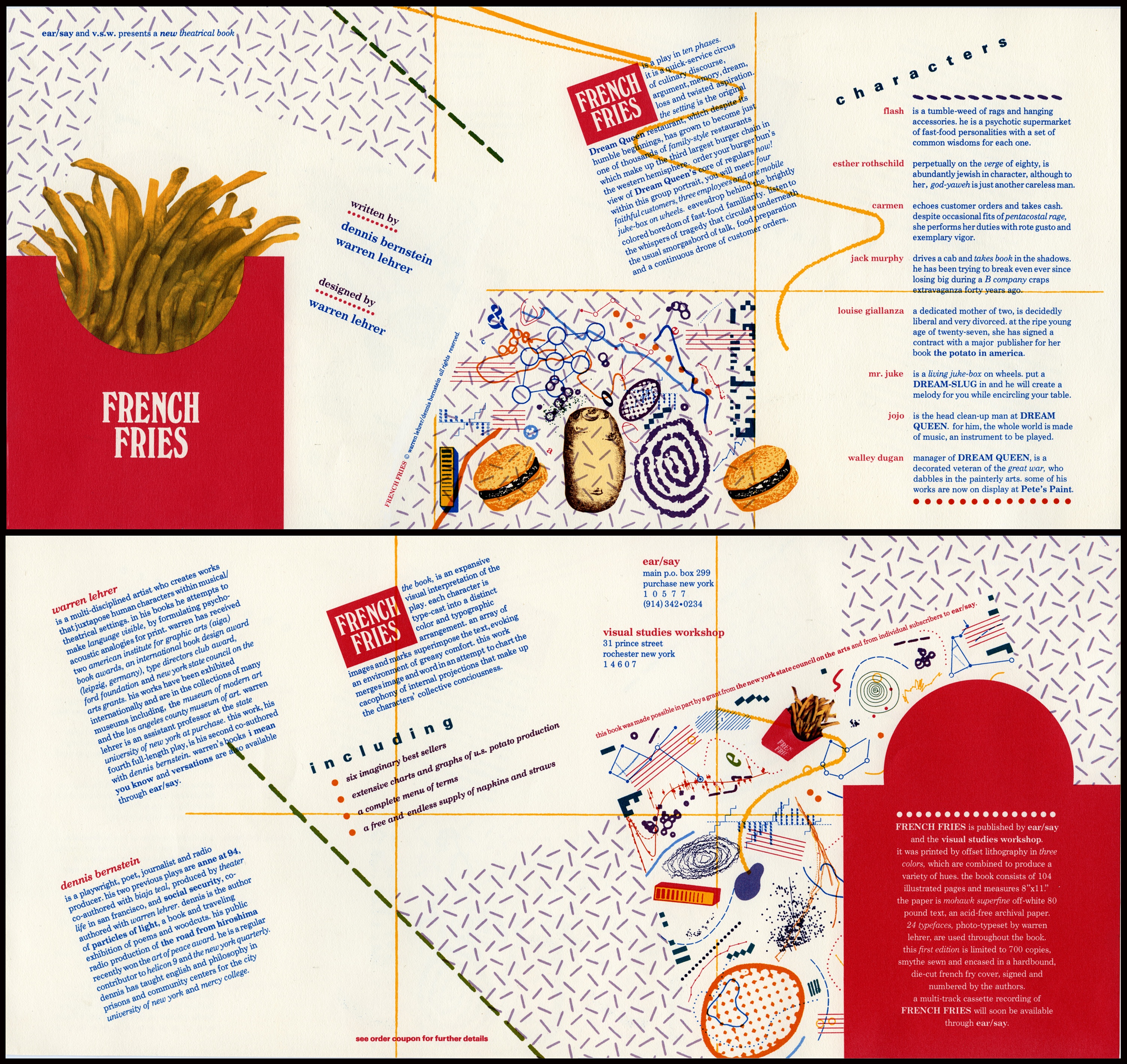
A poster announcing a performance of French Fries, designed by Joan Lyons using printers “waste sheets.” Below that front and back of the original mailer/prospectus designed by Lehrer.
Winner TDC Award
(Type Directors Club)
Winner STA Special Recognition Award
(Society of Typographic Arts)
Exhibited internationally including at the Georges Pompidue Centre’s L’image Des Mots exhibition, and as a solo exhibit at the Pieter Brattinga Gallery in Amsterdam. Copies of French Fries are also in the collections of the Museum of Modern Art, LA Country Museum of Art, Tate Museum, Getty Museum, etc…
French Fries has been written about and pages reprinted in dozens of books on design, experimental literature, and the art of the book.
“French Fries is one of the most fascinating books I have ever seen or read… The pages throb with energy and graphic vitality… French Fries proves that the book can be a movie, an existential feast, and a pastiche of literature and art…”
AIGA Journal Philip Meggs
“The tastiest book this season and for seasons to come, French Fries, Warren Lehrer’s latest tour de force is a remarkable accomplishment. Each page becomes theater and you are the voyeur…”
High Performance Magazine Judith Hoffberg
“Perhaps the biggest leap came (in my life as a book collector) when attracted by a four line description in a catalogue, I ordered a copy of Dennis Bernstein’s and Warren Lehrer’s French Fries… Never had I seen a book like it, nor have I since… Each page is a riot of homespun wisdom and raucous exchanges, overlapping life’s daily events… French Fries has also been my wisest investment, as I have watched the book increase tenfold in value…”
Bookworks Rose M. Glennon
“Lehrer pioneered what might be best termed ‘typographic performance’ in his 1984 book/play French Fries, a hot type cacophony of word and image that is today considered by historians one of the lynchpins of the deconstructionist era…”
Eye Magazine Steven Heller
“Without a discernable grid, the typography [in French Fries] flows freely across the pages, interspersed with images and marks evoking the ambiance and mood of the situation. Except for the work of the famous French designer Robert Massin, I had never seen an approach to typography quite like this before… I could experience the relationship between the text and its visualization, and I saw how effective it could be. Somewhere between seeing the books of Edward Rusha and Warren Lehrer’s French Fries, I discovered that my options as a graphic designer had expanded by tenfold.”
Emigre Magazine, The Last Issue Rudy VanderLans
“French Fries (1984) anticipates many of the design techniques later made possible by computer technology…. This high watermark in the preparation of art for offset printing pales in comparison to its design—to its imaginative uses of typefaces, scale, signs, symbols, and images to convey a nonlinear drama of everyday life. The spatial syntax of this remarkable tour de force is complex, uninhibited, and unconstrained by the norms of page design.”
U.S. Design 1975-2000 American Craft Museum Catalogue
“French Fries’ active and colorful pages are a triumph…. How much of what is audible can be made visible? This book asks and shows us how to push our habitual limits… and stretch our literacy.”
Fine Print Betsy Davids
“French Fries is a delicious, outrageous, funny, funky, sad, sometimes lyrical, warm, weird, mad, off the wall, on target, right on the mark, crazy, digestible, hilarious, word-laden book. I loved it.”
Collette Inez, writer
“Books such as French Fries [1984] challenge readers to explore the act of reading; to break with the usual linear pattern, vary the pace, look back on earlier passages, or skip ahead… [It is] a fiction of great visual complexity in which dozens of typefaces, images, shapes, and hundreds of screen tints build up to form densely layered compositions of immense energy…”
No More Rules: Graphic Design and Postmodernism Rick Poynor
(In French Fries), Lehrer and Bernstein have not merely presented us with a play… but with a remarkably sophisticated artist’s book.”
The Cutting Edge of Reading: Artists’ Books Renée Riese Hubert & Judd D. Hubert
“To fully appreciate Lehrer’s books, readers must suspend preconceptions about how books are to be read; for his defy tradition, redefining both form and function. Lehrer’s page spreads serve as stages for the characters in his books, enabling readers to participate in the drama by determining the pacing and the order of events. In French Fries, a book that is also a play and a metaphor for life, Lehrer presents a group portrait set in the Dream Queen Restaurant. Once into the book the reader is guided into the back door of the restaurant into a dynamic world of type, images, pictographs, and symbols… It is a quick-service circus of culinary discourse, dream, memory, and twisted aspiration.”
American Typography Today: 24 Innovators Rob Carter
“Lehrer’s acclaimed and influential 1984 book French Fries broke the grid—and possibly the crystal goblet—creating a work in which the design was not mere accessory to story but an integral mode of its performance. ..”
Eye Magazine David Banash
“In the early 1980s, Warren Lehrer designed and set the text of a play he had co-written with Dennis Bernstein. The title of the play is French Fries, and its setting is a fast-food joint. The printed text is less a script than a typographic performance, full of drama, full of action, and every bit as garish as the setting may deserve—extending the tradition of typographic theater dating back to Russian printer and playwright Ilya Zdanevich’s 1923 typographic performance of his play Lidantyu Faram.”
A Short History of the Printed Word Robert Bringhurst, Warren Chappell
“French Fries achieves an expressionistic resonance and throbbing graphic vitality rarely seen on the printed page. Its space is acoustical (having visual qualities that denote the properties of speech, sound, and music), plastic (possessing the spatial properties of twentieth century painting), and typographic.”
Type & Image Philip Meggs